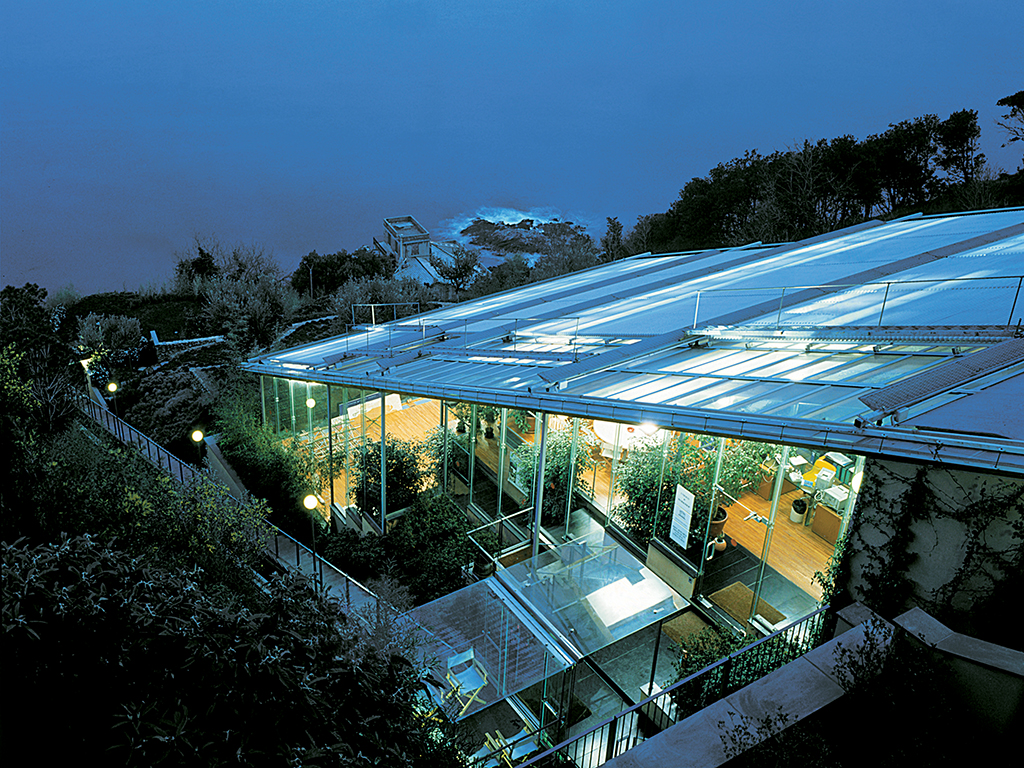
Laboratory-workshop in Vesima, Genoa | photo: Fregoso & Basalto, courtesy of RPBW
UNESCO laboratory workshop
A sophisticated, highly serviced version of an agricultural greenhouse, the laboratory and workshop at Vesima near Genoa that is shared by UNESCO and the Building Workshop is precisely the sort of building Piano’s Italian colleagues criticize him for. It is nonurban, has no conventional architectural elements such as a spatial sequence and fenestrated façade, and indeed lacks even any real architectural presence.
Untroubled by such concerns, the building has a straightforwardness and freshness that come from being a fairly direct response to place and program. Its glass roof follows the slope above a floor that simply steps with this slope. What walls there are are those of local tradition, pink stucco and fieldstone. Otherwise the structure is comprised of laminated timber beams on steel posts. The only conspicuous “technological” elements of the building fabric are the solar-cell controlled louvers and blinds that shade roof and glass walls. Even the characteristic “piece” takes time to detect, because there is nothing “technological” about the wood-framed glass panel of the roof other than its too heavy dependence on modern sealants.
If the building is straightforward, the experience of the building and its atmosphere is not, but instead richly subtle and ever changing. It is the feeling of being in touch with nature and the elements, of being in something itself semi-natural, that make this an archetypal Piano building — as well, of course, as being more striking in section than in plan and lit through the roof (as was the first Renzo Piano office-workshop built for himself in 1969).
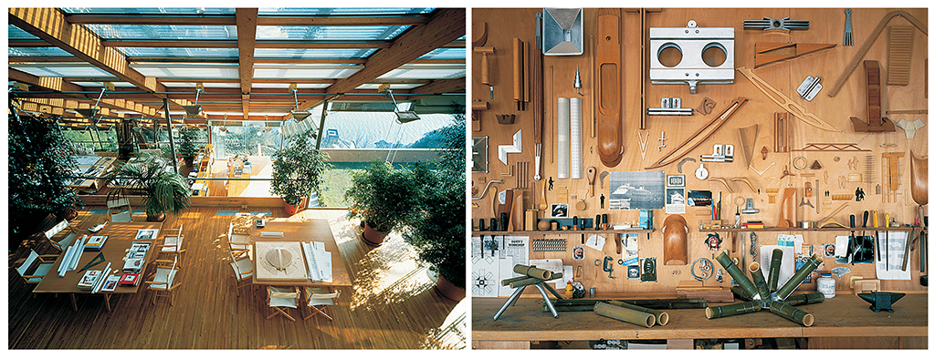
Laboratory-workshop interiors | photos: Fregoso & Basalto, courtesy of RPBW
For all this freshness and naturalness the building can be still be seen as deeply rooted in Piano’s formative period in the 1960s. The section inevitably recalls John Andrew’s Graduate School of Design studios at Harvard. The plan is 1960s too. Entry is on a corner from which two axes stretch at right angles (here, one along the contour and out to a terrace, the other down the internal stair) with accommodation in a truncated triangle between them. And the hypotenuse of this triangle is stepped to give views in two directions (here, those down to the sea that are otherwise cut off by the sloping roof). Such plans were clichés in colleges in the 1960s though this one lacks any sense of contrivance.
Mostly though the building calls to mind some of the writing of Reyner Banham. With automatically adjusting shading and air conditioning, there is something of “The Well-Tempered Environment.” The sense of minimal enclosure in nature recalls the vision of the article “Home is not a House” that was illustrated with a drawing of a naked man sitting in a forest glade enclosed in an air conditioned bubble with his needs served by a central robot, the many arms of which bore all sorts of electronic devices. At Vesima, this dream has become realistic and communal, and touched by some of the spirit of its contemporary antithesis, the woodbutcher’s art.
•••
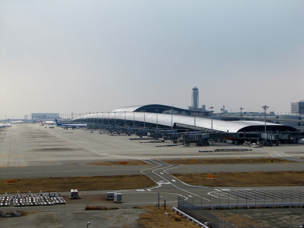
Kansai International airport, Japan | photo: redlegsfan21, via flikr
Kansai International airport
A fitting climax to the collaboration between the Building Workshop, in particular Noriaki Okabe and Renzo Piano, and Peter Rice (with their longtime collaborator, the mechanical engineer Tom Barker, also of Ove Arup & Partners) the terminal of the Kansai International Airport is far and away the largest, and probably the most thoroughly innovative of their joint works. It will also be a building that climaxes certain design ideals as spectacularly as did the Pompidou Center in its time. The Pompidou was the ultimate building-as-machine/building-as-kit-of-parts executed in a gung-ho let-it-all-hang-out manner that is somewhat indeterminate in its seeming incompleteness. In contrast, the perfectly symmetrical, smoothly curved and integrated terminal, with its obviously finished and finite form, is the ultimate machine-organism, climaxing the Building Workshop’s quest for a technology that emulates nature, a quest that extends back at least as far as Viollet-le-Duc.
What makes Kansai a machine is how directly it is shaped by the circulatory flows of passengers and air, the curves directly serving these functions by unambiguously orienting passengers wherever they are and by entraining ventilation air without the need for closed ducts. But anatomical explicitness and these same curves make it seem like an organism too. The metaphors it conjures are both mechanical and organic: hence it is both a glider and a dune-like form that with the surrounding trees lends the tabula rasa of artificial land some of the identity of an island.
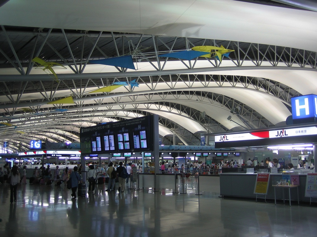
Terminal interior | photo: Joe Jones, via flikr
The basic organization of the terminal came from closely following the program (by the consultants Aeroport de Paris) and a critical review of other recent terminals. For instance non-directional and accretive structural modules of a design like Foster Associates’ Stansted Airport were avoided as they confuse orientation with identical views in all four directions. The satellite system used at Stansted was also rejected, although shuttles are used to move passengers along the wing that they board from.
The original competition-winning design included more nature in the form of planting than the final design. This filled a long open “canyon” between the two parts of what was a double-sided wing. The structure at this stage, like the roofs, was a series of separate curved elements. Neither architect nor engineer was happy with the solution. But devising a more integrated and synergistic solution involved so many computer calculations that these were postponed until after the competition was won. Now the curves of the roof flow seamlessly one into the other. So too, the huge three-dimensional trusses flow into the bowed elements of the wing that in turn now function collectively as a shell structure, with considerable increase in efficiency in all parts of the structure. So if one dimension of nature has been diminished in the final scheme (the excluded “canyon” along the wing) it is more than compensated for in another way by the building acquiring a far greater finite organic unity — and a fabulous dinosaur skeleton-like structure.
The curves “naturalize” the building, making it more organic, not only in increased formal unity and structural efficiency. They conform to geometries not previously applied to architecture, and are inspired by recent breakthroughs in chaos theory and topological mathematics that are giving new insights into the geometry of nature. Studies in these inspired the architects to seek out new geometric disciplines to shape the curves while allowing maximum repetition of components. Here all 90,000 cladding units are identical (each designed to take up tiny accumulative tolerances) as are all secondary structural elements while some primary elements from identical jigs are merely trimmed.
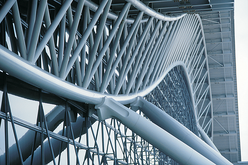
Curves of roof and structure seen from departures level road | photo: Ishida Shunji, courtesy of RPBW
Asymmetrical curves of the main terminal building roof that were adopted to entrain jets of air blown along it are a series of circular arcs of differing radii. The tapering curves of the wing, initially adopted to accommodate sight lines from the control tower (by other specialist architects) conform to a toroidal geometry. Conceptually this wing is cut from the top of a ring, of 10-mile radius and inclined at 68 degrees from horizontal, that passes through the earth and barely emerges on the island. It is the subtle combination of these geometries that will give this immense building a light-sprung poise, just as similar subtleties of converging columns and curved stylobate do for a Greek temple.
Toroidal geometry had been previously explored by the same team of Noriaki Okabe, Jean-Francoise Blassel and Peter Rice when devising the shape and skin of the Bercy-Charenton shopping center. But the shopping center was directly shaped by its immediate context of motorway ramps. In contrast the Kansai terminal, with its adjacent trees, creates for itself a sense of context, by appearing to be a favored topographical feature to which planes will come and go as naturally as do boats to an island harbor.
The text below was originally published in the exhibition catalogue for the 1992 Architectural League exhibition Renzo Piano Building Workshop: Selected Projects. All text by Peter Buchanan, © The Architectural League of New York.
Next: Part 8: Projects: J.M. Cultural Center & Padre Pio pilgrimage church
Previous: Part 6: Projects: Columbus International Exposition & Lingotto factory rehabilitation

