The Deborah J. Norden Fund, a program of The Architectural League of New York, was established in 1995 in memory of architect and arts administrator Deborah Norden. Each year, the competition awards up to $5,000 in travel grants to students and recent graduates in the fields of architecture, architectural history, and urban studies.
Thomas W. Ryan received a 2006 award.
I traveled to Scandinavia in 2006 to visit and study the seminal works of Alvar Aalto and Sigurd Lewerentz. The impetus for this investigation came at a time in New York when condo towers and stock markets were rising with equal ferocity. With technology demanding that projects be designed and executed at a frenetic pace, the traditional discipline of architecture was fast becoming un-moored by a fetishism for new forms and materials. In reaction to this contemporary momentum, I turned to Aalto and Lewerentz, whose work was grounded in strategy rather than style — an ambition that I felt was more central than ever to the survival and advancement of the discipline. By directly engaging with the enigmatic character and rigorous invention in these Nordic masters’ work, I came to know two approaches to the built environment that were revelatory both for their time and our own.
Alvar Aalto: Typology and distortion
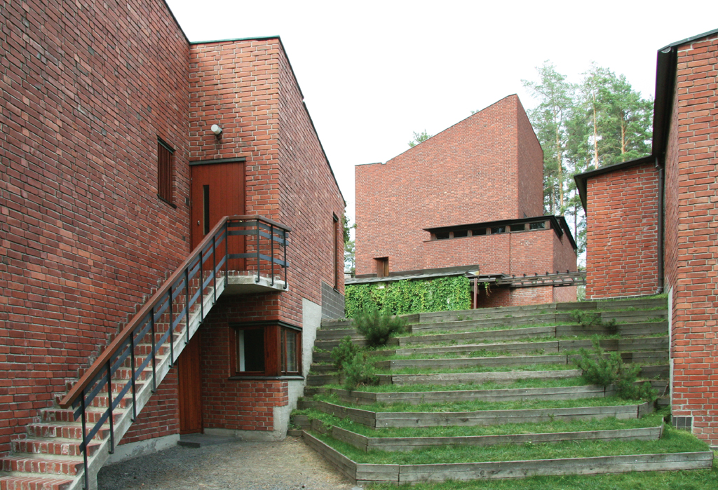
From his first major turn to Modernism with the Paimio Sanatorium of 1929, Aalto focused his work on humanizing the hard-edged rationalism of the time. Whether through the use of natural materials or the softening of forms, this pursuit manifested itself in many ways throughout his career, from the shape of a door pull to the carving of natural light through an interior courtyard. The consideration of form and scale was paramount to this exploration, and I was continually impressed to find it operating successfully within both urban and pastoral contexts. Finnish Architect and theorist Juhani Pallasmaa has made a number of insightful analyses in this regard, identifying Aalto’s treatment of architecture as a miniature landscape and his tendency to invert interior and exterior spaces. I found this inversion most potent at Aalto’s own summerhouse, where a cacophony of natural brick and tile patterns form an outdoor room within the strict square geometry of a white modern shell.
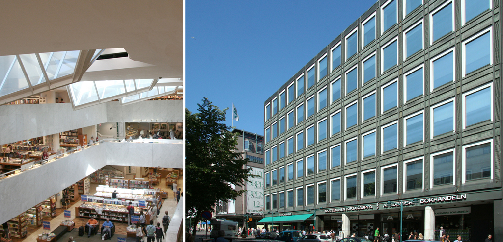
In a strategy repeated throughout many of his urban projects, the exterior façade is treated as static and repetitive, merging with the surrounding city fabric, while the interior is shaped by natural light from above. This strategy is on full display at the Academic Bookstore in Helsinki. Here, a façade of repeated copper and mirrored glass windows defer to the rhythm of the surrounding context. He used double glass for the windows and doors, while a series of skylights penetrate like glaciers below the water line into the space. Protected from the harsh winters outside, the courtyard is flooded with natural light, and the balconies surrounding the void are stepped back to shape a distinct geography within the space.
Construction as a means of expression
Operating at a number of scales, I found Aalto to be primarily a horizontal architect who still knew how to place the vertical. Whether holding an urban corner or marking the importance of a civic institution, Aalto’s monumental works operate on metaphorical as well as functional levels.
In the majority of these projects, corners are never just turned, but carved. In many cases the approach to the building is paramount, with windows and walls always expressing depth and carrying a shadow into the facade. Patterns are also omnipresent throughout the work, being primarily used to establish or reinforce a rhythm of singular repeated vertical elements. At the same time the mass of the buildings are always stepping away, climbing up and reaching out. I found this not to be a forced dynamism, but a situational understanding of the constantly shifting gaze of the viewer. In the urban projects, this dynamism is outwardly repressed, but always shows itself in section.
Considered scale and the tolerance for change
In a lesson even more relevant today, Aalto acknowledges that the concept of a tabula rasa as the context for an architectural project no longer exists, and that there will always be an inheritance of history, context and environment to be addressed. Aalto transforms this potential restriction into a freedom, pulling formal and constructional elements from disparate historical and regional contexts into a new unified whole. Pallasmaa has identified this practice with painterly collage, saying that within Aalto’s work, “A utopian modern future combines with indigenous heritage simultaneously.” And further:
The building is not unified by a single dominant architectural concept; instead it is a conglomeration of ideas, impressions and associations held together by a sensual atmosphere, in the same way disparate elements of a painting can be held together by a unifying quality of light.
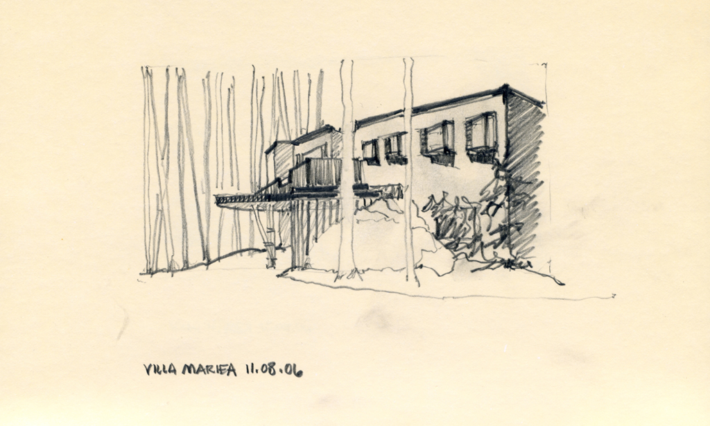
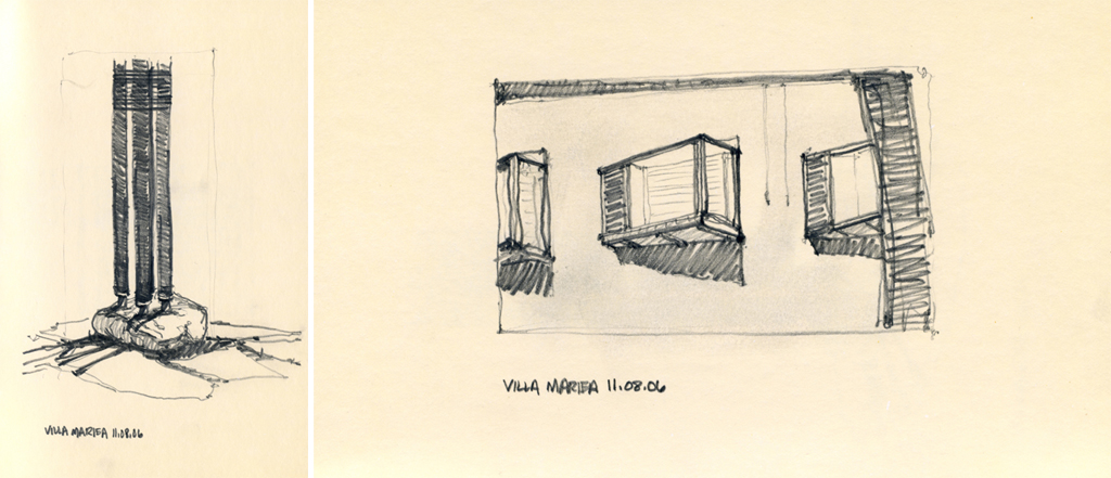
I also found that Aalto constantly uses the surrounding landscape to help establish a sequencing of the entry and choreography of the experience. Aalto’s own summerhouse on the Island of Muuratsalo, located close to the village of Saynatsalo in the central lake region of Finland, is masterful in its sequencing, merging landscape and building. In Aalto’s time, the island was accessible only by boat; weathered wood steps carved into the hillside remain from this time. Passing a traditional log sauna on the lake’s edge, a path leads through a series of large boulders with the white painted brick walls of the house coming in and out of view. As one closes in on the house, what first appears to be a white solid mass seen through the darkness of the trees dematerializes. A brick courtyard is carved from the solid form, with a series of wooden structures trailing behind, marching in the forest beyond, their traditional wood foundations stretching across the existing rocky landscape. At his best, Aalto exploits the contradictory elements simultaneously; the massive becomes a ruin and the traditional finds its place within the modern.
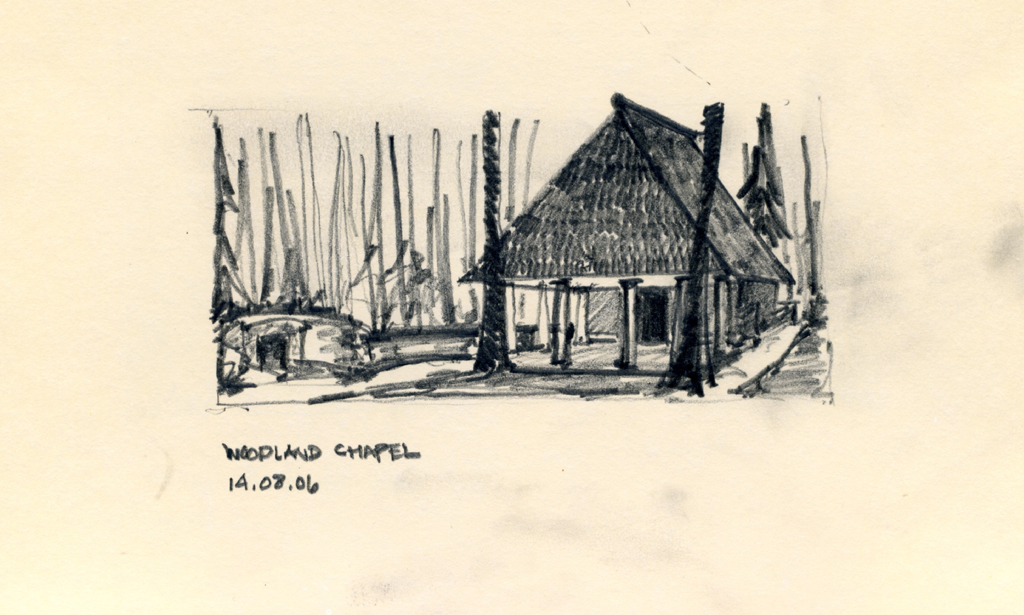
Woodland Chapel, Woodland Cemetary. Stockholm, Sweden. Erik Gunnar Asplund Architect. Credit: Thomas W. Ryan.

Chapel of the Resurrection, Woodland Cemetary. Stockholm, Sweden. Sigurd Lewerentz Architect. Credit: Thomas W. Ryan.
Sigurd Lewerentz: Establish rules to operate against
In 1915, at the age of 30 with his colleague Erik Gunnar Asplund, Sigurd Lewerentz won the competition for what would become Woodland Cemetery. Their proposal, entitled “Tallum,” was praised by the jury for its thoughtful integration of architecture and landscape, with a particular sensitivity to the Nordic relationship to “Nature”. Although the first prize was awarded in 1915, the design and construction of the complex would continue to occupy the architects throughout the remainder of their lives. As the process proceeded throughout the 1920’s into the 1930’s, and the burgeoning careers of these two young architects began to fully form, the design responsibility for various elements within the complex were divided between them. Asplund was to design the Central Crematorium and what was to be known as Woodland Chapel, with Lewerentz responsible for the Resurrection Chapel and the overall landscape design. While in Helsinki, I had the opportunity to meet with Juhani Pallasmaa to discuss the lives and work of Aalto and Lewerentz. Sitting at a large table, surrounded by hundreds of well-thumbed books stacked floor to ceiling on either wall, Pallasmaa spoke of Lewerentz as an architect of melancholia. Comparing his work to that of Michelangelo, the term held less of a connotation of sadness, than of weight.
Much like the delta blues being sung at the same time in America, Lewerentz’s architecture is simultaneously dirty and precise. Simple melodic refrains are ceaselessly repeated; devolving at times into a dissonance belying the complexity of what at first appears to be a straightforward narrative. It seems that Lewerentz was at various times leading and directed by this melancholia, and all that is inherent in its meaning. This fact became most explicit at Lewerentz’s Resurrection Chapel at Woodland Cemetery in Stockholm. The pure starkness of the form is anchored in the studied geometry of the golden section, while the offset entry portico is pulled from the façade and held slightly off axis. These formal gestures are unprecedented in similar classical work of the time and inculcate the complex with a charged strangeness, appropriately reinforcing the program of procession from life to death.
Layering of space, context, history and environment
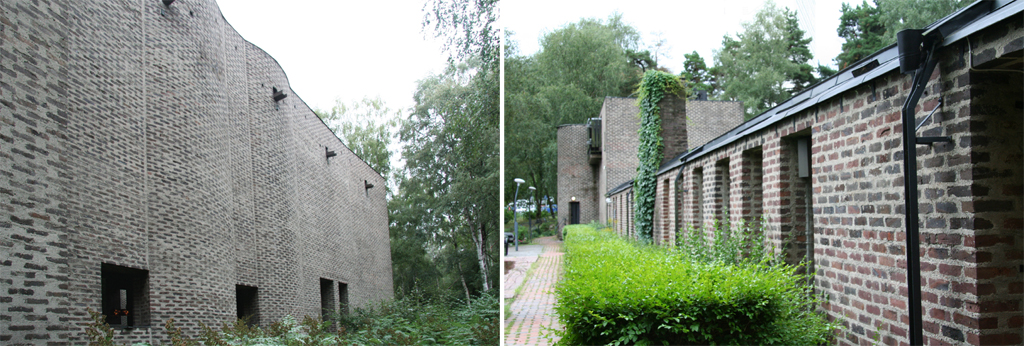
The extreme to which Lewerentz pushed the language of Classicism was taken even further with a series of late works, including the Chapel of St. Mark’s and the Flower Kiosk at Malmo Southern Cemetery. Located within an ancient grove of birch trees in the suburbs of Stockholm, St. Mark’s Church is formed almost singularly from brick. Wide mortar joints swim across a fortress like façade, their light gray color merging with the surrounding woods. Understood first as a mass, all functional elements are layered onto or into the depth of the brick. Frameless windows in the sanctuary are pulled inboard, seeming to disappear from the exterior, while bare conduit outlets and doors are fastened directly on to the surface of the interior. In the same manner, exterior walls are pulled away from the mass, allowing hidden light to filter in to the interior of a darkened sanctuary.
After visiting the cemeteries and chapels that occupied his thoughts throughout his life, it is even harder to understand where the direction of the program ends, and the intention of architect begins. The line that runs between Woodland Cemetery and the Flower Kiosk in Malmo is straight in purpose, but never quite clear. It is the act of occupying this line; between life and death, purpose and chance, intention and doubt, in which Lewerentz practiced and his architecture remains.
In the six years since my trip to Scandinavia, I find myself continually returning to the work of Aalto and Lewerentz, still finding new and ever more relevant questions embedded there.

South Cemetery Flower Kiosk. Malmo, Sweden. Sigurd Lewerentz Architect 1969. Credit: Thomas W. Ryan.
Biographies
is a Senior Architectural Designer and Project Manager at Christoff Finio Architecture, having completed projects for the New Museum of Contemporary Art, The Brooklyn Historical Society, and a number of residential projects in New York. He previously worked as a Designer at Richard Meier & Partners in New York. Ryan holds a BA in Visual Arts and an MARCH from the College of Design at North Carolina State University. While at N.C. State he was the co-editor of The Student Publication, receiving the Faculty Design Prize and the Kamphoefner Fellowship upon graduation. He has studied in Ticino, Switzerland and at the Architectural Association in London, and has been an invited juror at NYIT, N.C. State, and Yale University.
Explore
Lina Bo Bardi’s return to Salvador
Angela Starita discusses the architect's (mostly unrealized) plan to restore the historic city center of Salvador, Brazil.
Renzo Piano Building Workshop selected projects: Part 1
Time and place, technology and nature in the work of The Renzo Piano Building Workshop.
Michael Graves: The Portland Building at 25
Michael Graves revisits his work after several decades.


