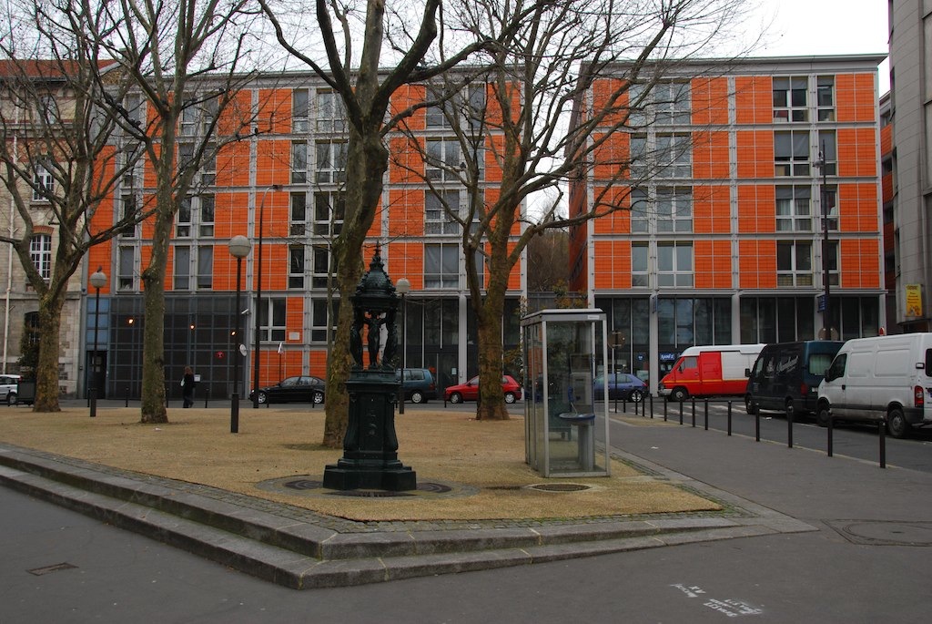
Rue de Meaux housing | photo: Paolo Rosa, flikr
Rue de Meaux housing
Of all works by the Building Workshop this housing scheme in the north of Paris represents the most conventional commission. Low-cost housing for a municipal client on a city center site, it is the sort of highly circumscribed project that most other European architects have to struggle with and survive on. Yet it marks a significant milestone in the Building Workshop’s oeuvre too. Its most conspicuous aspect, the cladding, is a development from that of the slightly earlier tower extension to IRCAM (the institute for experimental music and acoustics buried under a square adjacent to the Pompidou Center). On a prominently pivotal site the IRCAM tower explores city center contextualism with a cladding of specially developed terra cotta elements. Together these two Parisian projects, IRCAM and rue de Meaux housing, were important in persuading skeptics that the Building Workshop could produce convincing urban architecture.
But the buildings and their use of terra cotta are also very different. IRCAM took its cue from The Menil Collection, which is clad in the same weather-boarding as surrounding bungalows so as to settle into its suburban settings. The terra cotta element of IRCAM, now re-used at the Columbus Exposition, was devised to connect the smallish tower with the brick of the two adjoining buildings while the steel frames they are set in make some connection with the close-by Pompidou. At the very much larger rue de Meaux, the terra cotta cladding tile is not only four times the area of a standard brick face, but neighboring buildings are stuccoed. So the terracotta achieves not contextual continuities, that are here achieved more by site planning and massing, but a fineness of scale and a warm colored finish that will weather well.
Also, at IRCAM the terra cotta elements are secured in steel frames set forward from the concealed structure, creating an effect so light and delicate as to verge on the flimsy and prissy. At rue de Meaux the tiles face glass fiber reinforced cement panels and the effect, despite the crispness of the faceting and the extraordinary thinness of the horizontal louvers, is inuch more robust. This difference accurately reflects those of location, size and program — but perhaps also something of the contrasting characters of the two Associates who ran the Paris office and were responsible with Piano for the designs, Noriaki Okabe (succeeded by Paul Vincent) for the IRCAM tower, and Bernard Plattner for the rue de Meaux.
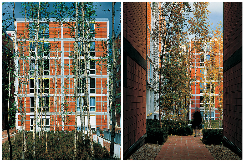
Rue de Meaux housing | photos: Michel Denancé, courtesy of RPBW
The rue de Meaux scheme is one of a number of new housing projects in what is otherwise a slightly seedy nineteenth century neighborhood. Local planners had wanted a public route across the deep site, flanked by fingers of housing leaving only small pockets of open space. But the Building Workshop argued for and adopted instead an enclosed rectangular garden that would have most impact as a verdant outdoor room. Overlooked by almost all of the 220 apartments, the garden is planted to inhibit such noisy uses as gatherings and games. In contrast to the utopian aspirations of some of the housing projects of northern Europe, rue de Meaux is not an attempt to create an intensely active social machine that provokes community-forging encounters. Instead it is almost the antithesis of this, a quiet refuge in which both the green oasis of the central garden and the facades that frame it are largely devised to protect anonymity rather than provoke social interaction or personal display. Indeed the impression all these give is that this is not low-cost housing, but a retreat for the well off. This impression is aided by the simple massing and flat facades that exhibit both a restraint and richness that is an immense relief after the silly sculptural posturings of so much current French public housing.
Although there is a nicely judged hierarchy in the relative animation of these facades, which are quietly understated where facing other properties and liveliest in the compositional climax of the garden, the street facade falters at one point. The problem is not the introduction of new materials, but the lack of a cornice to cap the façade and suggest closure to the space of the street. Otherwise the virtues of the scheme are such that they were immediately recognized, not just in awards accrued, but in a photographer and critic, both very prominent in architectural circles, immediately taking up residence here.
•••
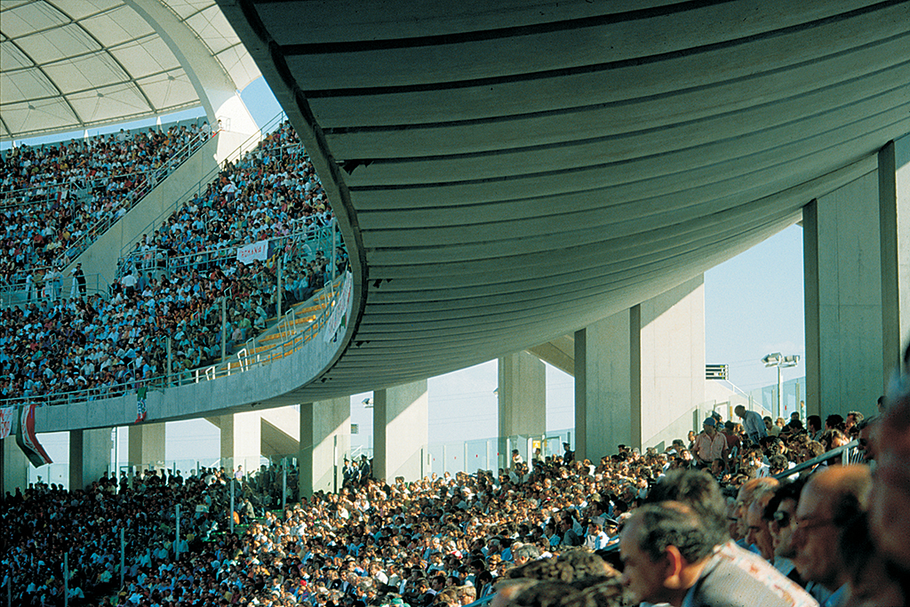
San Nicola Stadium | photo: Ishida Shunji, courtesy of RPBW
San Nicola Stadium
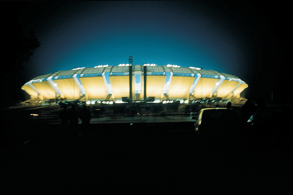
Some of the Building Workshop’s architecture is simultaneously contextualist and alien, responsive to setting, yet also strange and intrusive. Most of its works display this quality in some, often very small, degree. The most extreme examples of this tendency are the Bercy-Charenton shopping center on the outskirts of Paris and the San Nicola stadium outside Bari, in southern Italy. Although the shopping center takes its curves directly from the adjacent motorway interchange and the stadium opens up hospitably to the Apulian landscape, both look like huge and only momentarily settled spacecraft.
At Bari, however, what is seen from a distance is only part of the stadium. Concealed in a gently mounded crater to which the hovering upper tier seems tied only by gangplank-like stairs is the lower tier of seats and a large amount of submerged ancillary spaces. Ringing the top of this crater is an ambulatory. This is the key unifying element of the design, yet it is difficult to appreciate how fine it is from drawings and photographs alone. The ambulatory not only links all the circulation routes, but offers at their most intense the two primary and contrasting experiences the stadium affords, a compressed view in and down on the playing field and a sense of expansive openness outwards and up to countryside and sky. The single curve of the underside of the upper tier offers the sense of both compression and release.
San Nicola stadium is quite unlike stadia of the dominant Mediterranean tradition that originated with Roman arenas like the Colosseum and spread to include the bullring. These are closed and introverted structures. Instead the stadium returns to the earlier Greek theater where action was played out against the backdrop of the landscape. This openness to nature that is a recurrent theme in the Building Workshop’s work confirms how un-Italian is Piano’s approach. Atypically for Piano’s work, the stadium is made mostly of a single material, concrete. Yet it is also typical in the striving for lightness achieved here with each petal-like bank of the upper tier held aloft on only four columns, and the concrete of the curved underbelly seeming to hang like pleated fabric.
San Nicola Stadium | photo: Ishida Shunji, courtesy of RPBW
The initial design was for soccer only and so had a closer relationship between spectator and playing field. Later the clients decided to include an athletic track (as is typical of Italian stadia), thus distancing the spectators and leading to an inevitable loss of emotional intensity during matches, as well as considerably altering the plan geometry. A major concern with the design, that was specially built for the 1990 World Cup and in anticipation of the hooliganism such events bring, was with security and crowd control. Those same devices that give the structure its sense of openness also very effectively segregate the fans into groups of controllable size. Thus devices that may seem to serve largely aesthetic concerns also deal unobtrusively with one of the most problematic issues in stadium design.
The text below was originally published in the exhibition catalogue for the 1992 Architectural League exhibition Renzo Piano Building Workshop: Selected Projects. All text by Peter Buchanan, © The Architectural League of New York.
Next: Part 6: Projects: Columbus International Exposition & Lingotto factory rehabilitation
Previous: Part 4: Projects: Schlumberger renovation & The Menil Collection

