Learning in stages
Diana Nicklaus writes about theater and performance hall design in Berlin, Amsterdam, and London.
The Deborah J. Norden Fund, a program of The Architectural League of New York, was established in 1995 in memory of architect and arts administrator Deborah Norden. Each year, the competition awards up to $5,000 in travel grants to students and recent graduates in the fields of architecture, architectural history, and urban studies.
Diana Nicklaus received a 1998 award.
In 1998, I traveled to Berlin, Amsterdam, and London to study theater and performance hall design. At the time, I was one of the designers for the Touhill Performing Arts Center at the University of Missouri at St. Louis.
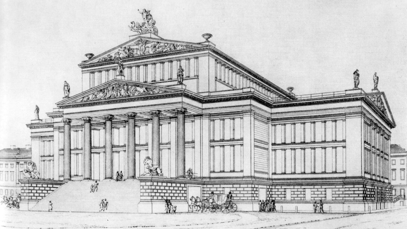
I began my study in Berlin at Karl Friedrich Schinkel’s Schauspielhaus. Though Schinkel may be best known for individual buildings, for me, his accomplishments as an urbanist are more impressive. The symmetrical façade of the Schauspielhaus derives a particular power from its position on the Gendarmenmarkt between the identical German and French Cathedrals. The plaza formed by those three buildings is quite grand, and today accommodates public events and outdoor concerts.
Inside the Schauspielhaus, a series of renovations and postwar reconstruction have changed Schinkel’s original work considerably. In 1935, the main performance space was renovated according to the Kaiser’s Neo-Baroque taste. In 1943, after a bomb fell on the Gendarmenmarkt, the shell of the building was reconstructed in its original form. The interior, which had been horseshoe-shaped, became a rectangular volume. The ornamental motifs of the original chamber music area were rescaled and applied to the larger space, the proscenium was removed, and the stage was reduced. Two large rigging beams added to accommodate modern technical requirements now detract from the spatial continuity of the theater. This visit convinced me that there is little benefit to a rectangular concert hall; neither its acoustics nor its aesthetics make the renovated Schauspielhaus a good performance space.
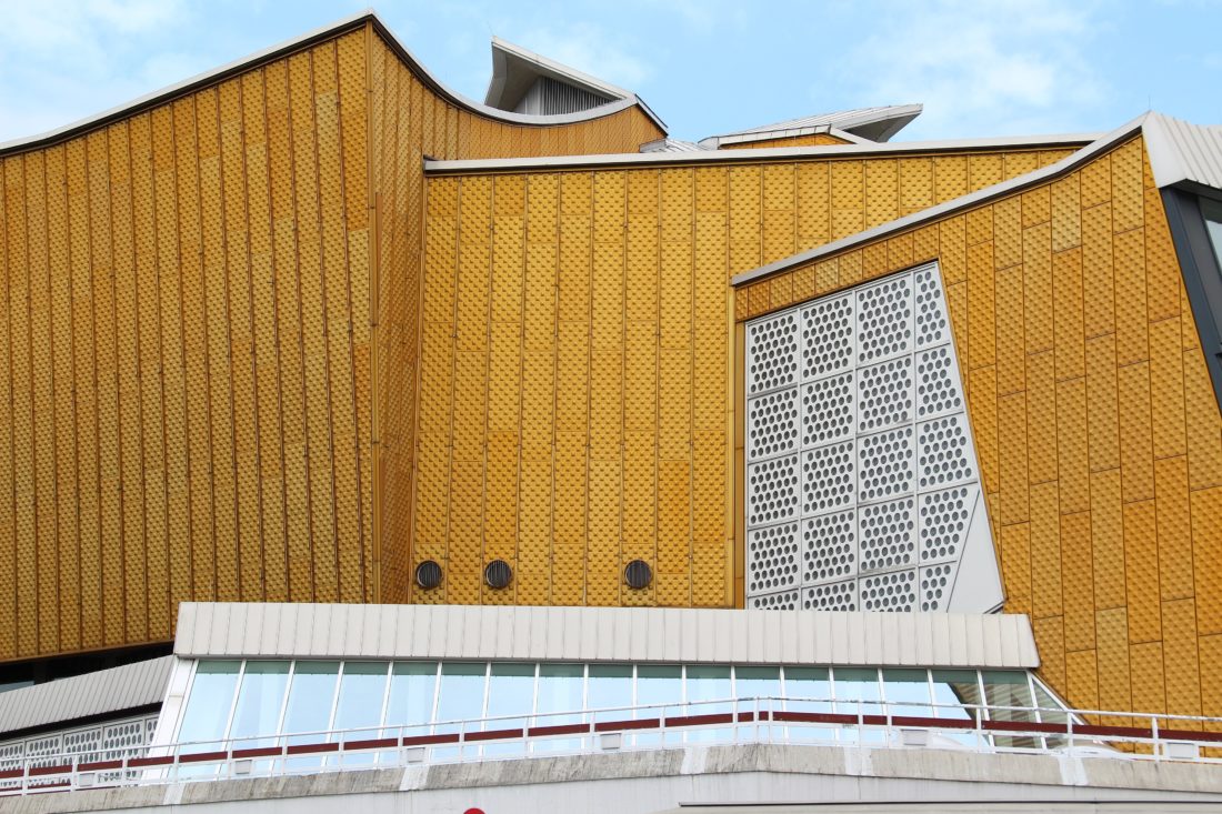
At the Berlin Philharmonie by Hans Scharoun, I heard Tchaikovsky’s Fifth Symphony, a piece I have performed as a violinist. I realized that no two people in the audience sit on the same horizontal level. Because of the slope of the floor, the space loses any sense of repetition and the seats begin to look like paper airplanes carrying different groups of people. Built in 1963, the Philharmonie is the crowning landmark of the complex of distantly-spaced buildings, including the Neue National Galerie by Mies van der Rohe, that comprise Berlin’s Kulturforum. In the Philharmonie, Scharoun masterfully combined orange metallic cladding, white brick, and stucco to create a series of elaborate masses that intersect in unpredictable ways.
While certain materials, such as the heavy aggregate of concrete walkways and the colored glass windows, date the building, others have withstood time better. The orange panels that cover most of the exterior continue to give the building a sculptural presence that is visible from many points in Berlin; the view from the Potsdamerplatz is particularly powerful.
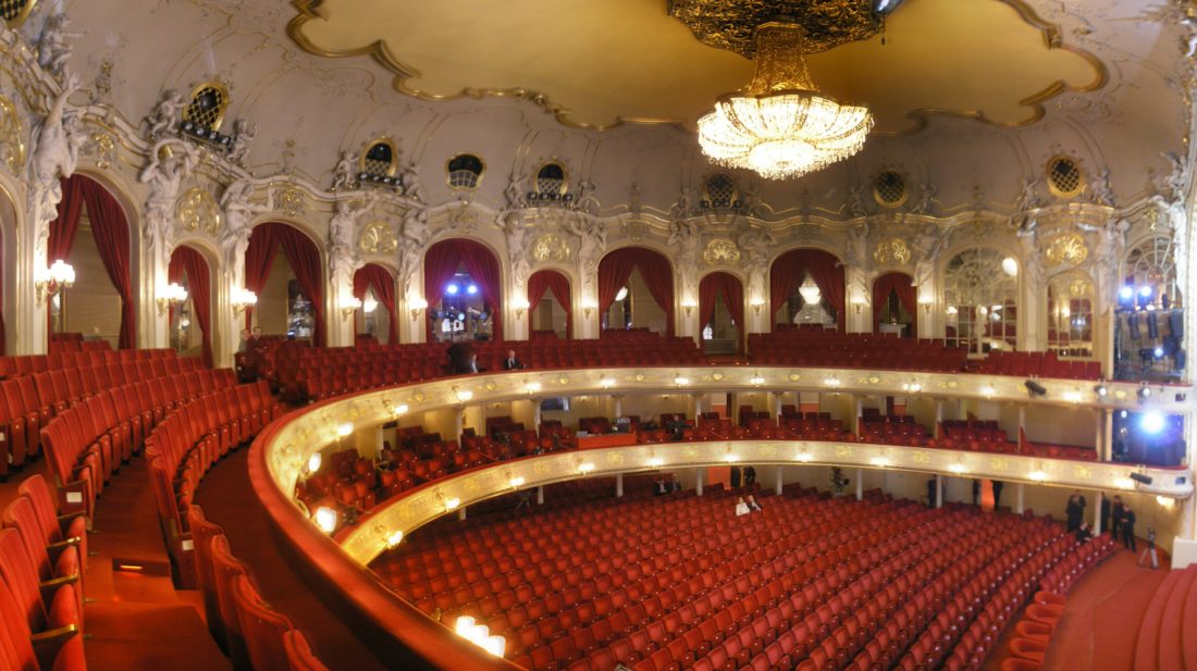
After decades of renovation, Berlin’s Komische Opera has lost its sculptural presence. The highly ornamented baroque interior, including Corinthian colonnades and glass chandeliers, clashes with the strictly modern exterior, which would seem brutalist if not for its façade of pink marble. Exposed bulbs on outdoor signage evoke a street show, and awkward seating impedes interior circulation. The opera company’s reputation for radical interpretation of operas parallels the temporal contrast between interior and exterior, but the awkward juxtaposition of materials and poor theater design are just poor design.
The Deutsche Oper is also architecturally problematic, but I was very impressed with its innovative connection to public transport. Transportation is a crucial aspect of theater design that is often neglected. The Deutsche Oper stop on Berlin’s efficient subway allows easy access to the theater.
After studying the music halls of Berlin, I traveled to Amsterdam. Like Berlin’s Philharmonie, Amsterdam’s Concertgebouw and Musiektheater are located in a cultural district that includes several of the city’s major art museums. The Concertgebouw is a beautiful historic building that exhibits the Dutch mastery of masonry. But its rectangular interior separates the audience from the performers, and a recent addition by the Dutch architect Cees Dam fails to relate to the original structure. Inside the addition, the original facade is intact, but the glass ceiling, lined with a light filtering mechanism, creates an awkward juxtaposition of form and materials. The addition might have been better sited at the rear of the building, away from the historic street.
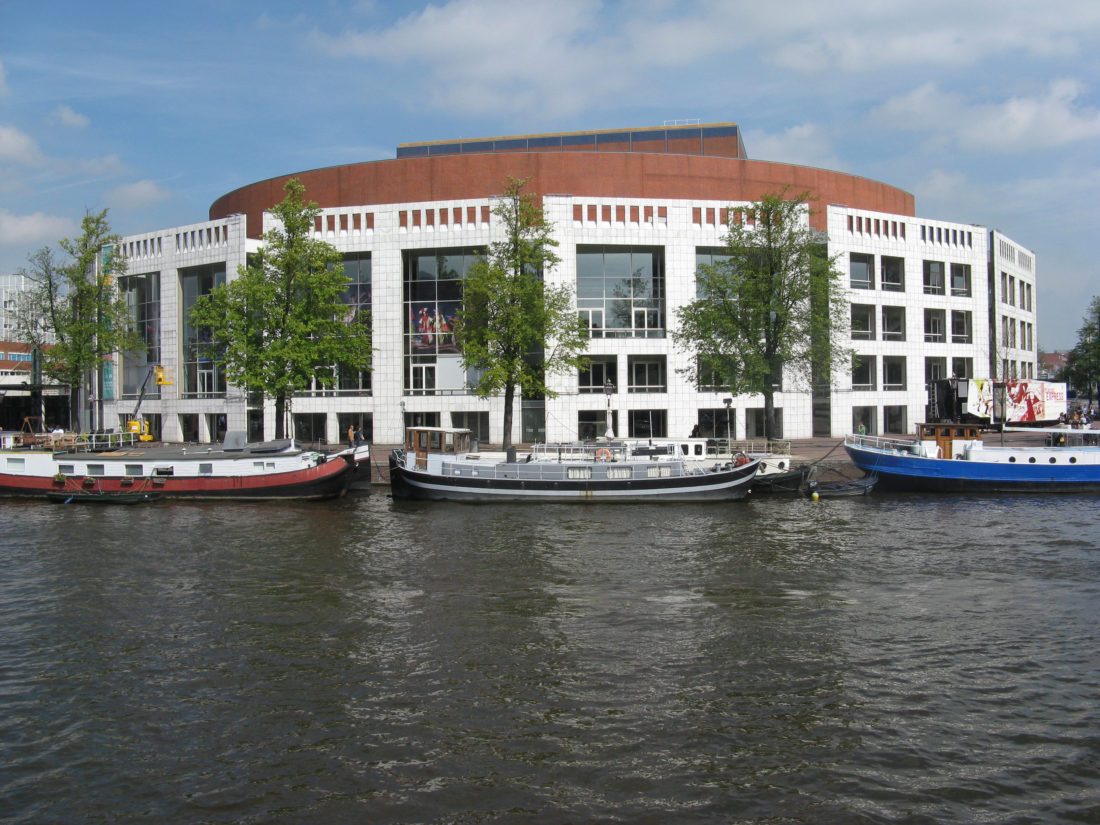
Also designed by Cees Dam, Amsterdam’s Muziektheater (1986) is located on the water side of a larger civic complex. For the Muziektheater, Dam created a large, segmented facade that faces one of the major canals, with large white portals that stand in marked contrast to Amsterdam’s red brick buildings. The mass of the theater space disappears behind this facade, lost in the larger civic complex; the building does not announce that it is a theater.
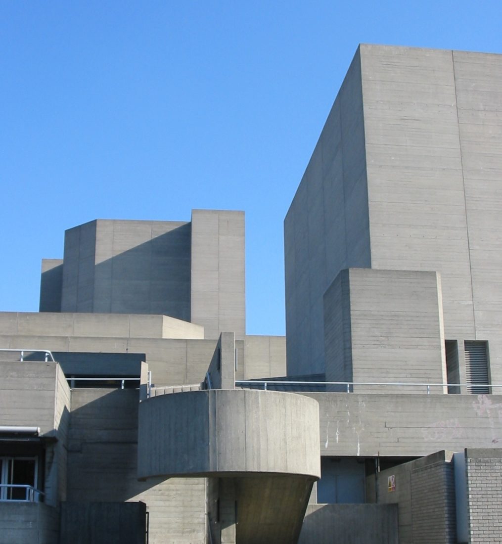
My next stop was London. On the south bank of the Thames, the Royal National Theater and the Royal Festival Hall provide a constant run of theater, chamber music, opera, and ballet. At the Lyttleton, one of three theaters that comprise the Royal National, I attended an extraordinary performance of Shakespeare’s Othello. At the Queen Elizabeth Hall, the mid-size theater at the Royal Festival Hall, I attended a Bach to the Futureconcert, and found the acoustics acceptable for a small chamber ensemble due to the system of punched wood paneling on the canted walls. I found the performance spaces in both the Royal National and Royal Festival Halls to be unexceptional examples of the stark modernist theater design of the 1950s and 1960s.
At the newly reconstructed Globe Theater on the Thames, I learned firsthand about the Elizabethan theatrical space. The designers of the reconstructed Globe have made a clear distinction between the architecture of the original and the twentieth century visitor’s center. Standing in the pit for a performance of The Merchant of Venice, I saw the theater come alive, as performers mingled with the audience, making the play a dialogue with the crowd.
A wonderfully detailed roof, supported by two ornate Corinthian columns, covered the stage platform. The elaborate faux materials and deep colors of the stage enhanced the play’s Venetian setting, and the half-timbered exterior recalled England’s vernacular tradition.
Because London’s Royal Opera was closed for restoration, I traveled to Glyndebourne, where I spent an exciting afternoon with Nick Murray, the technical director of the Glyndebourne Festival Opera. He provided extensive information about the history of the company and gave me a detailed tour of the building. This was my first visit into the upper galleries of any theater’s backstage. A dizzying tour of the catwalks gave me a tangible understanding of the intricacies of lighting and hanging stage sets. Inside the performance space, the staff was having a “technical day,” and allowed me to walk around the stage and space while lights and sound were being tested.
In the Festival Opera, architect Michael Hopkins masterfully combined a rustic aesthetic with high-tech vocabulary. Lush, green pastures, complete with Holstein cattle, surround the building. On the entry side of the theater, the view is particularly powerful. Hopkins made circulation tiers into deep porches that provide framed views of the surrounding countryside. Interior balconies are paneled with reclaimed oak, which is surprisingly uniform in color and texture, and juxtaposed with a pre-cast concrete ceiling. The climax of the performance space is a small concrete dome that covers the space gracefully.
The elegant combination of concrete and wood continues on the exterior, complimented by brick and steel. Wooden rafters span the open spaces, and are gracefully anchored into the brick with steel ties that sit in a small concrete frame. Beyond the rich palette of these materials, Hopkins incorporates his signature high-tech tent structure, extending it across the entrance on the lowest level, bringing bright, diffused light to an interstitial space between the first level of the theater and the shop and bar. I left the project with a new appreciation for Hopkins’ work, both as a theater designer and a master detailer.
Biographies
traveled to Berlin, Amsterdam and London in 1998. Since then, she has contributed to the design of performance spaces within two large museums, and a music hall in a conservatory. Now, she works at Collins Gordon Bostwick Architects in Cleveland, Ohio.
Explore
Aranda\Lasch lecture
March 5, 2015 | Benjamin Aranda and Chris Lasch | Blending history and storytelling with design driven by computation, Aranda\Lasch’s projects often grow from one repeated module.
Cities of the dead
Margaret Morton reveals the architecturally and culturally distinctive ancestral cemeteries of Kyrgyzstan.
Re-envisioning New York’s branch libraries
The Center for an Urban Future's latest policy report provides a comprehensive blueprint for bringing these vital community institutions into the 21st century.

