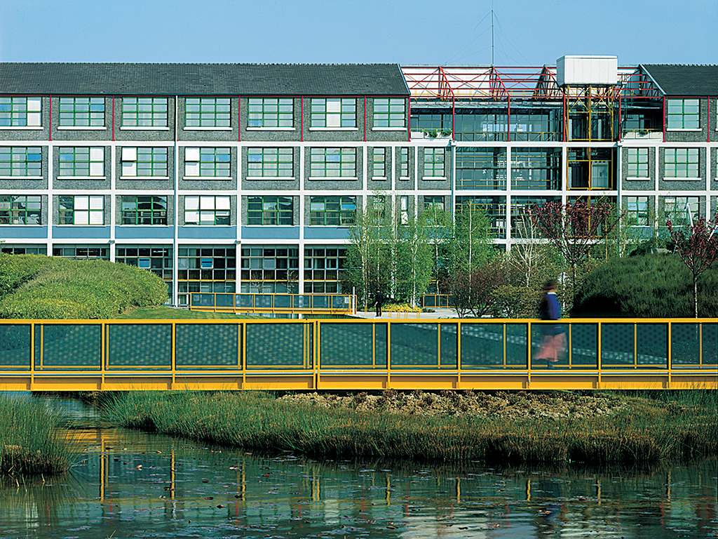
Schlumberger Industrial Complex | photo: Michel Denancé, courtesy of RPBW
Schlumberger renovation
The conversion of an obsolete industrial plant into a pleasant and efficient research center and offices was a daunting prospect, highly constrained as it was by the grimy and unprepossessing old buildings, a strictly limited budget and a very demanding client. Yet this is an important project for the Building Workshop. In these tough circumstances and at this large scale, themes explored separately in earlier work were brought together and the approaches adopted here became the foundations for future projects. The Lingotto factory renovation also uses a kit-of-parts strategy first adopted here so as to retain some overall consistency, and future landscaping works and tensile structures all benefit from experience gained here.
As at Otranto, modern technology is introduced to revitalize old buildings. As with the IBM travelling pavilion, technology co-exists harmoniously with and even emulates, as in the shape of the tensile structure, the forms of nature. Here much is achieved by eroding the old building, recessing new glazing behind the exposed old frame at some circulation cores and parts of the base of the building. This emphasizes the separate identities of new and old while also interweaving them together with nature into a new unity.
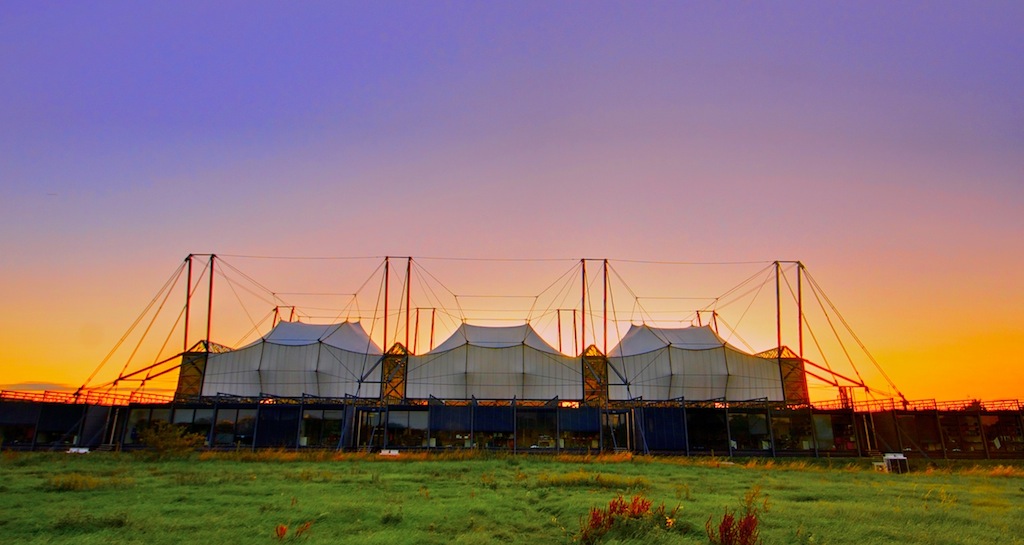
Awning-sheltered central facilities at the Schlumberger campus | photo: Nigel Cooke, flickr
The initial design, as its graphic presentation emphasizes, is something of a period piece that looks back to British architecture of the 1960s, including Cedric Price. It has a certain diagrammatic clarity lacking in the final scheme. For instance, though the parking is submerged as in the executed scheme, its presence is revealed by the roof being a rectilinear island surrounded by water with a free form opposite bank. From taxi drop-offs on the edge of each side, enclosed bridges (on the then-trendy diagonal) lead to the circulation core of each converted block. And open bridges connect to a waterside path. Adjacent to each drop-off is an entrance both to the parking below and to awning-sheltered central facilities. These are much more of a hub for the whole scheme than are the built equivalent.
In the executed scheme, the street of communal facilities is still central but no longer pivotal. But along with this loss of clarity the scheme has lost a certain sense of contrivance and datedness. Yet for all its attractiveness, the landscaping seems too “natural” and mock rural. It is a landscape you walk upon rather than are enveloped by, and that you can look at but cannot really use. Traditional and more formal French urban landscaping, such as the landscape architect first proposed, might have worked better. Then one might have entered a welcoming and usable (for sitting, trysts and boules) gravel floored room colonnaded with the trunks of horse chestnut trees and roofed with their foliage. But on the other hand, the aloofness from the street that the present landscaping confers might be exactly apt for a high-security research center.
•••
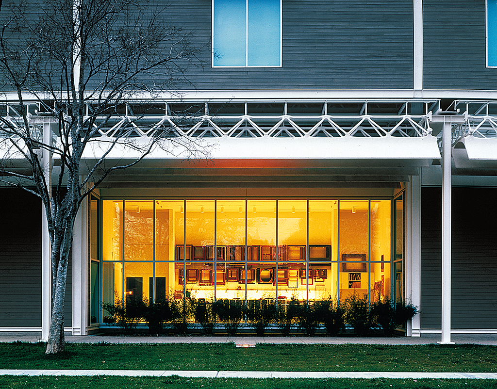
The Menil Collection, Houston | photo: Paul Hester, courtesy of RPBW
The Menil Collection
Discounting the impermanent IBM travelling pavilion, The Menil Collection might be seen as the Building Workshop’s first real mature work. It also shows clearly just how far Piano’s approach had developed in the decade between initiating the designs of the Pompidou Center and of this museum and study center in Houston. (Many of the differences between the buildings, however, reflect those of place and program rather than maturity.) On its city center site, the Pompidou rudely flaunts its technology in the face of, and so as to face up to, the surrounding historic monuments. In contrast, The Menil Collection wraps itself in the same clapboarding as the surrounding bungalows so as to settle almost shyly into its suburban setting.
The Pompidou is a huge, intense machine built to house and provoke the unpredictable and through which vast throngs pass daily. The Menil, by contrast, is a study center for an established private collection, with public but quiet galleries for only a rotating selection of these works. Yet even it has leading edge technology on prominent display in the form of the light-diffusing “leaves” that together with the truss constitute the characteristic piece of the design. These have been designed so that natural light permeates everywhere in the ground floor galleries, an impossibility in the stacked and immensely deep floors of the Pompidou. And if that building’s mighty trusses verge on the overwhelming, the leaves of the Menil neither overwhelm nor distract from the art below them as they float, indeed almost swim upwards, in the light that floods down between them.
That all the art is seen in natural light was a requirement of the client, Dominique de Menil, who also insisted that the light be handled in such a way that visitors are alert to its constant changes with time, season and weather. Such changes bring alive the galleries and the art, as Madame de Menil well knows from living with these works in her house. As part of her strategy of achieving this, she wanted most of the artworks to be stored in ideal conditions of darkness, and constant temperature and humidity in a “treasure house” (where they are nevertheless immediately available for study). The works can without harm be relatively brightly lit when on short-term display. She also wanted this to be a “village museum,” unpompous and approachable, with some of its ancillary functions in the surrounding bungalows.
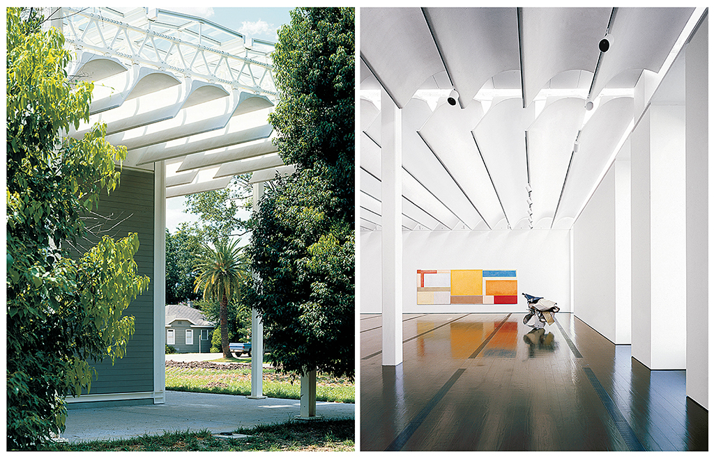
(left) detail of roof, photo: Hickey & Robertson (right) gallery interior, photo: Paul Hester | images courtesy of RPBW
Madame de Menil, aided by Paul Winkler, together with Piano and his team, crystallized these requirements while travelling together to see various galleries. The solution to the lighting was inspired by that of a small gallery on the kibbutz of Ein Harod in Israel. But the desired atmosphere was found much nearer home, in the Media Center, or “Arts Barn,” on the campus of Rice University and sponsored by the client.
Piano had already built with oversailing space-frame roofs. The B&B Italia offices near Como (1971-73) and Free Plan Houses near Milan (1972-74), both by Piano & Rogers, are examples. And his own Office Workshop in Genoa (1968-69) had a space frame roof through which it was naturally lit. The oversailing roof of the Menil is to some degree a descendant of these, although it has American precedent too in a corporate headquarters by Skidmore, Owings & Merrill in Kalamazoo and in the much-published prototype schools for southern California by Ezra Ehrenkrantz. Like all of these the museum roof accommodates air conditioning. It also includes the leaves that shade and diffuse the light admitted through the ultra violet-excluding glass roof.
In their usual quest to eliminate redundancy, both Piano and Rice wanted the leaf to play a structural role as an integral part of the roof truss. Eventually it became its bottom chord. For the truss they chose to explore ductile iron, which they had first encountered in the chassis of the VSS experimental car for FIAT; and for the leaf they chose ferrocement, with which Piano had recently built his own yacht. The original concept of the leaves was as very thin arcs of ferrocement. After extensive testing and development, so as to admit exactly the right amount of light of the desired quality, they became more complex, substantial and sculptural. Now, together with the truss they have a beautifully refined biomorphic shape such as Charles Eames might have created.
Charles Eames comes to mind because the building seems, to foreign eyes at least, so very American, having particular affinities with California of the 1950s and ’60s. If the roof canopy and the joints of the trusses might call to mind Ehrenkrantz, and these same joints and the leaves evoke Eames, the white steel frame makes recognizable reference to Craig Ellwood, a mutual enthusiasm of Piano and Walter Hopps, the then-curator of the collection. The museum also makes more immediate contextual connections. Besides adopting the clapboarding of its neighbors, its colonnade evokes the verandas of southern plantation houses. As a stoa for peripatetic scholars this colonnade also recollects Greek Revival traditions of American civic architecture.
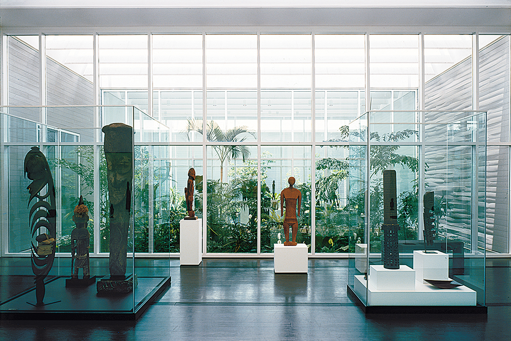
The Menil Collection, gallery interior | photo: Hickey & Robertson, courtesy of RPBW
Yet the building has other contextual dimensions. Piano claims the main structural grid of the roof canopy was conceived as a microcosm of the city grid. Like that of so many American cities, Houston’s grid is exactly oriented on the cardinal points. This could imply a cosmic connection for the north-facing leaves, yet the grid is brought down to earth by the pockets of planting that invade it so that nature is everywhere present on the ground floor. But the city grid is part of the surveyors’ grid that reaches out to embrace most of America. Stretched out below its oversailing roof the building projects some of that sense of reaching endlessly outwards that distinguishes much American architecture from the more rooted and contained closure of European architecture.
In the year after completing The Menil Collection, the Building Workshop was commissioned to design a museum of contemporary art for Newport Harbor, California (1987). Sited at the bottom end of a long narrow and sloping park, its cross walls would have echoed at larger scale the weirs that dam a gully along the side of the park. Again the galleries would have been lit through a glass roof, this time filtered through holes in the vaults that spanned between the cross walls to support the roof. In places they would also have supported earth where the park extended onto the roof before being connected by escalator to the main entrance. Apt to both its site and Californian tradition, it was a semi-landscape solution, with inside and outside interpenetrating and a certain ambiguity about which was the ground level.
Currently the Building Workshop is working on two more galleries. One is the Cy Twombly pavilion, to house works by the artist and be built as an annex to The Menil Collection amongst the bungalows that surround it. The other is a private gallery near Basel, Switzerland, to be built for the E. Beyeler collection of modern art.
The text below was originally published in the exhibition catalogue for the 1992 Architectural League exhibition Renzo Piano Building Workshop: Selected Projects. All text by Peter Buchanan, © The Architectural League of New York.
Next: Part 5: Projects: Rue de Meaux housing & San Nicola Stadium
Previous: Part 3: Projects: UNESCO reconstruction experiment & IBM traveling pavilion

