Welcome to the people’s park
A roundtable discussion about the 2019 Folly/Function competition.
July 24, 2019
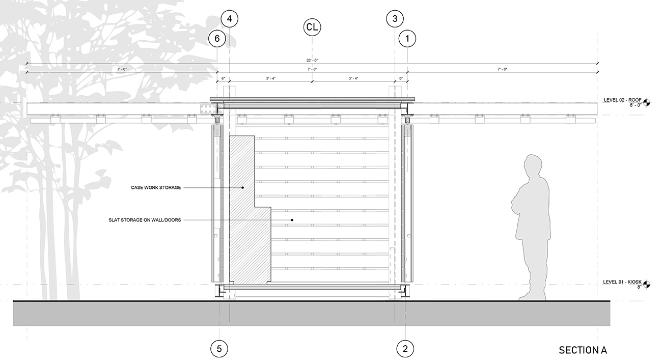
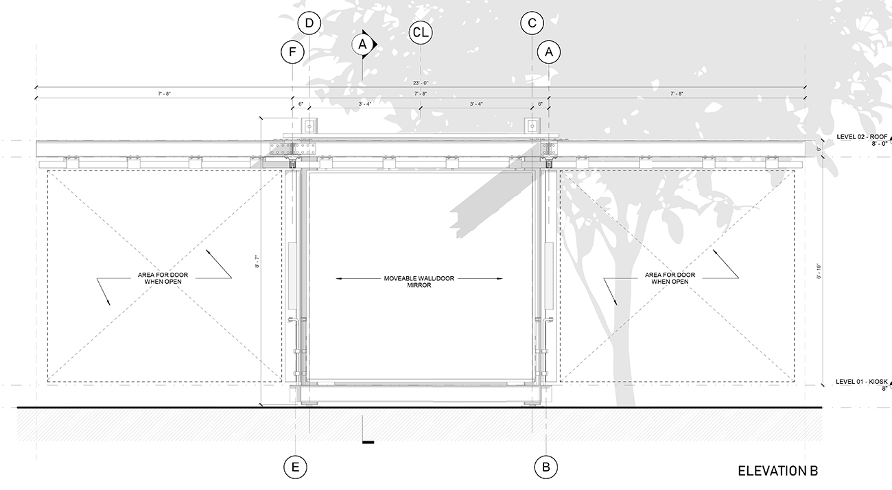
Demonstration of Objects in Mirror Are Closer Than They Appear door functionality. Video credit: School Studio
Folly/Function is an annual juried competition engaging architects to design and build a project for public use at Socrates Sculpture Park.
For the eighth iteration of Folly/Function, Socrates Sculpture Park asked designers to reimagine the entry kiosk typology for a friendly neighborhood art park. The winning proposal, School Studio’s Objects in Mirror Are Closer Than They Appear, was unveiled in June.
Earlier this summer, School Studio’s Kyle Bigart and Katie Hoefler sat down with representatives from Socrates and The Architectural League, as well as 2013 Folly winner (and 2019 juror) Toshi Oki, to discuss the competition’s goals, the evolution of the design, and the making of the kiosk.
*
Anne Rieselbach, The Architectural League of New York: Can you explain what Socrates hoped to achieve with this year’s competition?
John Hatfield, Socrates Sculpture Park: The Folly/Function program has evolved over the years to improve how the park looks and functions.
This time we wanted to focus on visitor experience. What do they see when they first arrive at the park? How are they greeted?
Historically, people would come in and still have no idea where they are. That’s partly because we dedicate the billboard, which faces out to Long Island City, to an artwork. Most organizations would brand that space, but it’s really important for us to showcase art.
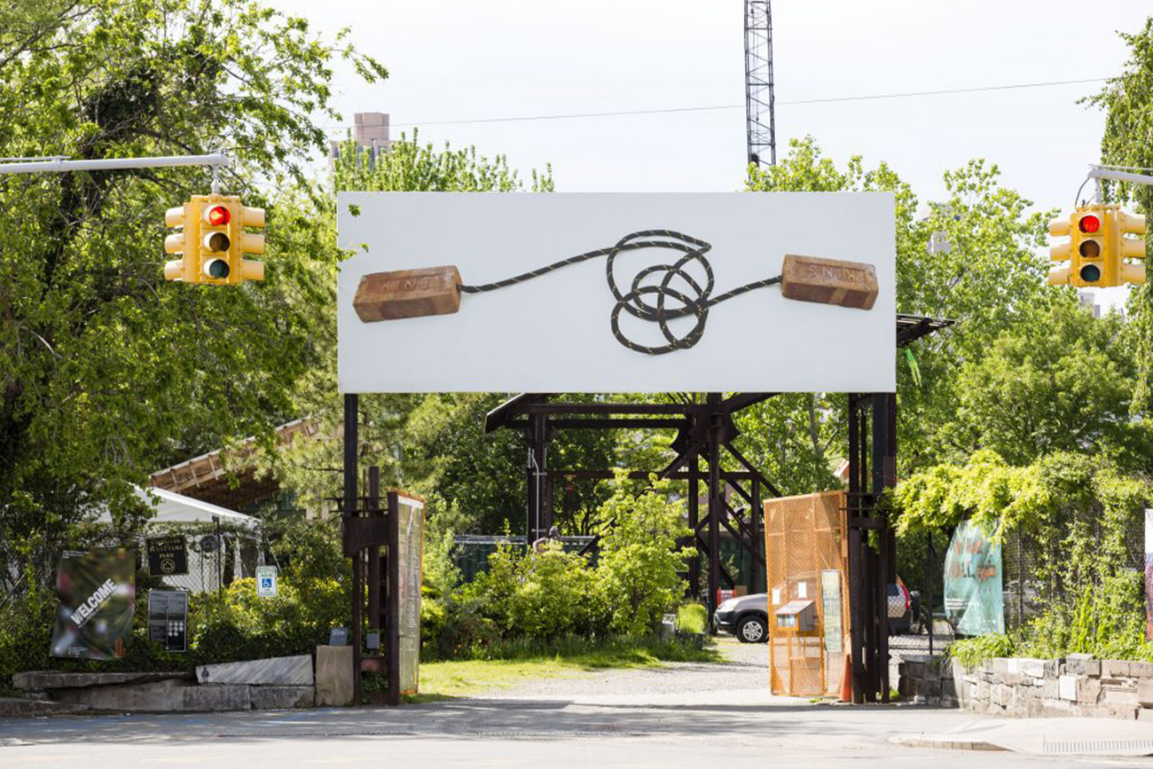
Socrates billboard featuring Nari Ward artwork "King: finish line, jump rope", 2017. Image courtesy of the artist; Socrates Sculpture Park; Lehmann Maupin, New York and Hong Kong; and Galleria Continua, San Gimignano / Beijing / Les Moulins / Habana.
So we wanted something at the entrance to tell people where they are, and to have a place that staff can occupy during events in order to greet people, to disseminate information. And since we are a visual arts organization, we wanted people to immediately encounter something aesthetically interesting.
On the interior, the kiosk needed to accommodate two staff members, but also display merchandise—T-shirts, hats, totes. That’s not necessarily a commercial thing; we don’t make much money on it. But there’s a psychology of place that has to do with merchandising and branding.
The last programmatic priority was portability. Nothing in the park is permanent, so the idea that this might move was also part of the brief.
Toshi Oki, Toshihiro Oki Architects: During this selection process, we also talked a lot about the interior spaces. How would it feel for staff members who are sitting there all day, especially in the summertime?
Rieselbach: And why did the School Studio proposal seemed like a good fit for the park’s needs?
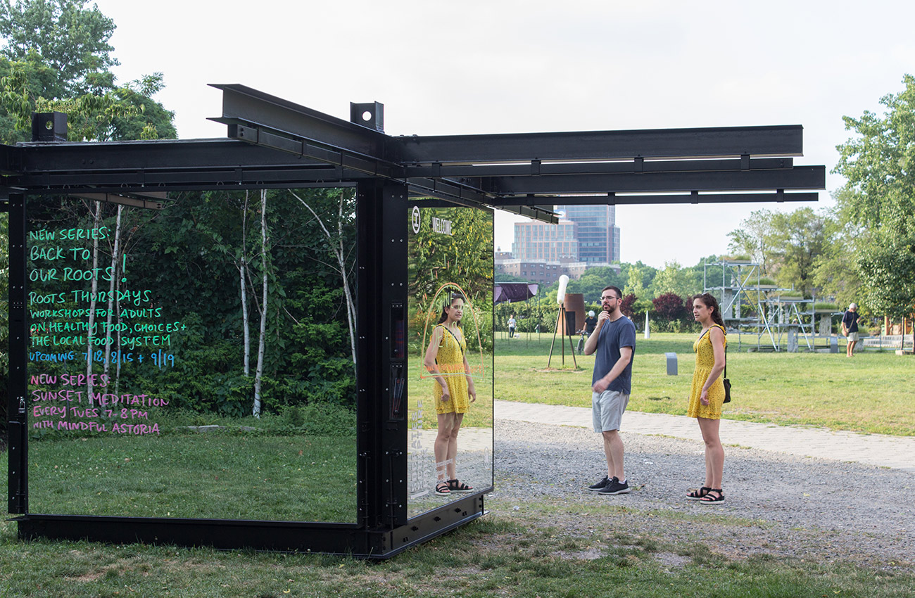
Jess Wilcox, Socrates Sculpture Park: It actually did address everything in the call for submissions. But what won me over was the mirror. It fulfils the functions of signage and greeting, but also sort of makes itself invisible. It brings in color, because it reflects everything around.

After considering various options for the reflective door material, School Studio decided to use mirrors, which provide greater visual clarity than stainless steel and other metal films. To mitigate the risk associated with mirrors, Bigart and Hoefler selected gym mirrors, whose safety backing makes shards less likely to fall off if the surface were to crack. They also opted for thicker-than-normal glass (1/4") to increase the mirrors' strength. Credit: School Studio
And beyond the literal reflection, it creates a space of reflection to think about the relationships between architecture, art, the public, and the park. It just hits so many points.
The simplicity of the design also ties to the ethos of the park. We see a lot of things that are overengineered, or that function in overly complicated ways. This project really reflected the transparency of making that is part of the park.
Catarina Flaksman, The Architectural League of New York: Katie and Kyle, could you talk about the evolution of the design, from the early stages of the idea through to construction?
Kyle Bigart, School Studio: We’ve experienced the need for something to mark the entrance personally. We stumbled into the park when we were on our way to the Costco down the street, and were thoroughly confused, but also inspired. You know you’re somewhere, but you’re not sure where.
So we really focused on the need for the kiosk to function on a lot of different levels, and for a lot of different needs—not just for the people who would stumble in, but also people coming for events, or to see a specific artwork, or just walking their dogs.
At first, we were thinking about the idea of a balloon that deflates and then re-inflates, but we kept running into the problem that if the kiosk isn’t there, the signage isn’t there. Then we came upon the idea of the mirror making something visible invisible, and that was really the “Aha!” moment.
After we won, the interiors are what changed most.
Katie Hoefler, School Studio: We had gone in a totally different direction for the interiors initially. We wanted a seamless experience from outside to inside.
Bigart: We got over-concerned with the concept and the materials we were using for the exterior. But once we stepped back, we thought, “It probably wouldn’t be too nice to sit on a mirror.” [laughs]
Hoefler: People have to sit in the kiosk for hours at a time. So how do you make that a nice experience? That drew us to wood as a material, and specifically cedar, because it’s not just weatherproof, but smells very lovely.
I really like that the kiosk has turned out to be a kind of magician’s box. You have one experience on the exterior, and then you open it up and it’s a totally different experience on the interior.
Sarah Wesseler, The Architectural League of New York: The design is notable for its adaptability. How did this quality evolve as the design progressed? And from a Socrates perspective, what kinds of different uses do you foresee for the kiosk over time?
Bigart: Adaptability was actually the main reason we wanted the design to be completely symmetrical. We’ve been to Socrates for a couple of the art shows, and we’re always interested to see where the artists choose to place things. We didn’t want to take any options away from the artists. So all the doors on the piece can move or stay in place. You could pick the whole entire thing up and rotate it 180 degrees, and the only thing that would change is the signage.
We also wanted the park staff to have flexibility. If it’s sunny out, they can close one of the doors to provide shade. If it’s windy, rainy, they can close them all.
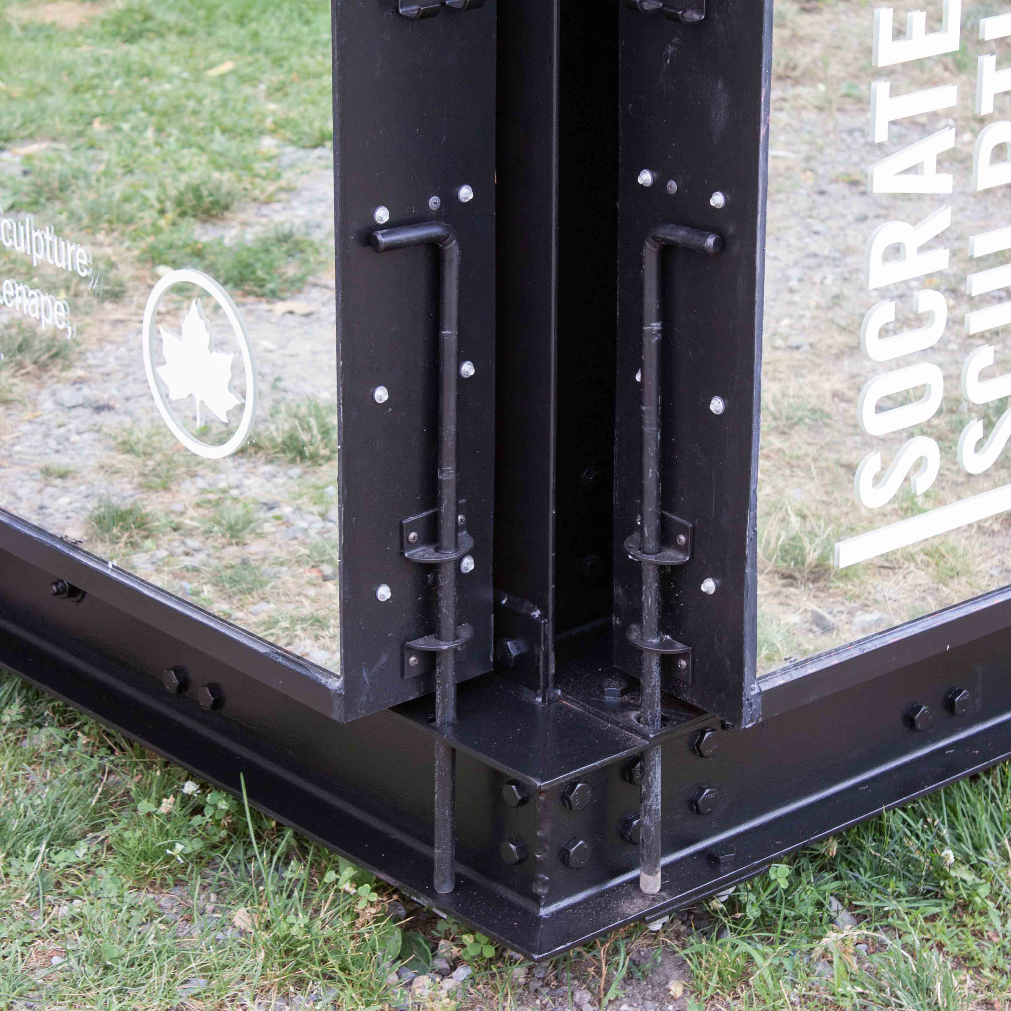
School Studio worked with a structural engineer to develop a system that uses cane bolts to lock the doors in place when closed, as well as anchor them to the ground when open in order to prevent them from twisting in the wind. Credit: School Studio
Hatfield: During the judging process, our first question is always, will this do the job that we want it to do? And once we narrow down the list to things that will work programmatically, we have almost an inverse analysis, which is, well, what’s interesting about it?
For me, adaptability is one of conceptual things that resonated about this piece. You’re going to experience it in different ways, which is pretty much the same as the park itself—no artwork is permanent. We’re constantly installing, de-installing, doing new events. So conceptually, that was a nice marrying of this design and the park itself.
And the mirror is interesting in that it’s deferential. It’s reflecting back out the things in the park—the sculptures, the people. When you’re walking in the park, you’re greeted with yourself. It welcomes you, but it reflects it back to you. Socrates is the people’s park, in a way, and there’s a populism and a humility to this design.
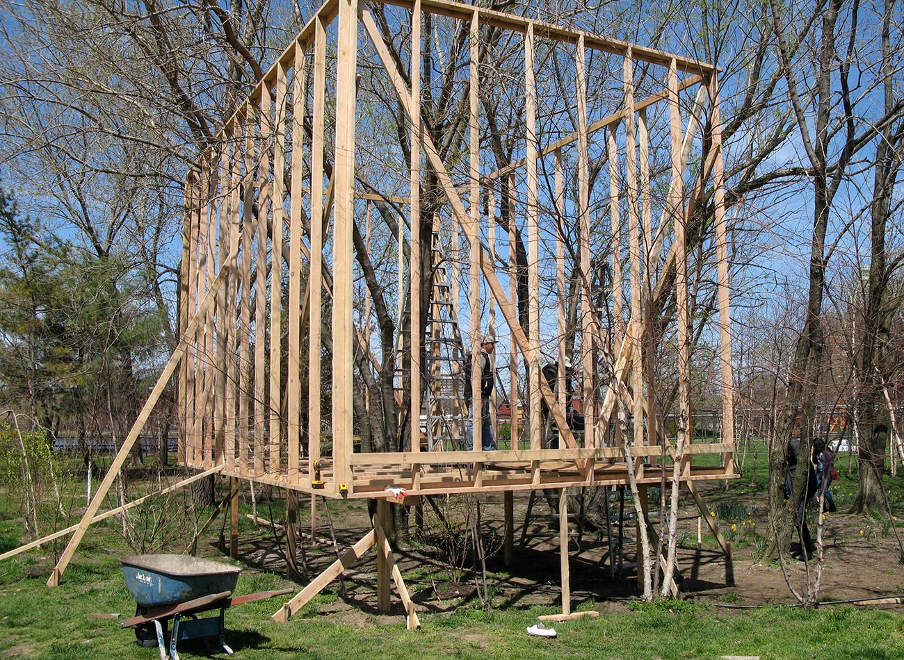
Early on, Bigart and Hoefler considered using wood for the structure, but ultimately settled on steel. Because they lacked extensive expertise building with steel, they decided to devise a structural system that could be bolted together. Hoefler's father, a trained welder, helped spot-weld the connections where reinforcement was needed. Credit: School Studio
Rieselbach: Which is interesting, because, as you pointed out during the jury, there’s a fine balance between architects trying to be sculptors, which you don’t want, and architects creating an object that’s overly bland or deferential.
Hatfield: Yeah. I mean, architecture is sculpture; it has form. So it’s just a matter of how that looks in relationship to sculptures that are out there. If it’s trying too hard, there’s almost a sense of competition. And that’s just what this doesn’t do, because it reflects back out.
Rieselbach: Toshi, Katie, and Kyle, could you talk about what it was like to build your designs at Socrates? Because you’re working alongside artists creating art. You’re also working alongside the public coming in and out. And then you’re working with the resources of Socrates, and people who just really know how to make things.
Oki: Having this kind of competition experience, where a young person can come in and make a pure design and have it built, is extremely unusual. Usually there are so many requirements that you can get bogged down by the reality of budgets and schedules and contractors. This is an extremely rare chance for a designer to literally make something by hand that they conceived of and put down on paper. I don’t know any other competition in the world where you not only have the ability to build your design, but you’re actually given the facilities and the tools and the support to do it. It was an incredible experience.
Bigart: Yeah, it was amazing. Although we did get some visitors to the park asking us where the bathroom was. [laughs]
Hoefler: People were always like, “What are you making?” A few people asked if it was a ropes course. We’ve gotten a gym.
Bigart: But working in the park, having access to the facilities, is really great and unique. We’ve had a couple of friends come out to help, and at the end of the day they were all immediately like, “So can I come out tomorrow too?” They got the bug of working with their hands, being outdoors, and being in Socrates.
Hoefler: Being an architect and an interior designer, sitting behind a computer all day for ten-hour days is our life—like most people who work in corporate America. So being outside, having this beautiful view of the beautiful park every weekend, has been really special, and it’s something we’re really thankful for.
Interview condensed and edited.
Explore
Folly 2013: Talking treewood
A conversation with the 2012 and 2013 winners of the Folly competition.
Folly/Function 2016 roundtable
A roundtable discussion on the layers of folly and function in Sticks.
In conversation: Jason Timberlake Austin, Aleksandr Mergold, and Elissa Goldstone
The winners of Folly 2014 discuss their practice.

