Reimagining the kiosk
A typical kiosk may offer newspapers, maps, or bottled water. These Folly/Function entries asked what else they could do.
July 24, 2019

Socrates Destiladera Team: Ilse Cardenas, Regina de Hoyos, Diego Escamilla, Juan Luis Rivera, Tonatiuh Armenta, Mariana Elías Lara
Folly/Function is an annual juried competition engaging architects to design and build a project for Socrates Sculpture Park.
This year’s Folly/Function call for proposals asked entrants to design and fabricate an information kiosk to be located at the park entrance.
A jury composed of architects reviewed the 65 submissions and chose one winning entry, Objects In Mirror Are Closer Than They Appear, by Brooklyn-based firm School Studio.
Here are several additional proposals that stood out to the jury.
The observer
Periscope in the Park
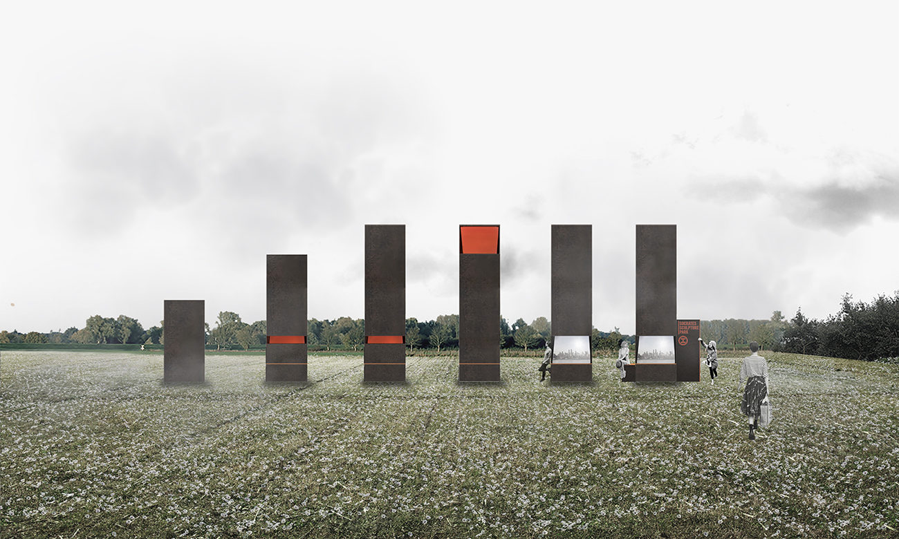
RICA Studio proposed a deployable structure that, when open, doubles its height to create a dialogue with the Manhattan skyline, framing different views of the city and the park. Through an inner system of mirrors positioned at 45 degrees, the periscope captures distant images and brings them closer to the viewer. The modular system of foldable metal panels can also fulfill the park’s programmatic needs, including seating, informational signage, and interior storage.
The fountain
Socrates Destiladera
PALMA Team: Ilse Cardenas, Regina de Hoyos, Diego Escamilla, Juan Luis Rivera, Tonatiuh Armenta, Mariana Elías Lara
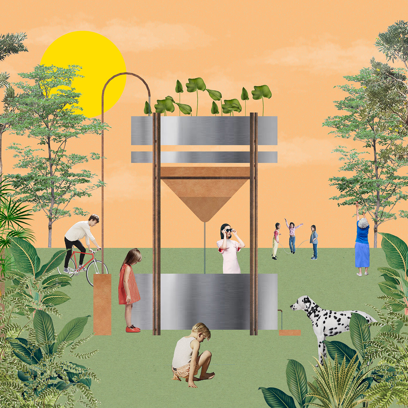
Inspired by the park’s location on the Queens waterfront, Mexico-based firm PALMA proposed a kiosk that incorporates a filtration system to collect rainwater. Based on a traditional rainwater purification technique from the Canary Islands called destiladera, the structure consists of a conical clay filter topped with an aquatic plant filter, being at the same time a sculptural object and a functional kiosk. The filtered water is then offered to visitors through a water fountain, referencing the common fountains present in most public spaces.
The minimalist
Short Stack
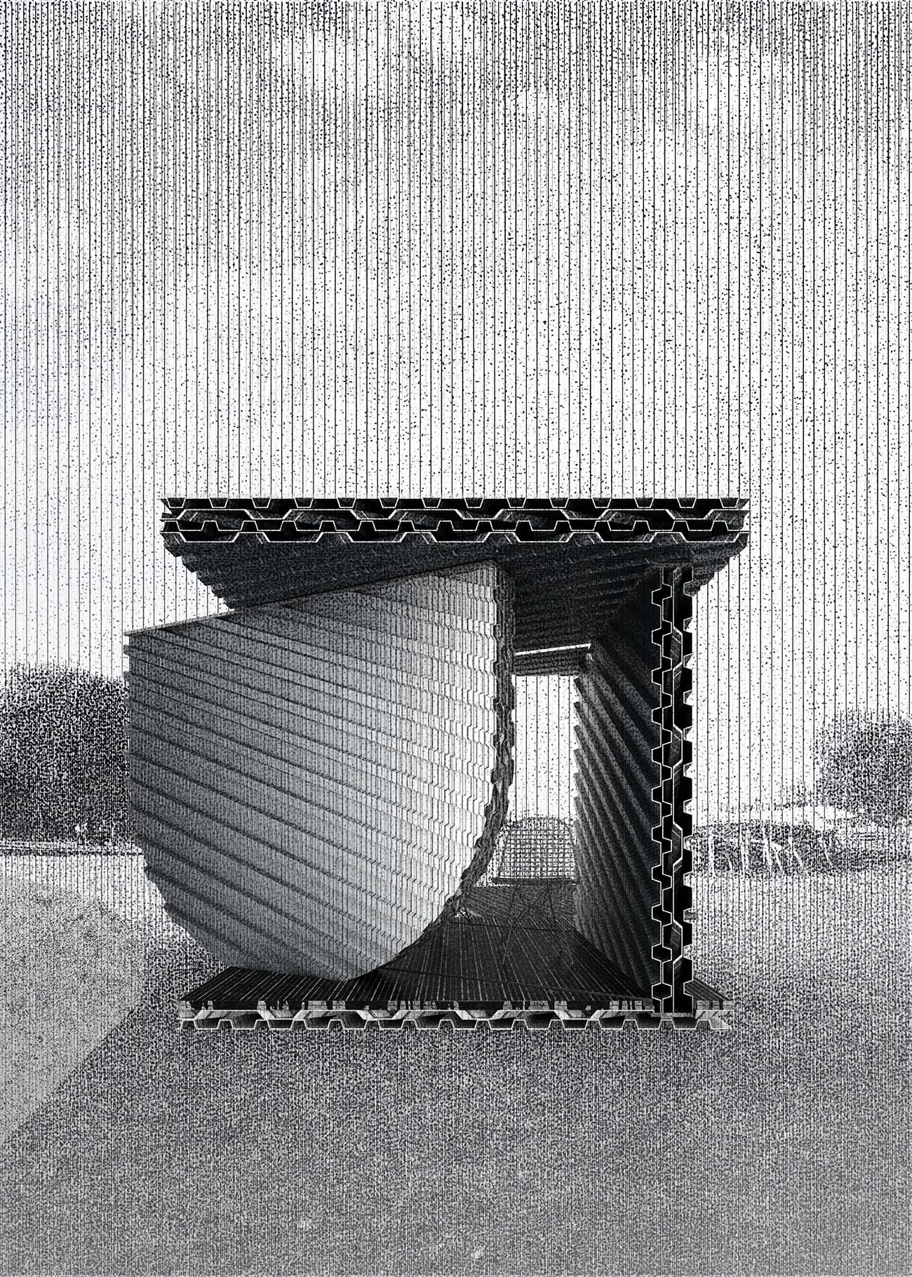
Kevin Hirth’s proposal is based on a minimal approach to building materials. The kiosk is built entirely of ribbed structural steel decking assembled into five stacks to create a simple, functional shelter. Sliding doors allow for the kiosk to be locked, while its interior provides space for seating and storage.
The readymade
Knock-lock
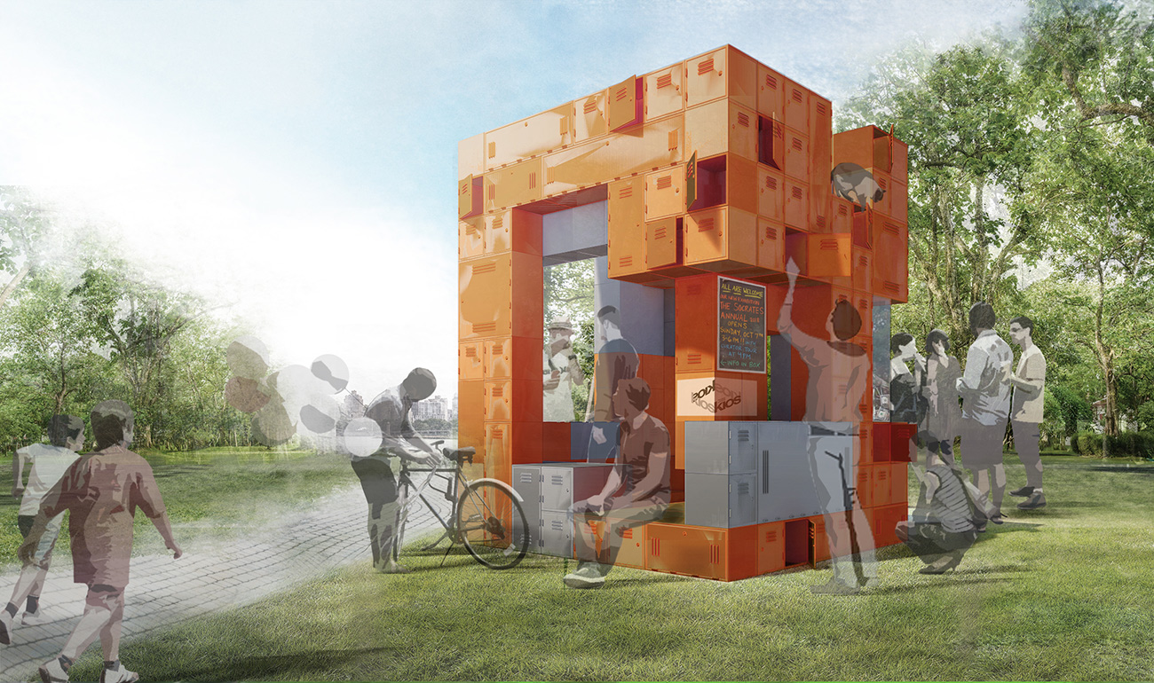
Through the use of off-the-shelf lockers of various sizes, Jingjing Zhao and Huizhong Sun propose a fun and functional kiosk, turning an everyday object into an unfamiliar sculptural form. The modular system can be easily assembled, relocated, and transformed, as its welded modules are connected through bolted joints. The structure responds to the park’s infrastructure and aesthetics, providing visitors with a welcoming and playful entry experience.
The bubble
BubbleWrap
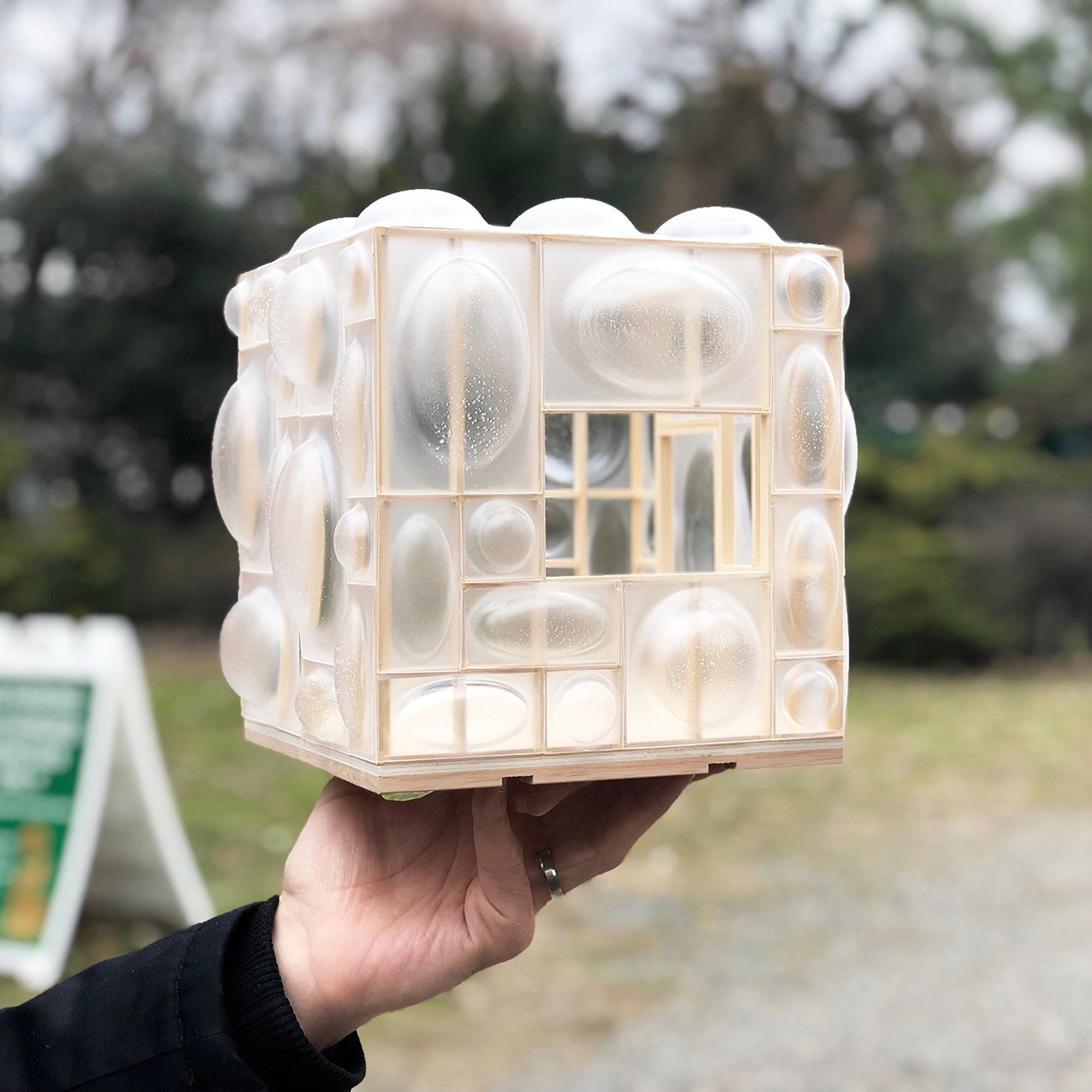
This proposal by afoam is inspired by children playing with soap bubbles in the park. Testing the limits of plastic cladding, the kiosk consists of a cubical wood frame clad in custom-formed, translucent acrylic “bubbles.” The material is intended to catch sunlight and glow, welcoming visitors to the park.
The guardian
Sphinx
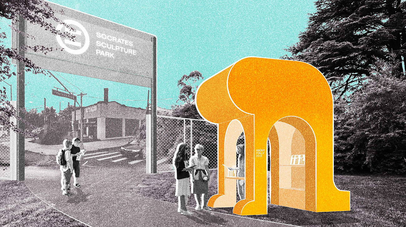
Topos Studio proposed a kiosk referencing an Egyptian sphinx to guard the entrance to the park. Mysterious but familiar, Sphinx greets visitors upon arrival and can also offer shelter under its large torso, elevated above four arches. Built with a wood-frame structure and bent plywood coated with cement, the kiosk possesses a monolithic appearance while remaining lightweight.
Explore
Worms, wimples, and wobbles
When is a chair not just a chair? A look at notable entries to the 2018 Folly/Function competition.
Circle Shade – 2πR4: Inspiration & poetics
Folly/Function 2017 winner Eva Jensen describes her design process.

