Folly 2013 Finalists
Of the 162 entries received, four finalists were recognized for their overall quality. These proposals display forms, materials, and conceptual intent that are literally and figuratively textured. While each of these projects explore different themes and perspectives, they are all notable for their clear relationship between intent and form, and for their demonstrated understanding of Socrates Sculpture Park’s context and underlying philosophy. All of the text and imagery below is excerpted from the original proposals.
Pier by Keefe Butler
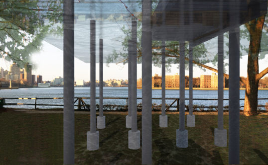
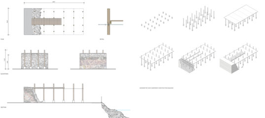
At the edge of the park and toward the waterfront, a simple wooden pier is anchored to the top of a massive 10’-high block of what appears to be excavated earthen landfill. This pier is held as it extends by wood pilings with concrete footings; there is riprap on the ground trailing sparsely from the water, as though this geological section was sliced from the shoreline and dragged to its site. The pilings carry overhead a thin, glossy, transparent plane 16’ by 30’, holding a shallow sheet of water. The visitor stands beside the pilings, beneath the pier and transparent plane. Through the ripples of this “projected waterline,” the sunlight shimmers and clouds pass beyond, while simultaneously a ghostly image of the river and city is mirrored in the underside of the elevated surface, as past and future are submerged in the present moment of existential and phenomenological reflection. Pier proposes to create, in the theme of architectural folly, an object that inverts expectation by melding with its context, blending into the themes of its surroundings and creating a phenomenal, existential, and temporal reflection, in the guise of an overtly literal representation of those surroundings…
ELENCHUS by Julien Leyssene
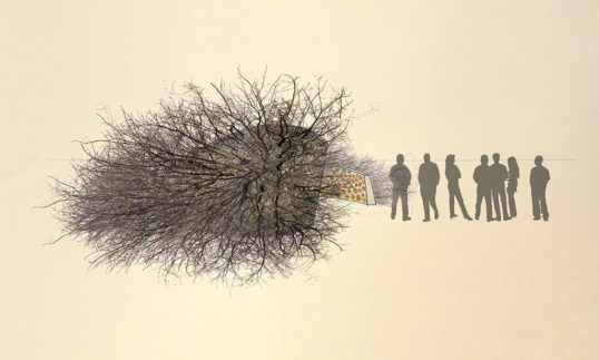
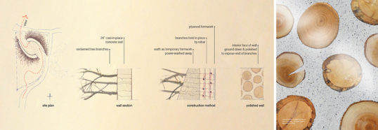
ELENCHUS casts felled branches collected from New York City park trees into two opposing concrete shells to create an enigmatic landscape element in Socrates Sculpture Park. From an initial approach, its amorphous form crouches low in the landscape; its phalanx of branches nestling an extraordinary secret. Moving around the form, the viewer discovers a seam between the two shells, revealing a pristine polished concrete interior. The branches, snarled and chaotic on the shells’ exteriors, penetrate the thick concrete walls, and their ringed limbs are seamlessly polished into the surface of the concrete suspending them in place. Running her hands along the walls, the viewer realizes that this glasslike surface is comprised of the very same materials that ruggedly cage the exterior. Following the contours of the walls, the viewer is finally presented with a magnificent view across the East River toward Manhattan.
Curtain Spolia by Georg Rafailidis & Stephanie Davidson
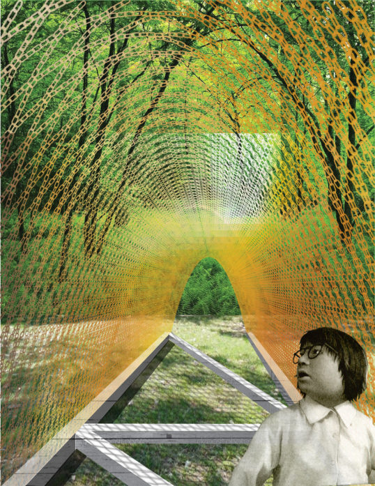
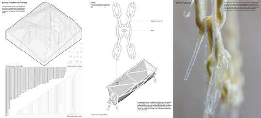
Using the [2012] folly, Curtain, as a material quarry, our design offers a radical, new interpretation of its building materials: Curtain Spolia. Chains have a tradition of being the form-finding tool in the making of catenary structures. For Curtain Spolia we propose to re-use the wood members of the existing folly as a framework from which a catenary vault made of the plastic chain link could be hung. Coating the resulting hanging structure with two layers of structural epoxy resin would make it rigid and allow the structure to be flipped upside-down. The resulting vaulted form of Curtain Spolia reinforces the theme of transformation that happens throughout the construction process. Not only is Curtain translated into a surprising new form, the transformation from a hanging structure to a compressive vault that suddenly is able to support itself emphasizes the surreal change from tension to compression, from soft to rigid, from white to amber, opaque to translucent.
Guesthouse Belvédère 3.0 by Marc Maurer & Nicole Maurer-Lemmens
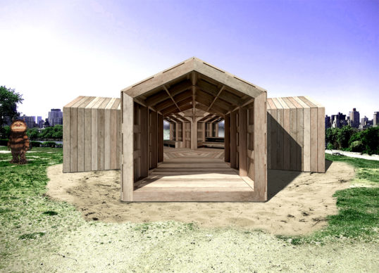
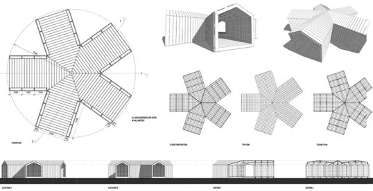
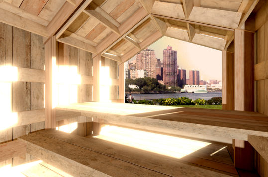
Employing a simple, five-pronged layout for a wooden structure, the piece resembles a five-cornered star from above. With open ended arms, the visitors can walk through the spaces, while their expectations are confused by a subtle use of perspective. Approaching the structure, our eyes perceive the angle between the star’s arms as a right angle, concealing the fact that you are walking into a five-armed building and not a four-armed one. In addition, details within the structure are worked out meticulously. All joints and joists are connected at right angles, including doubling of ceiling joists and adjusted connections between them, conceal any traces of metal screws and leave the visual impression of the interior completely wooden. The wooden planks are used for both the construction (beams and columns) and the cladding.
Explore
Folly 2013: Themes
Selections of project proposals best exemplifying some of the major themes arising from the Folly 2013 competition.
Folly 2013: Talking treewood
A conversation with the 2012 and 2013 winners of the Folly competition.
Folly 2013: tree wood
Installations images and renderings of the winning entry by Toshihiro Oki, Jen Wood and Jared Diganci.

