November 17, 2014

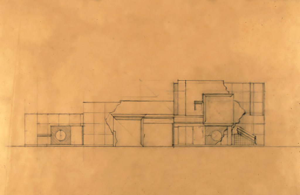
Crooks House | Fort Wayne, Indiana | 1976 | Pencil on tracing paper, 12×19″ | Courtesy of Michael Graves & Associates
Text by Deborah Nevins, from 200 Years of American Architectural Drawing (1977).
Michael Graves is among a group of architects who since the mid-1960s have explored the issue of an architectonic presentation of meaning, thus departing from the theoretical and formal foundations of the International Style. This reevaluation of content and form in architecture is reflected in two books on theory Robert Venturi’s Complexity and Contradiction in Architecture of 1966 and Christian Norberg-Schulz’s Intentions in Architecture of 1965. The architects who, with Graves, are committed to this reevaluation differ substantially from one another both in their formal vocabularies and in the aspects of the symbolic and cultural meanings of architecture that concern them. Among these architects are Mitchell/Giurgola, Peter Eisenman, Hardy Holzman & Pfeiffer, MLTW Associates, Venturi & Rauch, and John Hejduk.
Michael Graves is particularly concerned with architecture as a language of elements — doors, windows, molding, rustication, walls, and so on — that while performing their obvious structural functions also carry symbolic meaning with which our culture has imbued them. This architectural language is seen by Graves as referring inevitably to its own past history; that is, its meaning is self-referential. Graves aims to heighten the conceptual awareness of both this architectural language and of experience in architecture. This experience consists of those ritualistic events intrinsic in one’s involvement with all architecture — for example, the acts of procession, entry, and arrival. Graves physically defines these ritualistic ideas through the creation of oppositions or dialogues: the transition from public to private realms, from disorder to order; the perception of the elements of nature and the elements of building, and their transmutations from one into the other; and the idealization of the horizontal or ground plane in contrast with the more particularized vertical or wall plane. To further define the symbolic elements, Graves — who is also a painter — employs a palette of colors that suggests the elements of nature, such as sky, earth, and foliage. He also uses rustication and molding to mark the base and successive levels of a building or a space.
Graves has explored these symbolical and metaphorical notions in his built — largely residential — work and in larger projects yet to be constructed. The latter include additions and renovations to the Newark (New Jersey) Museum and the Fargo-Moorhead Cultural Center Bridge connecting North Dakota and Minnesota.

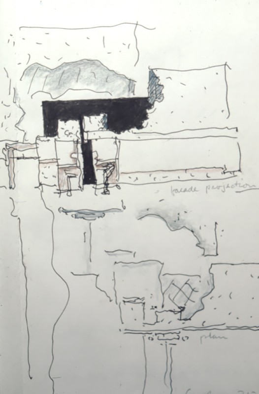
Crooks House | Fort Wayne, Indiana | 1976 | Colored pencil and ink, 8 3/16×5 3/4″ | Courtesy of Michael Graves & Associates
Graves’ sketchbook studies for the Crooks House under construction in 1976 in Fort Wayne, Indiana, present his earliest ideas for this suburban house. The program includes a courtyard, a garage connected to the house, and a well-defined garden space. In its initial form, the plan and garden elevation of the house were to be irregular in configuration, much like the edge of a torn piece of paper or of a ruin. This configuration reflects the meandering outline of the arbor vitae hedges that enclose the garden. Thus the perimeters of the house and of the garden through their interrelationship create an intimate connection between landscape and architecture. In the later stages of the design development, the plan of the house was regularized and the arbor vitae were treated as wedges of growth enclosing the exterior space. The Crooks House elevation study shows the courtyard or entry wall standing between the garage on the left and the house itself on the right. A primary focus is the ritual of entry, and the façade, with its central opening, emphasizes the place and moment of entry, as well as the fact that the winding path of the driveway becomes axial and frontal at this moment. The blind window on the right is at once the physical center of the wall of the house proper and the right-hand side of a “façade within the façade” — its limits defined by the “torn” edges applied to the house and courtyard portions of this elevation. The center of this secondary façade is the corner of the house marking the plane through which one enters the house from the courtyard. The fragment of molding placed in projection on the right side of the elevation guides our attention again toward the center.
A sense of connection among the pieces of this façade is achieved by several means. The great square of the blind window is replicated in the actual opening of the courtyard entrance. Both are framed by molding at the top and one side. This framing is reversed in each element so that one completes the other. The motif of the circle in the latticed square appears on both sides of the façade. Experiments with an architectonic language are seen in the juxtapositions of elements and surfaces: the large blind window adjacent to the small actual window; the planarity of the blind window in contrast with its three-dimensional molding; the solid mass of the house against the torn edge applied to it.
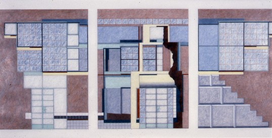
Similar themes are explored in the elevation study of a warehouse that Graves renovated as his own residence. The study shows three elevations of the courtyard through which one enters the house. To the existing pink stucco walls is applied metal, plywood, stucco, and tile. The windows are either clear glass or glass block. The “torn” fragment that frames one side of the entry elevation is an ideograph of the notion that the building is made of fragments: a fragment of the original structure added to new fragments of disparate materials. In the elevation on the right side, stone rustication is simulated by scored stucco and is stepped like the stairway that exists behind the wall.
This composition of collaged elements visually and symbolically emphasizes the principal entrance in the center elevation. This emphasis is accomplished in part by placing a bent plywood marquee over the doorway. At the same time, a small window at the upper corner of each of the two side elevations is placed adjacent to a double set of larger windows, establishing a focus again toward the central door. Although this focus suggests that the door is in the middle of the elevation, tension is created by the actual asymmetrical position of the door. The real center is marked by the division of the double windows that contain an ambiguity, being read one element or two. Unity is achieved within this collage of elements through the use of color and the marking of the interior floor levels, which are uniform on the three sides.
…
Read more excerpts from 200 Years of American Architectural Drawing in this collection from the League archives.
Explore
John Hejduk
John Hejduk's (1929-2000) highly theoretical work is demonstrated in his isometric projection drawings that deal with the organization of shape and volume.
Richard Meier
Richard Meier considers the duality of public and private space, evident in his dramatic drawings that articulate types of enclosure.
Drawings and intent in American architecture
Excerpts from the book's introduction by David Gebhard looks at themes of style, intent, and value in architectural drawing, situating these works in relation to "high art" of the 19th and 20th centuries.

