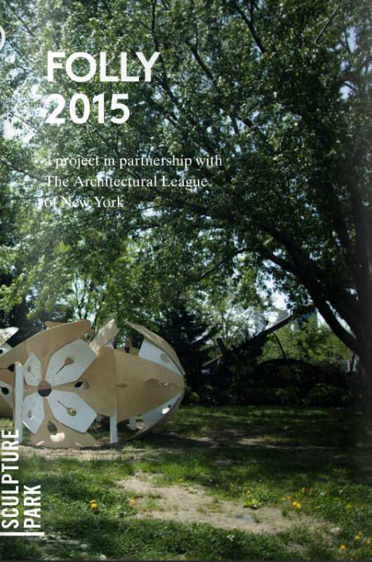
Folly 2015: Notable entries
Sophie Elias surveys themes that emerged among the Folly 2015 submissions and highlights a number of proposals deemed noteworthy by the jury.
Many of this year’s Folly entrants took the competition as an invitation to explore the relationship between the natural and the manmade, design for movement and social interaction, sensory perception of place, and kitsch nostalgia. Others explored formal concerns with passive technology, repurposed materials, and modular systems. Each of the following notable entries demonstrates an intriguing approach to one of these themes — or, in many cases, several overlapping themes — and offers a fresh interpretation of the idea of the folly.
Sensory Perception of Place
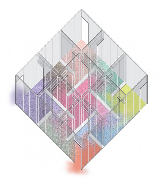
A number of entries sought to make us notice what we normally ignore — in juror Leslie Gill’s words, taking “invisible aspects of what a site or a park could be, and making them visible or audible in a way that we can register them as part of public space.” In Local Color, the proposal by Thomas Heltzel and Margaret Zyro of PRACTICE, visitors’ footsteps document patterns of movement through a maze-like wooden structure wrapped in walls of translucent mesh fabric. Brightly colored gravel is initially sorted by hue within the structure’s 3×3 grid, but mixes over time as it’s walked through: “Moving through the thresholds of each space, visitors disturb and transform the ground-covering gravel, leaving their mark of travel and recording a collective memory of inhabitance and use.” The designers view this “open framework capable of accepting, adapting, and transforming with a continually changing population” as “an idealized representation of the city.”
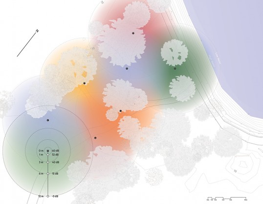
Benjamin Lucraft’s Sound Houses incorporates an array of weatherproof speakers, each of which emits a single, consistent tone. Informed by his research into the emotional effects of different tonal intervals, Lucraft predicts that visitors’ reactions to each sound will determine their “routes and places of settlement” within the park. For instance, visitors might congregate at the point of overlap between notes D and B, which together produce “warmth and security,” but would most likely avoid the “‘uneasy’ emotion made up by the interval between D, B, and F.”
Passive Technology
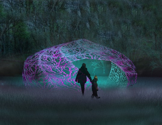
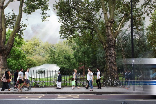
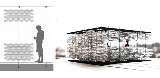
New means of harnessing passive technologies give shape to another group of entries. The domed Watering Hole pavilion, by Harrison Atelier, employs evaporative cooling to keep its occupants comfortable on hot summer days. A system of narrow-milled capillaries allows captured rainwater to flow and seep between layers of clear PET plastic, forming a “distributed cistern.” The designers bring attention to the “visual and experiential value of collecting and distributing this resource drop by drop,” and draw a parallel to the watering hole in the wild as “a body of water that prompts its users (predator and prey) to gather in an uneasy truce around this shared resource.”
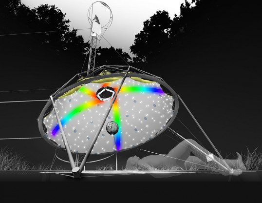
Ryan Enschede’s Star Talker uses a heliostat to direct sunlight toward an eight-inch disco ball, creating a light effect on a stretched fabric dome meant to be viewed from below. The heliostat’s mirror and set of reflectors sit above the tree line on a radio mast stabilized by guy-wires, while a computer adjusts the heliostat’s angle throughout the day to follow the sun’s path.
Nature and the Manmade
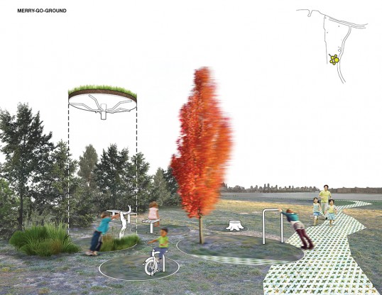
Julien Leyssene’s Merry-Go-Round, a deceptively simple arrangement of plants and furniture, uses hidden engineering to challenge the “perception of nature and landscape as being a static experience.” Trees, shrubs, and sod are planted on top of five merry-go-rounds set flush with the ground, which rotate when visitors push on certain landscape elements. The project serves two groups: “people who have come specifically to observe and experience the art, and local families who use the park as a park – to picnic, to play, and to allow children to run around.”
Experimental and Repurposed Materials
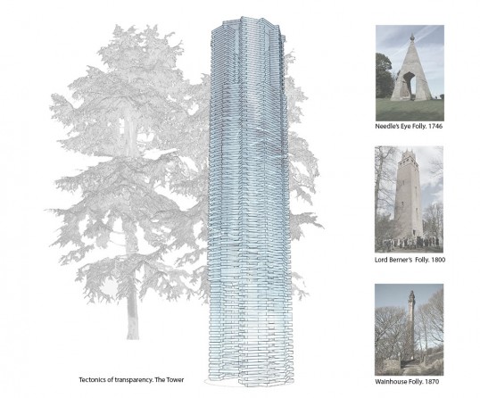
Juror David Benjamin, of The Living, drew attention to entries that could offer new construction techniques to the field of architecture. Cristina Parreño argues in her proposal for Tectonics of Transparency: The Tower that even as a socially functionless structure, a folly can nonetheless serve as an “architectural prototype.” Her 22-foot tower’s 800 bricks are made from stacked layers of float glass mortared with UV-curing glue. “Glass has an innate ability to withstand extraordinary compressive forces,” she writes. Structural glass therefore has the potential to create “completely new spatial experiences,” such as a view of the skyline through the tower’s walls, or a view straight down through the treads of its spiral staircase.
Shuai Feng’s Gathering Sky is made from fiber optic spray toys – brush-like bundles of translucent plastic – affixed to clear plastic panels. The toys provide an inexpensive prefabricated module whose texture catches sunlight and could be lit by LEDs at night. Feng calculates the tilt angle and placement of the structure in relation to the sun’s path such that sunlight brushes the fibers to create “a diffused lustre” every day of the year. Looking ahead to the folly’s deconstruction, Feng proposes a second life for the toys as Socrates souvenirs.
Modular Systems
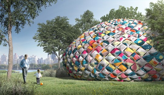
In their proposal for Mochi, Nancy Hou and Josh de Sousa present a prototype unit made from plastic shopping bags. Using a household steam iron, they fuse stacks of bags into inflatable pockets. These units can then be fastened together with grommets to form a “thick membrane” and fitted to a scaffolding of PVC and plywood. Taking inspiration from Socrates Sculpture Park’s history as an “abandoned landfill and illegal dump-site,” the team designed Mochi to re-use 6,000 bags, or “the same amount NYC wastes every 15 seconds.”
The 360 plastic chairs that comprise Urchin, by CODA, offer both seating and shade. A first row of chairs, staked to the ground, forms a ring around an open space. Stacks of interlocking chairs curling above the first row are lashed together with zip ties. “Urchinplays with the question of usefulness and uselessness by the manipulation of the simple chair – and consequently our perception of the chair’s functionality,” the proposal states. “Beyond this first ring, the chair becomes structural/material/formal…begging the question: is it still a chair?” CODA suggests that chairs be donated to homeless shelters around the city following the folly’s deconstruction.
Nostalgia and Kitsch
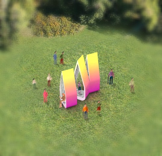
In Little Joy and The Enchanted Ruins, pop aesthetics play on the nostalgia that has historically defined the architectural folly. SPORTS Collaborative’s idea of a folly hinges on the knickknack: “like the folly of the past, the knickknack is whimsical, delightful, and resembles something familiar and likeable but falsely and/or inaccurately portrayed.” Their proposal explores the “formal and aesthetic qualities of knickknackification” to isolate “artistic techniques of delight.” This process results in Little Joy, a set of teardrop-shaped plywood shelters. Each is painted in a bright, glossy color gradient on the outside and lined with reflective Mylar fringe on the interior.
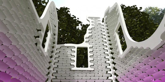
NEON’s Enchanted Ruins proposal evokes a classic folly typology, “the romantic ruin,” but makes no attempt to appear authentic: “The design takes recognizable elements of the ruin and simplifies and abstracts them. The language of the Enchanted Ruin is one of erosion, structural openings and repeated elements.” Its brightly colored “stonework” shingles are made from flexible timber sheets, which hang on tensioned steel rope and are counterweighted so that they gently pivot when the wind blows. The result is “a magical, naturalistic movement.”
Interaction and Movement
TurnStile, by mcdowellespinosa, “challenges the assumption that an architectural folly operates primarily as a visual mechanism. It is a folly you must touch, poke, pop and push.” Its rectangular volume is a “dense forest” of rotating bubble-wrapped turnstile arms; those who dare to enter “must continually swim through the pillow-scape” to make their way to the other side.
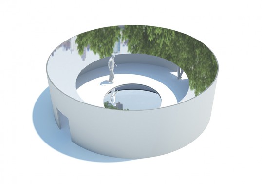
DCPP Arquitectos present Openness, which requires the visitor to travel “from a hermetic situation to an opened space.” Two of the folly’s surfaces reflect the sky: a mirrored ring around the outside of the open upper space and a pool of water in the center of the opening. The team hopes to establish the site as “a virtual link between New York City and Mexico” by hosting cross-cultural programming.
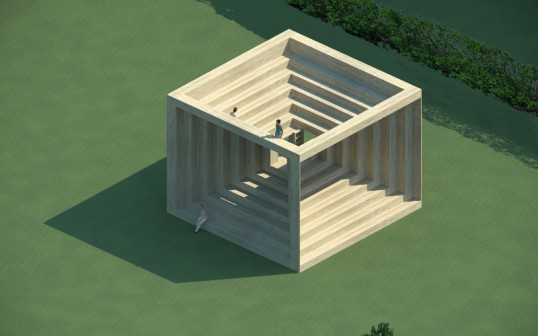
Omphalos is a symmetrical, block-shaped folly in structural lumber designed by Bernardo Zavattini, who has a background in lighting design. Its ziggurat-style steps open up “interconnected viewports” and allow visitors to access a ladder that leads to an open upper amphitheater space.
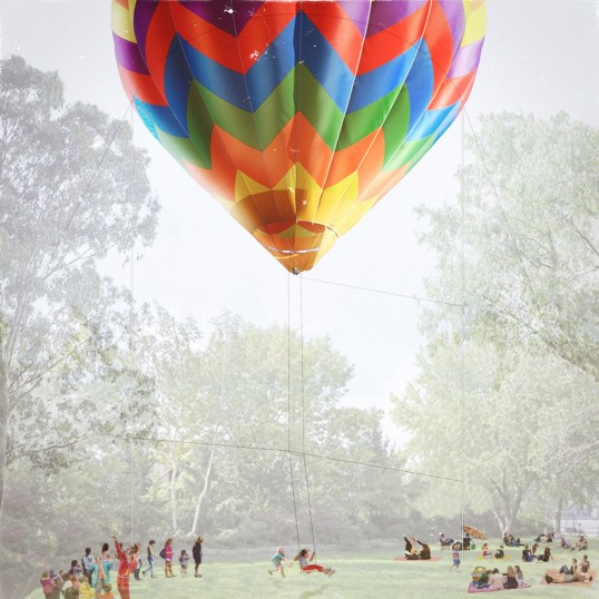
Balloon Swing, by Jesse Lockhart-Krause, invites interaction from children by offering them “a unique & memorable ride within the protection of the surrounding trees.” A rope swing hangs from a hot-air balloon, borrowed from the local ballooning community, which is temporarily moored in a small clearing within the park.
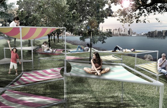
Hammockery was inspired by traditional hammocks, which the designers at DFArquitectos admire for their “incredible design, color and functionality” and as “an arts and crafts element that has remained in our everyday life.” Pipe scaffolding forms a grid of triangle and lozenge shapes which hold up the hammocks at four different heights.
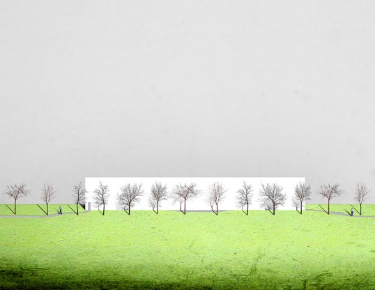
Kyle May and Seth Salcedo propose Roadblock — a 160-foot-long, 24-foot-tall wood frame clad with white gypsum wallboard. It “temporarily obstructs the view Socrates Park had of Manhattan, forcing us to go to the water’s edge to adore the skyline.” Visitors can also walk through a narrow corridor between the folly’s walls. Visible from Manhattan across the river as well as from the entrance of the park, Roadblock serves as both “a backdrop for the daily activities of the park” and “a glowing billboard for Queens.”
Sophie Elias is the Architectural League’s program intern. She also works on school design and construction for Katie Winter Architecture.
Folly is a competition co-sponsored by The Architectural League and Socrates Sculpture Park that invites emerging architects and designers to propose contemporary interpretations of the architectural folly, traditionally a fanciful, small-scale building or pavilion sited in a garden or landscape to frame a view or serve as a conversation piece. Folly was established by Socrates, in partnership with the League, to explore the intersections between architecture and sculpture and the increasing overlaps in references, materials, and building techniques between the two disciplines. Now in its fourth year, Folly attracted over 120 submissions in 2015.
Explore
Dynamic mediums: The design and fabrication of Torqueing Spheres
Delve into the design, materiality, and fabrication of Torqueing Spheres through a process photo essay and interview with designers Mariana Ibañez and Simon Kim.
In conversation: Mariana Ibañez and Simon Kim with Elissa Goldstone
The winners of Folly 2015 engaged in an email conversation with Elissa Goldstone, the exhibition program manager at Socrates Sculpture Park.

