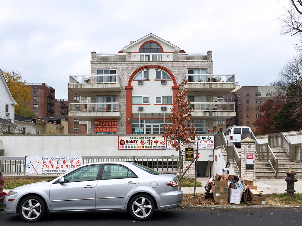
The spectacular vernacular of Queens
Two photographers discuss the beauty, joy, and whimsy of the “ordinary” houses of Queens.
Architect Rafael Herrin-Ferri and urbanist Joseph Heathcott are both fascinated by the seemingly ordinary vernacular residential architecture of Queens, New York. And both have turned their camera lenses on the borough to capture the stories told by everyday houses and streets. On November 9, 2017, they spoke with Emily Schmidt, The Architectural League’s Manager of Housing Initiatives, about the allure of “the city’s most enigmatic borough,” the spirit of collective urbanism in a place that’s constantly being remade, and why documentation can be an act of preservation.
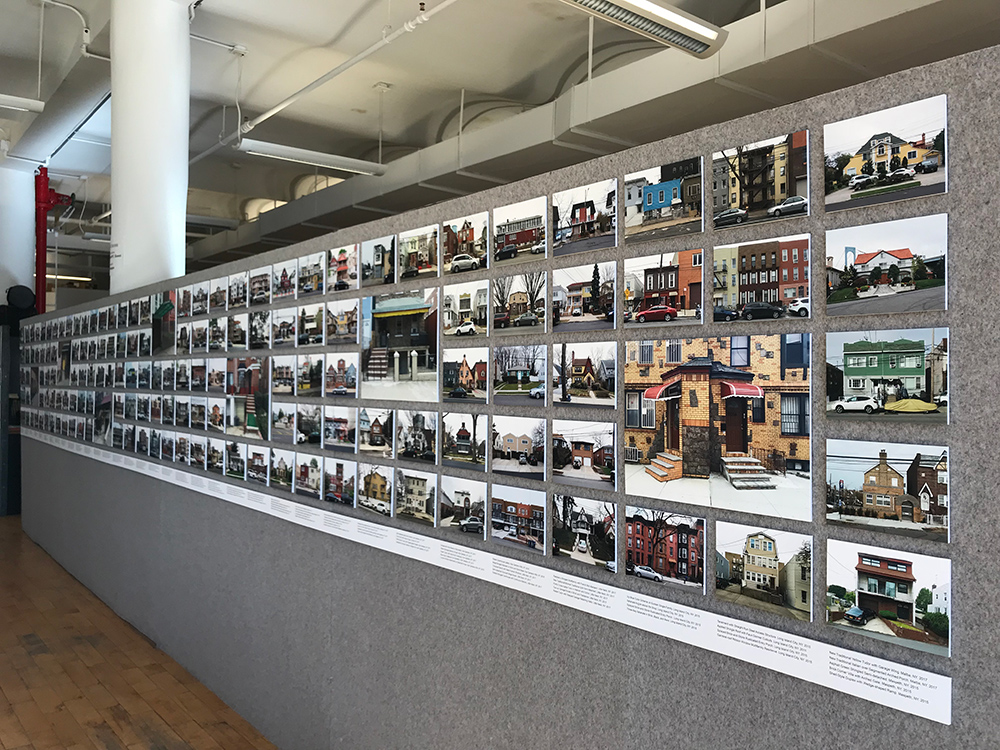
The conversation was part of the All the Queens Houses exhibition, a selection of 273 photos from Herrin-Ferri’s project of the same name, which was on view at the League from October 20, 2017 to January 26, 2018.
*
Emily Schmidt: I’m going to kick off the discussion with a seemingly simple but ultimately complex question: What do you both find so compelling about Queens?
Rafael Herrin-Ferri: I’ve been in Queens about 10 years, and I’ve always been interested in walking streets and looking at architecture. In Queens, practically every block has some exception to the rule in terms of housing typologies. There’s just such incredible variety, all in a nice, human-scale type of architecture, that I started documenting it.
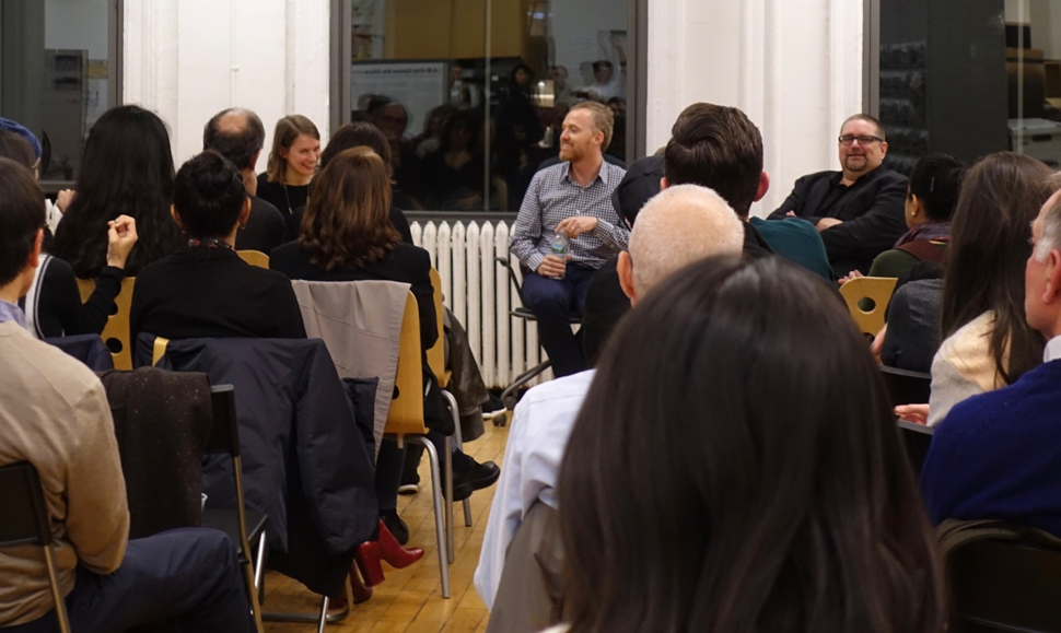
Facing the camera, from left to right: Emily Schmidt, Rafael Herrin-Ferri, and Joseph Heathcott. Credit: Nisma Zaman
Part of it was an excuse just to keep walking and getting to know the borough, like I did for 10 years in Manhattan before that. As I continue to explore Queens, it never disappoints. Every little street offers some gem.
I’ve also always been interested in typological studies, like the Bechers and other architectural photographers. That seemed like an exciting way to discover the vernacular. Part of the reason for doing this exhibition is to condense that experience and see what the common traits are. Even though most of these houses have traditional morphology, they’re not strikingly modern at first. But the way they’ve been adapted throughout the years is somewhat modern, which creates this very interesting tension. You have very economical, expeditious choices being made in terms of what materials are available and how quickly people can transform their houses.
Joseph Heathcott: I have also lived in Queens for 10 years, and the same things attract me. It’s the city’s most enigmatic borough—it never holds still long enough to describe it properly. It’s very strange, and I love it for that strangeness and for its immense adaptability.
I think that adaptability is what has attracted millions of people over time, particularly newcomers to this country. The ability to buy a house for relatively little money and change it to suit your family is actually quite remarkable. The architecture ends up being quite flexible, unlike the brittle architecture you might find in Manhattan. It’s very hard to change a giant apartment building to suit your needs, but in Queens, you can knock something down and put something new up, change this room and knock out some walls. That changeability of the grain is so fabulous. Walk around Queens and it’ll repay your visit multiple times. Please do it.
Schmidt: What does that adaptability look like on the ground? What are some of the materials, colors, juxtapositions, moments that you look for when you’re photographing?
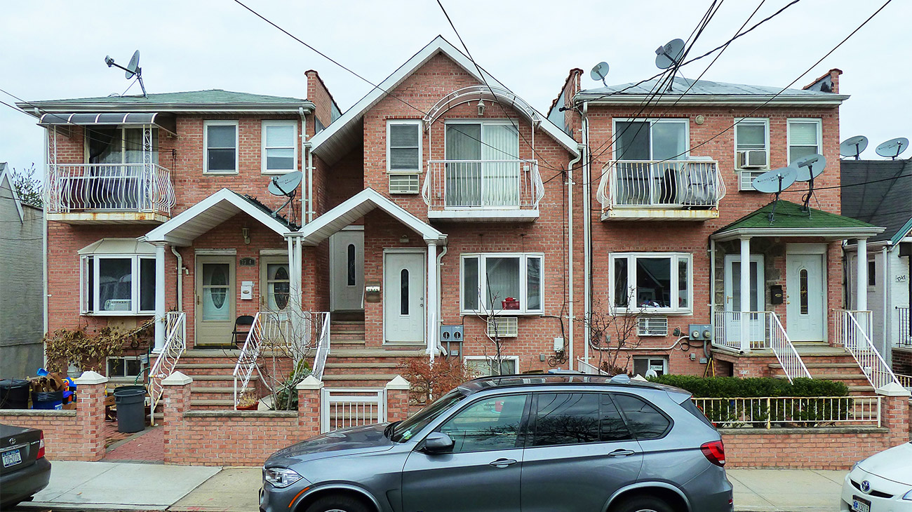
Herrin-Ferri: For one, there’s the ubiquitous step-down aluminum awning, which pops up on maybe half of the houses there. It immediately adds color to the front of the building.
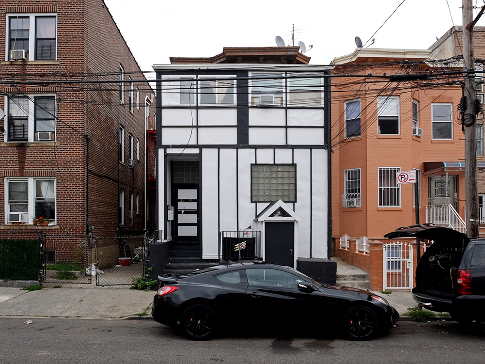
A lot of what I look for, since I am either walking or biking, is stuff that is below or at street-front level—front-of-house modifications. They have more human scale. For instance, the common sunken driveways. There’s varying degrees of the sink of the driveway versus the rise of the stoop to the front door, which often creates all these other secondary entrances around them.
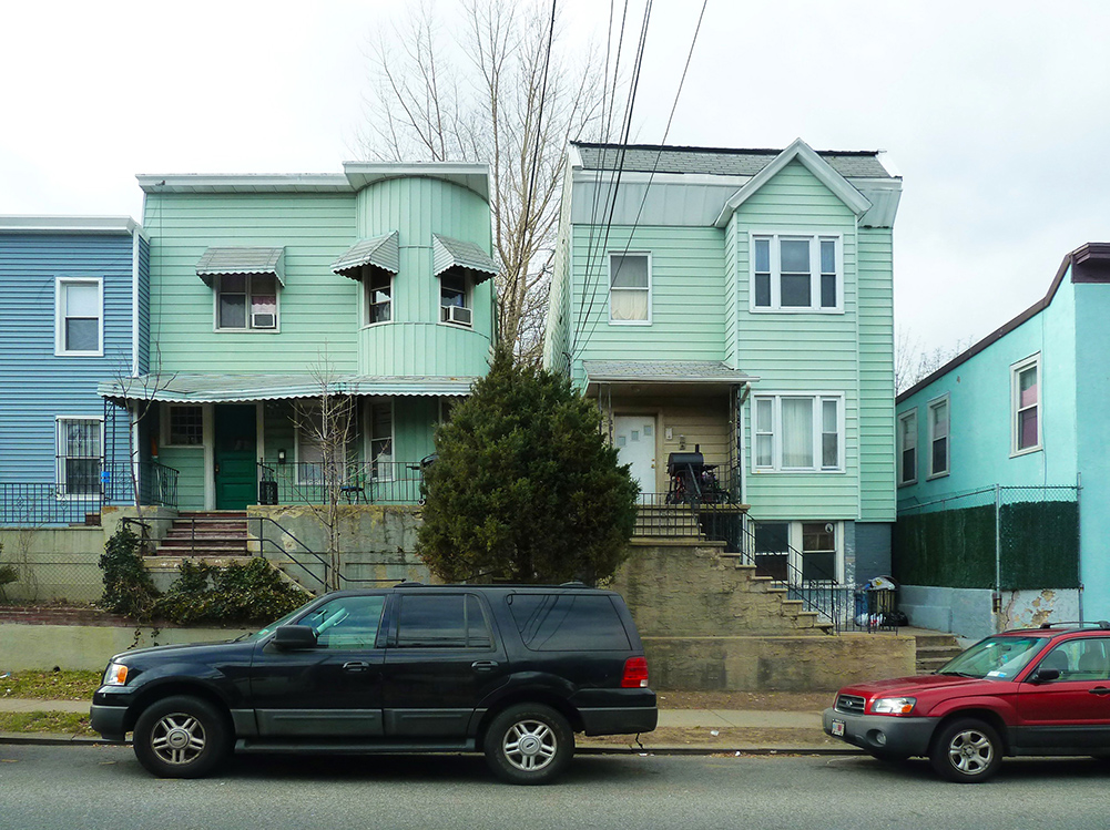
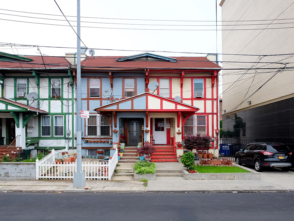
Also, color is, obviously, a main theme. I focus on how color might reflect different cultures and references. I’m almost thinking about this as the data collection part of the project, and from here I might focus on what might be behind these choices. I have gone to the city’s Building Information System database a couple times to find out if the owner came from a certain part of the world, based on color choices, for instance. I usually get it right.
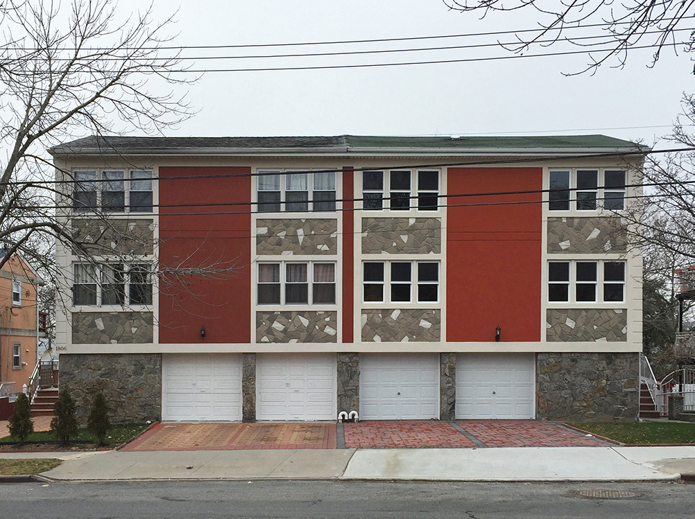
Heathcott: One of the things I love about Rafael’s photographs is the great attention to not just the differences in individual houses, but to houses that are built in identical rows and then change over time. One owner might decide, “I don’t like that gable roof, so I’m going to get rid of it and just have a flat roof.” Another might put some fake stone on the front. That kind of variation and adaptability is really alluring.
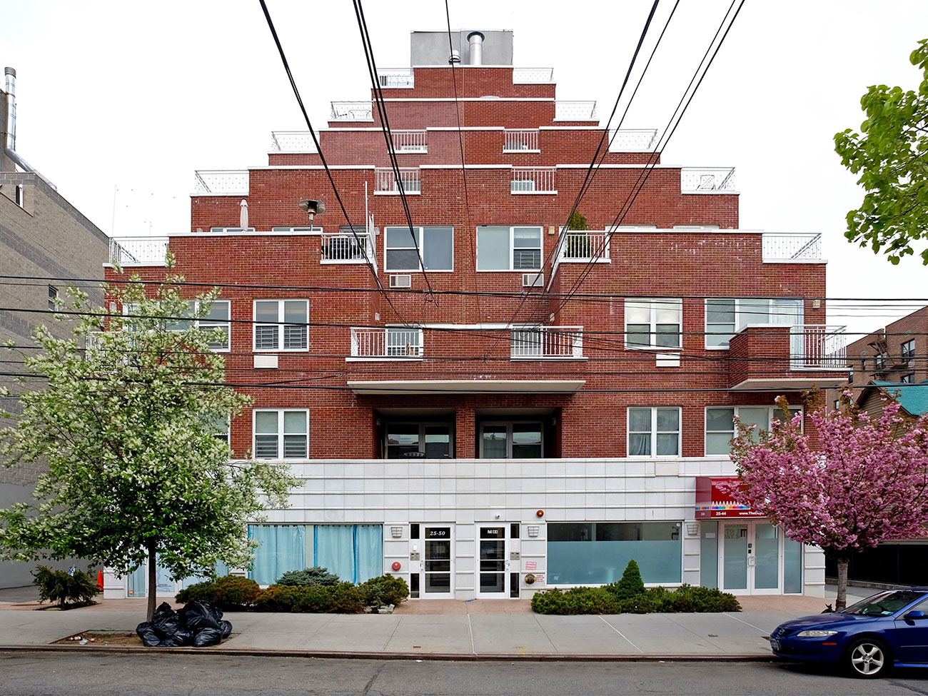
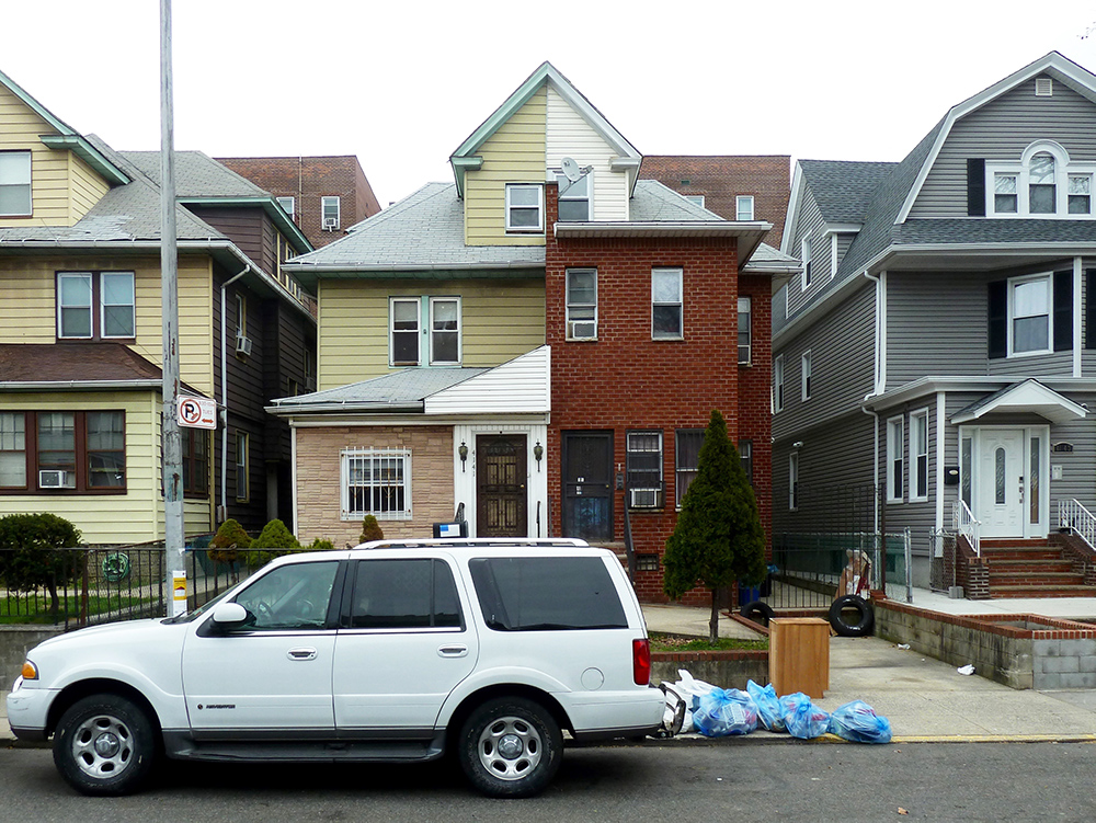
Herrin-Ferri: I’m also attuned to the variety of scale you’ll see on just one street. Astoria-Ditmars Boulevard in Astoria was first developed with single, one-story cottages. A couple of them have remained. Those are now mixed with small apartment buildings, including one of my favorites, the Wedding Cake Condo, which is seven stories tall, right next to a cottage. And everyone seems fine with it.
It’s hard to find that kind of variety in other cities I’ve been to in other parts of the world. Normally it’s a more even street elevation and consistent vernacular. I think that is very unique to Queens.
Heathcott: Queens is a borough of strivers. It’s where people go to try to reach the middle class. Part of that quality is individuation, and another is a focus on nuclear family life. These things are registered in the architecture. In many ways, people don’t really give a shit what the neighbors think of their house. They do what they want to do—because it’s their house!
Herrin-Ferri: Even when it’s a semi-detached house and half their space belongs, basically, to another neighbor. They don’t mind; they split it right down the middle. There’s a lot of joy and whimsy to it. There’s also a lot of pride. There’s no dilapidation in any of those photos. It’s really people just trying to eke out a little more space for families.
Even the fact that it’s a largely immigrant borough may make people transform their houses. They are expanding them with the thought that their mother can move in, a brother can come live with them. I think that all comes through as well.
Schmidt: Despite the focus on the streetscape, this is also architectural photography. I’ve tried and tried to find a person in any of these photos, and I haven’t yet.
Architectural photography has a long history of being an austere, high-style, or privileged form of photography. What does it mean to you, and why is it important to adapt this form to the more ordinary aspects of an urban landscape? Why did you end up taking on a project to photograph just some person’s house?
Herrin-Ferri: It just seemed natural to photograph what people think of as ordinary, or less designed, landscape. With photography, you can focus your vision and find things that pop out, which can inform your architectural thinking, but also your understanding of the culture and community. Architect-designed buildings already provide a curated experience, whereas when you photograph something ordinary, you’re drawing out something that isn’t immediately visible. That’s the exercise and the joy of photographing.
Heathcott: That’s exactly right. The practice of architectural photography comes out of an art-historical discourse, and it’s very closely tied to the demands and precepts of architecture itself. So just as Rafael says, high-style buildings generally tell you how to photograph them. They insist on a way of photographing them—and, by god, that’s how they’re photographed.
Walker Evans is another really good example of a modernist photographer who takes pictures of modern buildings and infrastructure in a way that creates a particular language of photography. He’s part of a generation trying to create a new architectural photography by telling the story of buildings and landscapes that everybody lives in.
Architectural photography has primarily focused on maybe half a percent of buildings in the last 50 years or so. Only recently are these other types of stories being told. They are drawing from other traditions, like vernacular architecture studies and graphic traditions, which have other ways of telling stories about built environments that are not necessarily framed in advance by the people who are designing the buildings. That, to me, is what is so powerful about this show.
Herrin-Ferri: If you can overcome the hurdle of what people classify as “ordinary,” suddenly there’s a lot more to see. You just let a lot more light and life in when you don’t have limit yourself to what’s “correct” in architecture.
Heathcott: You mentioned the absence of people in the photographs. I get that complaint a lot about my photos, too. That is what’s powerful about this approach to architectural photography, though. The houses themselves actually reveal social and human dimensions; the people are there in the choices they made about their houses. Every single building tells a story about the people who live there—and perhaps, if you read enough, why they might have made those choices, and how those choices differ from others that have been made. I think these photographs deserve that kind of reading.
Herrin-Ferri: My best friend told me once that all these houses look like they’re wearing funny hats or making funny faces. They do look back at you.
Heathcott: There’s so much personality.
When I photograph, the houses don’t tell me how to photograph them. I have to figure out, well, what does it mean to take a picture of this relatively ordinary house? Is that your experience? In some ways, you need the seriality of this exhibition to tell that story, unlike the high-style building where one image may be just fine.
Herrin-Ferri: Yeah, that’s true. I’ve always thought of it as a series, and that’s why I’ve tried to maintain the same lighting conditions as much as possible.
Schmidt: You’ve been on a dogged—if not obsessive—pursuit in the last five years of going out regularly to photograph, making your way across the borough. It’s a lot of work. You told me that one of your inspirations was a book on the disappearing storefronts of New York City. You’ve also mentioned how you’ve gone back to some of the buildings and seen that they’ve been modified, repainted, torn down. So is this, in a sense, an effort to capture a moment in time that may not be here for very much longer, or to show Queens before the completion of what you’ve called the “condo boom”? And what are the challenges that you see facing the housing stock going forward?
Herrin-Ferri: Granted, tall buildings are going to pop up. But the fact is that the fabric is already pretty well established, with small parcels of land. Combined with the fact that properties often get transferred just as much to other family members as they do to the market, does give me some reassurance that this’ll be around for a while.
I do like to think of this project as an act of preservation. If people see these neighborhoods can have this much character, then they might be less likely to come in and propose Manhattan- or Bronx-style full-block developments. Perhaps Queens can keep growing, but incrementally and at a livable standard.
Heathcott: Very well said. One of the places you can see that at work is in Rafael’s photographs of tear-downs, or buildings that have been built to replace other buildings. And that’s where you might be tempted to say, “Oh my god, that building was torn down and this monstrosity was built in its place. It’s gaudy and garish.” But hey, it’s Queens! That’s what we do! We do garish and gaudy. And it’s just the next generation of that. That’s what this borough’s about; that’s what it’s for.
Herrin-Ferri: They still can’t escape their vinyl-clad neighbor. They may spend a lot of money to build a French Provence-style fantasy, but they still have something completely different right next door. It’s still within a spirit of collective urbanism.
Heathcott: There is a preservationist story to be told. But it isn’t about the buildings per se—it’s about what makes the buildings possible. That’s what preservation should be: Not necessarily the obsession with the artifact, but rather the things that enable artifacts to happen in particular ways in the first place.
Queens is not precious. It’s something that people can really grab onto and make their own. That, I think, is what needs to be preserved.
Herrin-Ferri: I came to New York right when the High Line project was starting. I was familiar with it through Joel Sternfeld’s book Walking the High Line. He’s another photographer who does American landscape and built structure at a somewhat modest scale. It was always my idea that his book—his photographs showing all the wild vegetation growing from seed—saved the High Line. That’s always in the back of my mind: If you document the natural state of things, that can work as preservation.
Schmidt: That’s a great moment to open it up to a few questions.
Audience Member 1: Is there something particular about the zoning of Queens that makes these buildings possible? And do you have any hopes for future zoning—something that would enable these neighborhoods to maintain their character, if not the exact same houses?
Herrin-Ferri: I haven’t looked into the zoning fully. There are some interesting mixed-zone moments, particularly in Flushing. There’s a case to be made for a variety of zoning, and definitely the lid should be kept somewhat on so the neighborhoods can be preserved at a certain height, so as not to become intimidating to pedestrians.
Heathcott: We’re looking at a vast sea of R2 and R3 here. Most of the neighborhoods that Rafael’s gone into are pretty much covered by relatively strict zoning laws as far as the heights of buildings, the floor area ratios, and things like that.
But the reason that Queens looks like this is its developmental history. It exploded at the moment when these kinds of houses were popular, not only in New York but around the United States. They’re not actually that different from houses built in other places, but they proliferated here because Brooklyn had really grown and filled out by the early 20th century, while Queens was still merely a few villages and farms. In the teens and ’20s, the borough exploded—a lot of these buildings were built between the 1910s and ’50s and ’60s.
Audience Member 2: Could you speak to your choices as a photographer? It seems like most of the photographs were taken from across the street, which has the advantage of giving the buildings room to breathe—there’s some space above them—but the disadvantage of showing cars in front. Did you try different approaches? How did you arrive at this one as your default?
Herrin-Ferri: It’s just too close to get the photograph otherwise. I’ve thought about this a lot, and there have been a couple houses that I’ve gone back to photograph without a car in front, but in general I’ve embraced the cars. I think they’re just another element in the composition. Sometimes large SUVs are blocking the house and I’ll have to stand on the wheel in order to get the photograph. I’ll feel bad about that, but then I think, eh, the SUVs invaded the city first.
That’s basically my process for capturing a house and its neighbors as much as possible. I’ve worked with different cameras over the years, but now I have a decent wide angle so all can be captured.
Audience Member 3: What are your criteria for photographing one house versus the next one?
Herrin-Ferri: It begins with a certain understanding of the typology of the house, and the style, whether Queen Anne, Victorian, Tudor, or midcentury modern. I look for how far away from that archetype a house has gotten—how personal an owner has made it and how much character it has. So it’s subjective. I have a lot of pink houses, and some are less interesting than others—it matters how much pinkness a certain house has, how far they’ve pushed it, how much it expresses. It’s mainly an aesthetic idea, but also a lifestyle idea of being uninhibited and expressive.
Audience Member 4: I was born and raised in Sunnyside and now I live in Woodside, so I really appreciate this. I also worked as an architect in Corona for 12 years, so I’ve really seen the transformation. When I was growing up the houses were very open: You’d just walk up and knock on the door. I’ve seen a transformation—especially in Flushing, Corona, College Point, Richmond Hills, and Rego Park—to this new kind of fancy façade, this really loud, kind of bling prison. Half of the houses now have this barrier, like, “I don’t want you to come in anymore.” I find that really ugly; it’s not welcoming anymore. Have you seen that?
Herrin-Ferri: People have different ideas of security. Some people are comfortable without bars on their balconies, others just aren’t. It is true that you see more and more of this style. I think some of that has to do with what’s on the market, because prefabricated materials and structures get thrown on.
But I still find it a very open and interesting street landscape to engage. You can step past the property line without feeling like you’re invading too much.
Audience Member 5: I have two questions. First, I am struck by the naming conventions of your photographs. A number of them are based on the architectural style, but others are Siamese Twins and Three Musicians. How did those names come about?
Second, do you have a favorite neighborhood to photograph?
Herrin-Ferri: The naming did start more academically, but it quickly devolved into a more humorous exercise—in part from just finding the character, and in part from doing 273 different captions. It seemed natural. I thought about the variety of what can characterize a house and tried to give a little information about what first attracted me to it. In the end, I drew from art history, which is has always been a love of mine, and architecture and other captions that I’ve read.
And my favorite neighborhood to photograph? Corona is one, for sure. Flushing is another, although it’s a little harder to photograph because it is much more urban and taller. But anywhere where I think people are less inhibited and they’re really building what they want to build.
Audience Member 6: Do you need architects to do architecture?
Herrin-Ferri: That depends on the definition of architecture, and whether you think architecture is just building. I have always admired the book Architecture Without Architects. But I think you do need architects to do architecture, and not everyone is capable. Probably a lot of architects are involved in the houses shown here, believe it or not. A lot of what gets these houses built ultimately, though, is the contractors.
This project tries to show that there are limits to good architectural design as we understand it. Not everyone wants as much light as architects think they do—some people like darker interiors. There are lessons to be learned here.

