Setting the Stage
Tei Carpenter's designs seek a balance between flexibility and specificity, allowing for different uses over time.
October 5, 2021

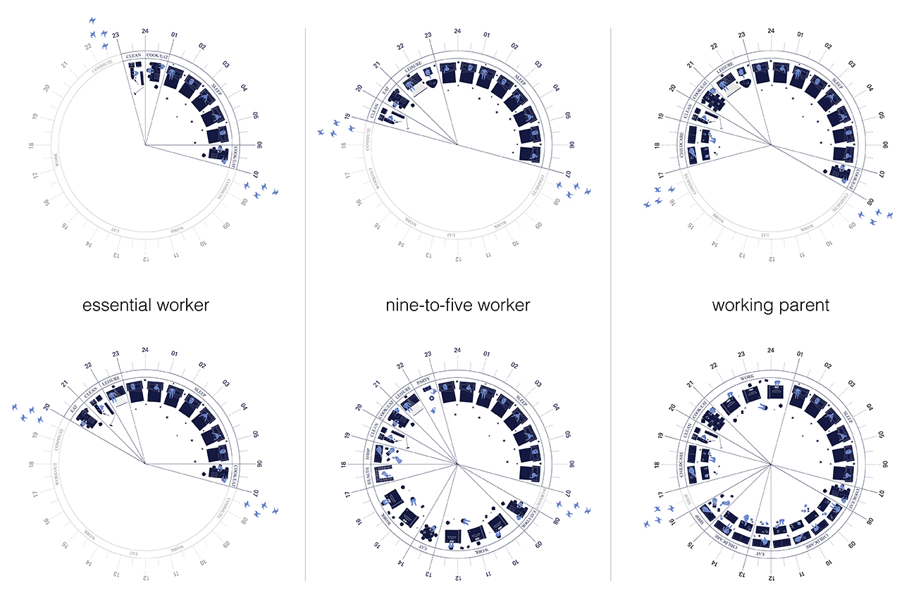
Tei Carpenter's spatial clock drawings reflect on the changing uses of domestic space during the COVID-19 pandemic. The top row represents pre-pandemic routines, while the bottom row considers occupant schedules during lockdown. Credit: Tei Carpenter / Agency—Agency
Tei Carpenter won a 2021 League Prize.
Agency—Agency founder Tei Carpenter was working on a residential commission in New York when COVID-19 hit, forcing her clients, along with billions of others around the world, to abruptly transform their routines and quarantine at home. To process the implications of this shift for the Crown House design, Carpenter began to create drawings of “spatial clocks” reflecting on how the use of domestic space was changing during lockdown. Office workers, for example, may have previously spent half of each 24-hour cycle away from the house; stuck at home during the pandemic, they suddenly had to find room to accommodate activities that normally took place elsewhere, from business meetings to workouts.
Although COVID provided the impetus for the spatial clocks exercise, Carpenter has long been interested in the question of how architecture can accommodate different uses over time. Nanase Shirokawa, a former program and membership associate at the League, spoke to Carpenter about how ideas of flexibility and openness have influenced her work.
*
The concept for your Crown House project changed because of the pandemic. What was it like to work with the project stakeholders in the context of COVID? How did this change over time?
What was really interesting about the project is that it didn’t really have to fundamentally shift. The pandemic just reframed our thinking.

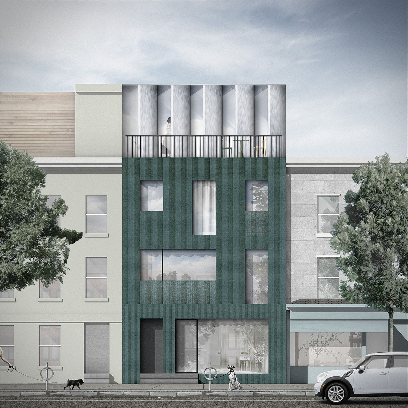
Rendering of Crown House, a residential project in New York City that inspired the spatial clocks series. Credit: Tei Carpenter / Agency—Agency
From the outset, the clients talked about the house as a space that would be considerate, almost as though it was a character itself: a host in the experience of daily life. We talked about the rituals and sequences that the house could afford, like walking into the house and taking your shoes off, putting your umbrella away, knowing exactly where things go—even at the level of how you bend or crouch down to your shoes, how one’s body shifts positions in space.
There’s this intensity in a New York City space because it’s so small; you end up using almost every part of it. So the owners wanted to consider really specifically how the house could host their things and activities on a daily basis.
And then with the pandemic, it became clear that we needed to think more about the different trajectories their lives might take. They started thinking more about, “Oh, what if we ended up working from home,” or even “What if we had children”—this is a really young couple.
So the idea of unpredictability became more important: the idea that something can be designed for time and change.
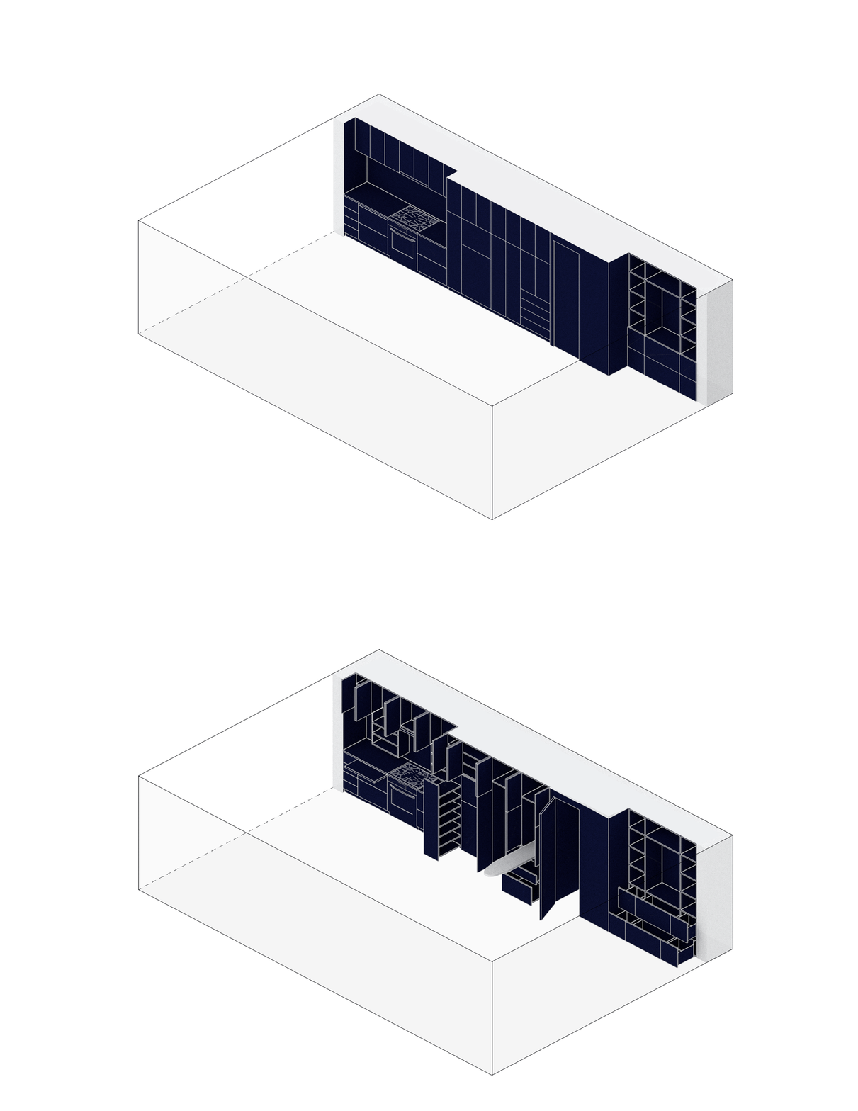
But we also wanted to maintain the tight design. Our solution was to incorporate elements like transformable millwork so that a dining room, laundry room, and extra bedroom are concealed, but come out as needed.
A lot of your projects have this tension between a grounding in the deliberateness of actions you take in certain spaces, on the one hand, and a sense of openness and possibility on the other. How do you think about this tension in a design?
I like to think about the notion of a ritual, because it also gets to the idea of space as a site of action and experience—space produces certain habits or behaviors. But whether these are obedient or disobedient behaviors, we don’t know. As a designer, you don’t know how people will use a space over time.
Specificity is very important in a project; it should accommodate the behaviors it was designed for, of course. But it also has to allow for accidents and spontaneity, and for different users over time. There’s not a singular public or singular actor or singular ritual, but rather a heterogeneity or multiplicity of behaviors that can be facilitated for different people, or maybe even different species.
Sometimes I reference the water fountains in Rome, the nasoni—to drink from them, you have to plug up this spout, and then the water comes up through a hole in the spout. You can’t resort to a default, “I’m going to turn the water fountain handle on and bend down and drink,” but actually, “Oh, no, I have to do it this way now.”
And that produces a relationship with the city. Even with infrastructures like water fountains, there’s a specificity of place, a specificity of context. Even if some people use the nasoni one way and some people use them another—you know, some kids are standing on top of the fountain when they drink. Rituals can change with different actors, and they can change over time.
Right. And sometimes you don’t even recognize your own rituals until you’re put in a disorienting new context. I like the idea of inserting an element of play or openness into a design that nudges people to change or question their habits.
Yeah. And for me, fundamentally, it’s a question of finding alternatives to the top-down, singular-author, single-use modernist model of architecture. That’s something we really need to rethink. We’re seeing this with the pandemic: The life of a building that’s designed as XYZ is only going to be that for so long. Right now, there are so many empty office spaces; what are those going to become? In the context of health crises, climate change, etc., this notion that architecture and design can be more flexible, permeable, spontaneous—that it can be an actor or character itself—is really important.
But the question becomes, how do you design something that’s open while still designing with specific constraints and materials? Balancing the two ends of the spectrum is the challenge.
You designed a public water project in New York. Have you been surprised by the ways people have used it?
I can’t think of a specific interaction, but some of the conversations have been really interesting: people saying “Oh, you could do something like this, but just for bees, or for dogs,” or asking “How immersive could these be?” People really want to get wet in the summer, so how could you allow that to happen? Could you have the experience of the sprinkler or the fire hose—a site of play as much as a site of delivering water?

Agency—Agency's New Public Hydrant project enables new uses for New York's fire hydrants. Credit: Tei Carpenter and Chris Woebken
I’ve also had conversations like, “Oh, if this is by the East River, could it be about XYZ?” So that’s interesting, because it becomes an idea about an infrastructure with versions of itself that can negotiate specificities of a particular context rather than one whose design is repeated exactly no matter where it lands.
Are there certain sources of inspiration that you look to when trying to find a balance between openness and specificity?
I really admire Renata Lucas’s interventions in urban spaces, like Cruzamento in São Paulo. She repaved a crosswalk with plywood and, in doing so, she re-asserted the crosswalk as something to pay attention to. She did another beautiful piece where she made a really simple cut in the sidewalk curb. And in that cut, you start to notice the curb, the location of the curb, and how you’re walking down the street.
Her work is quite subtle, but it reasserts those elements in the city. I also like the fact that her work is not in the gallery—it is very much in the street—and that she’s looking at existing systems, but with understated, specific interventions.
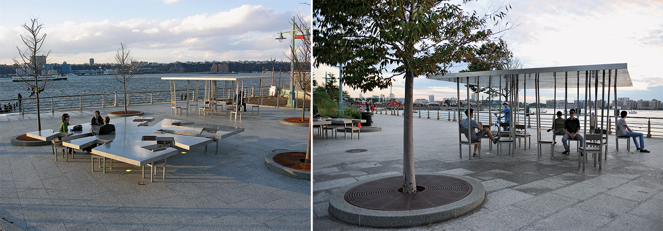
Another artist I think about is Allan Wexler. There’s a really smart humor in his work, the way he takes domestic elements and exaggerates them to produce something new.
He made this beautiful table with different cuts, making it more difficult to use. You can’t quite reach across the table and you don’t sit facing each other—it disrupts the notion of a dining table or a sitting area. He has another piece that’s a series of chairs; he’s elongated them to become columns, and the columns produce a roof. It becomes this pavilion/chair hybrid of sorts.
Objects like these start to open up different worlds, in a way. They allow you to imagine what a system that would produce them could be like.
It’s really neat. The way you’re speaking about it reminds me of building a theater set, or creating a scene—echoing reality, but with some things slightly off. You know that you’re entering a space that has its own rules.
Like a Samuel Beckett play. That’s such a nice way of putting it. The theater stage set is a great reference point both as a spatial platform as well as the possibilities of scripting of alternative narratives.
And in your own work, you translate this theater-set sensibility into lived reality—reframing the way we look at the world, or even just reframing the subtleties of where you put your shoes or where you take a nap.
I remember going to Marfa and seeing these pieces of furniture Donald Judd had in his studio space for napping. The location of his bed is unusual, but these pieces of furniture are really designed around a persona, a narrative. But they make you start to think about how there’s a default around domesticity, and what produces domesticity—and how perhaps that can be opened up.
Interview edited and condensed.
Explore
Seeing through the cracks
Michan Architecture seeks out opportunities to transform the ordinary into the unexpected.
Between art and architecture
Olalekan Jeyifous speaks about his path from architecture school to the art world.
Making buildings, making books
For Trattie Davies and Jonathan Toews, book-making has become an important part of architectural practice.


