Seeing through the cracks
Michan Architecture seeks out opportunities to transform the ordinary into the unexpected.
Isaac Michan Daniel of Michan Architecture is a 2020 League Prize winner.
Mexico City-based Isaac Michan Daniel founded Michan Architecture in 2010. Working closely with clients, manufacturers, and construction workers, the practice experiments with different materials and building processes in order to bring new qualities to everyday environments.
The League’s Catarina Flaksman spoke with Michan about his work.
*
Can you talk about the combination of technology and tradition in your work, and how you mix digital processes with local materials and crafts?
This idea of hybridizing technology and local craft wasn’t something we planned; it was just the way we could build in Mexico.
In all our projects, we work to understand which elements can do what, and how we can push them to do more. Sometimes we start with a material, a texture, a structure, an ornament—it depends on the project. But we’re really working very closely with constraints and norms.
For example, the housing projects I’ve been working on for some years have a lot of restrictions; they are limited in terms of program, budget, site, and so on. So we look for small cracks in the design brief in order to produce something of interest, or to make users more aware of their surroundings.
Also, something that was very inspiring when I started working on these projects was looking at Italian modernist projects from the ’50s, like buildings designed by Luigi Moretti and Studio Passarelli. They found super-exciting opportunities within normal programs and common materials. So that really motivated us to push our design.
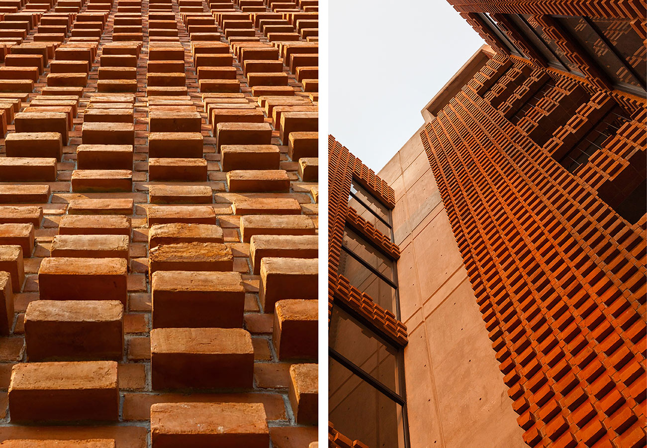
When we started working on the Z53 project, for example, we found that most of the buildings around it have masonry and concrete frames, with every wall carrying a load. We knew we really didn’t have a lot of room to play with this model, so we tried to find these small apertures in the brief. The building is low-income housing, but we didn’t want it to look like a housing project. Rather than just laying the bricks as they are traditionally used, or covering them with stucco and paint, which is also very common, we wanted to take advantage of the material that was pretty much given to us, and use it as texture, as ornament, but also as structure.
So we combined the design work we were doing digitally with local craftsmanship. We went to Puebla, a city in Mexico where they produce a lot of bricks, and worked very closely with the craftsmen there. We used four different sizes of bricks.
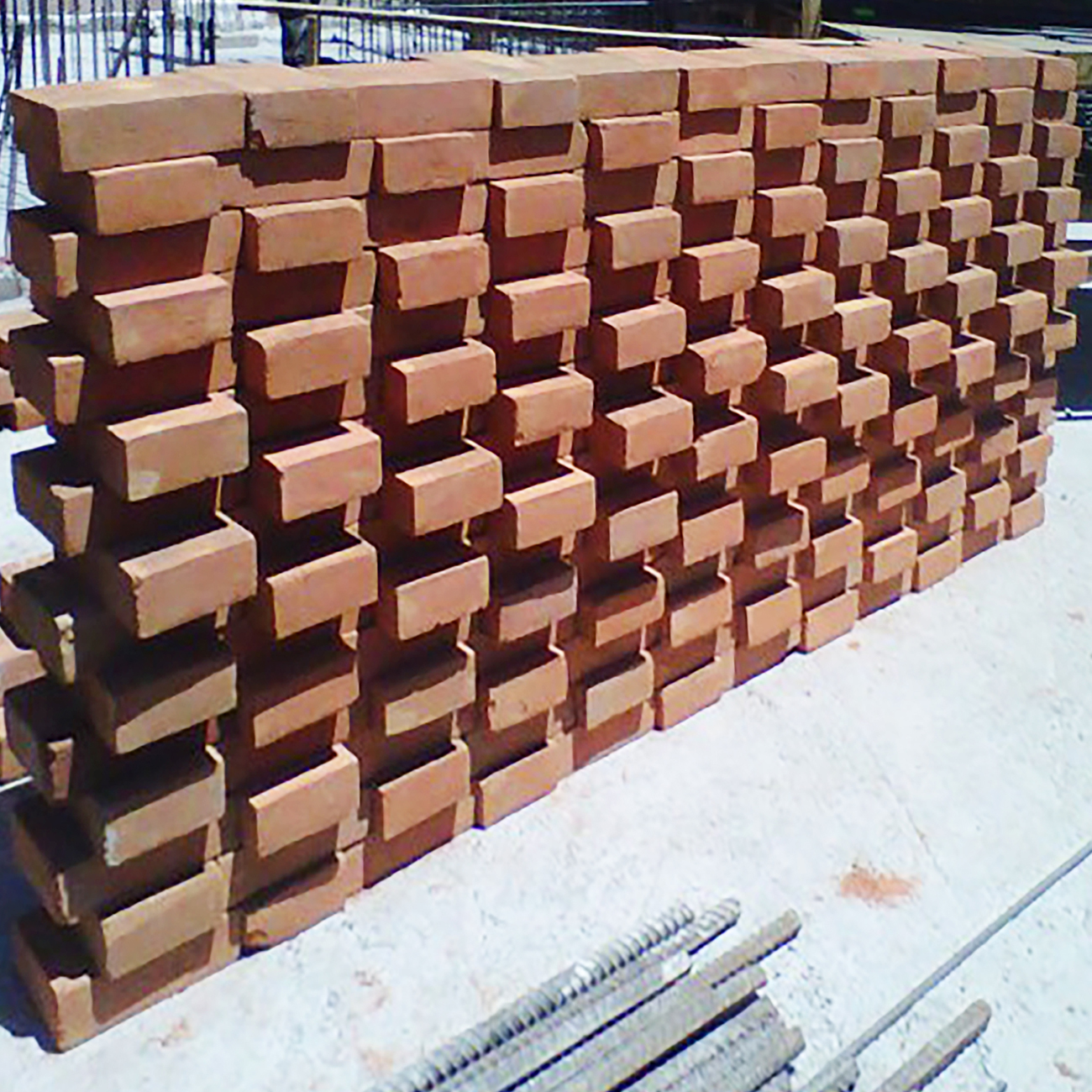
One challenge we had to solve was finding a way to build the concrete rebar frames without leaving them exposed. Instead of building the frames as you typically would and covering them with brick tiles, which would have maintained the aesthetics but changed the structural solution, we produced hollow bricks that were used as formwork for the concrete. That also reduced the cost of the project, since we didn’t have to spend money on formwork.
We had to negotiate every aspect of the project in order to make the design work. Once the provider of bricks didn’t bring them for almost a month, so the project was almost canceled, and everyone was suggesting to just use regular bricks and a typical wall design. But these moments are part of everyday life here, and it’s fun for us to try to make things work.
In the end, I think what’s successful in the Z53 project is that it blends in with its surroundings, but also offers something new. When you look closely at the building, you see these bricks that look like they’re moving, and you don’t know if they are just ornamental or if they’re structural.
Why did you decide to go to a specific brick maker in Puebla? How did those bricks compare with the bricks that are typically used for this kind of project?
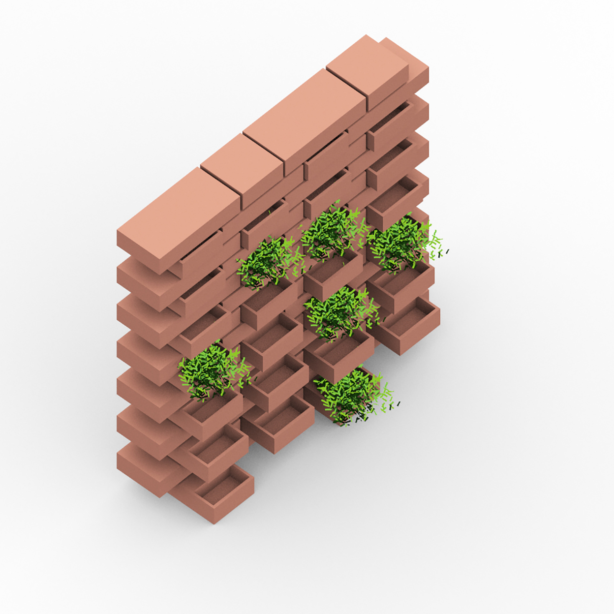
So we first thought of using hollow bricks from the largest factory in Mexico, but then we realized that there could be a lot of problems with water if they overlapped, which is what we envisioned. One idea was to put planters in the exposed hollow spaces, but that would have been super expensive and required a lot of labor.
The only difference between the solid traditional brick and the one we used is size—the short side is two centimeters longer than usual to cover the beam.
For the protrusions on the façade, we used different sizes of bricks. It’s one repeated curve in section—it goes from zero to ten centimeters, and then back to zero. We ordered four sizes of bricks from the manufacturer, and then we cut the sizes in between onsite to match the ten different projections. This cost a bit more than the client had anticipated spending on the façade, but they were willing to change other aspects of the project to make the funding work out.
When we found this brick solution, everyone was happy. The structural engineer was happy because the construction is super simple. The client was happy. We built one small mockup to see if the design would work. It worked, and we were able to continue.
How involved are you in the construction of your projects?
That first project, Z53, was a collaboration with Grupo Nodus, which is a firm of architects and developers. They were in charge of the construction, and when the construction was halfway done I went to the States to do my masters. I went to the site every time I flew back, but I couldn’t be there all the time.
In most of the commissions I’ve done since, I have been in charge of the construction. I’ve worked as what you would call a contractor, but it’s not exactly the same as it would be in the States. I organize carpenters, steelworkers, etc. And that relationship has been interesting to me. This is why I find Mexico an amazing place to practice, because sometimes you become the contractor, sometimes there’s another contractor—but there’s a very close dialogue between construction and design, and you can really test ideas and possibilities.
And what is the conversation with the workers or the manufacturers like? Is it challenging to translate new technologies and digital processes?
One of the most exciting parts is this translation. And they’re really receptive to new ideas, in my experience. Sometimes there’s not a lot of time to have all the construction documents perfect, so you go to the site more often. When the workers get involved and you explain this process to them, they put more effort into the project and they’re more excited about it, because they’re also learning. And I learn a lot from them. There’s a lot of reciprocity in that sense.
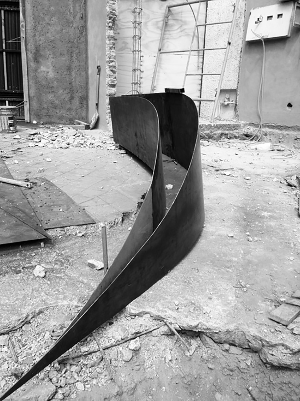
To give a concrete example, in a landscape intervention for a residential project, we bent steel plates. We didn’t have the budget to use the real bending machines, so we figured out another way. We designed these geometries in the computer, then printed them on a one-to-one scale on a huge piece of paper. The workers followed the contours on the paper to cut the steel by hand, then smashed and bent it.
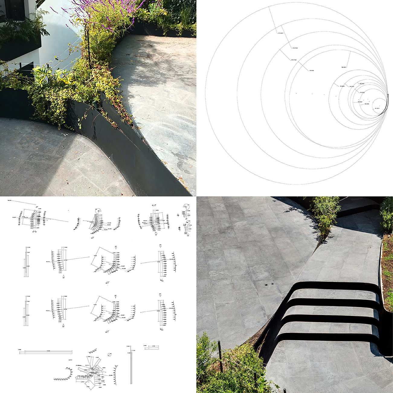
JD landscape images and surface planter drawings. Images courtesy Michan Architecture/JD landscape. Bottom right image credit: Rafael Gamo
For me it’s very inspiring to think about how you can do things not only the way they’re typically done, but also kind of misread and misuse material, misuse digital technology. In this process, you often end up with a result that’s related to the context, because it’s linked to the materials and the budget—but you can still produce unexpected results.
In your League Prize submission, you mentioned this idea of creating something different as a kind of provocation—trying to find the balance between the familiar and the weird. Can you say more about this?
It’s funny, but that also kind of started by accident, and it’s now something we encourage in our office. When we started building, we realized that we wanted our projects to feel like a natural fit within their context. But we also like this idea of something that is familiar and then has new moments of something unexpected. This hybrid is exciting for us.
How much do you think your time studying in the US has influenced your work? Did you find architectural education there very different from what you experienced as an undergrad in Mexico?
Yeah. Education in Mexico is more conservative. There is not a lot of room, in my experience, to speculate and to imagine new possibilities for architecture. My education at Pratt Institute really opened my mind to new ways in which I could produce architecture. What I enjoyed quite a lot was not just thinking about the formal aspects of design, but this idea of seeing architecture as a cultural discipline. I’d never heard of that before.
In terms of form specifically, I still have ambitions, but they’re more grounded now. When I came back I had to incorporate these ideas into the local context. I think that’s the point of education: to learn different things from everywhere, and then create your own set of values, your own methodology.
We look for opportunities to incorporate these different ideas into our projects. We don’t think, “OK, we have this specific idea in mind, and we want to apply it on every project and work very strictly within these rules.” We’re very open to external things shaping our ideas. For instance, the masters in the US shaped something, and then I came back. The materials on a particular project shape something. I’m interested in developing and moving, not staying static in one notion of how I want to practice.
Explore
Flash and spectacle in the face of austerity
Debroit-based Anya Sirota discusses the relationship between architecture, culture, and urban vitality.
Potable water and local power struggles in Honduras
Timothy Kohut reflects on alternative visions for community development in Tegucigalpa.
LANZA Atelier lecture
Isabel Martínez Abascal and Alessandro Arienzo present their League Prize installation and other work.


