Interview: Ogrydziak Prillinger Architects
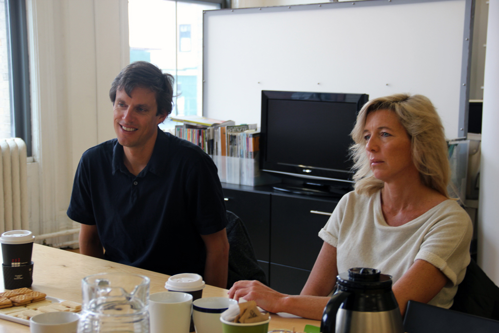
Luke Ogrydziak and Zoë Prillinger of San Francisco’s Ogrydziak Prillinger Architects analyze design logics, such as techniques of representation, efficiency, and consistency, and the opportunities to subvert or complicate these controls. Recent work includes the Parallax Pavilion in Lotus, California; the Triskelion Exhibition Pavilion in San Francisco; the Gallery House in San Francisco; and the under construction South End Rowing Club in San Francisco. On the occasion of their lecture (video below), Ogrydziak and Prillinger sat down with League Program Director Anne Rieselbach to discuss their practice.
Anne Rieselbach: The series emphasizes the voice of practitioners. How would you describe your voice?
Zoë Prillinger: I think we have a voice with a bit of a hybrid accent, and it has changed over the years. In some ways, it’s been location dependent. We come from an east coast background, which is an important part of our intellectual formation. Yet, we moved to and have spent a lot of time in California. I’m Australian as well, so we share some cultural qualities with Australia. That combination of influences has changed the way we think about theory and the application of theory into practice. Building ideas in the real world and understanding how to make them relevant have always been critical to us. We have a highly critical attitude towards the discipline but we are also mindful of how our work and ideas are situated historically. At the same time, we’re interested in looseness, if you will, and achieving a sense of easiness or lightness. It can be difficult to maintain a jauntiness when you are tightly in control of work. So, I suppose our hybridized accent is one that combines control and loss of control.
AR: As an emerging firm, what do you see as the advantages and challenges to practice in today’s economic, professional, and intellectual climate?
Luke Ogrydziak: In some ways, even though we’ve been through and are still in a difficult economic time, the current moment—at least on the west coast—feels quite promising. There has been a turn in the last couple of years. People seem more open, culturally, to embracing how the built environment can take on some of the more global issues that architecture is dealing with. Practicing in the Bay Area presents a bit of a paradox. The culture is very progressive and future-facing, full of people thinking about how the world can be different. There is a kind of utopianism that attracts people. At the same time, the built environment hasn’t really been a reflection of that. But now, those two things are starting to intersect and there seems to be a cultural shift. It’s a good time to be practicing architecture.
ZP: In terms of being an emerging firm, because we’re small, we’re young, we have less overhead, and we’re lighter on our feet, we can afford to be more experimental. We are living in the future if we want to be. I think the nature of “heavier” firms, the ones that are already institutions, is more towards self preservation rather than experimentation. Clients come in expecting to know what they’re going to get. We, on the other hand, can redefine ourselves all of the time.
LO: The clients we’ve had have been very interested in engaging in the process of design. People don’t come to us for a specific product.
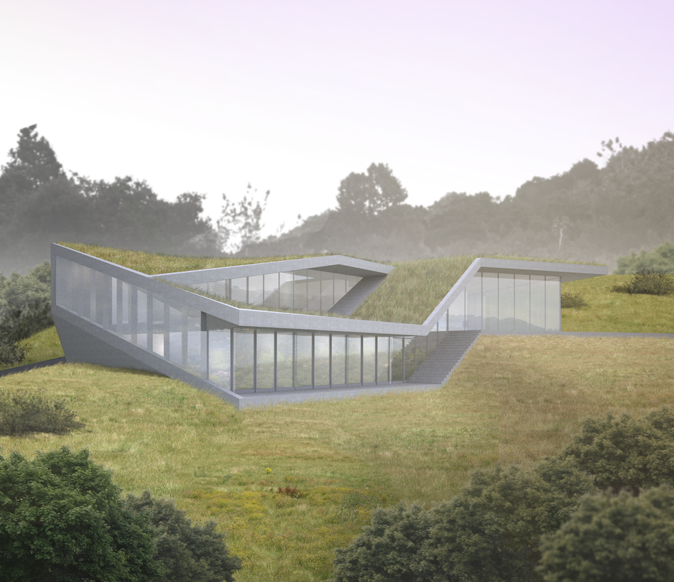
Loop, Orinada, California, credit: OPA | click for a project slideshow
AR: Speaking of your design process, you mention in your portfolio the pitfalls of systems of control that architects employ—such as representation, efficiency, consistency—and your desire to subvert these by employing design methods that, to paraphrase, free yourselves from yourselves by introducing something inhuman into design. What does that mean?
ZP: We try to be aware of conventions that we’re taking for granted, whether they are certain architectural expectations about representation or efficiency or use or program or form. And different projects have different cues. We try to follow threads and see why things are done or thought about in a certain way. Once we sense a potential way in, we try to explore alternatives.
LO: Your question takes me back to reading the Robin Evans essay “Not to be Used For Wrapping Purposes,” which famously talks about Peter Eisenman’s axonometric model and the slippage between what Peter thought he was doing and what Robin Evans thought he was doing. I feel like almost all of the work I get excited about is somehow still grappling with that essay. There is an entire generation of people thinking about machinery and the “inhuman,” the opportunities that emerge when you think about how what you’re doing is also doing something back to you. In a way, you can think of language as a machine. You can’t escape operating within language, and since you’re already within a system that’s working beyond you, why not make it explicit? A lot of the projects we’ve done or that we show are about picking out certain aspects of language and making those explicit. Some of it is spatial and geometric but some of it, I hope, is also psychological.
AR: Much of your work is driven by employing irregular geometries and then mining them for their spatial possibilities. There’s spatial play as you conceptualize that shifts as you realize the project. What is your generative starting point for each project?
ZP: Whenever we first meet with a client, we’re always thinking about a way into the project through some kind of dislocation. There’s always an attitude of opening things up or loosening things up when we listen to a new project brief.
We get more pleasure in a space that unfolds through experience rather than one understood in its entirety from the beginning.
LO: In the discipline, people talk about the parti and the power of the diagram. When we start a project, we do conceptualize it in a simple or compact narrative. There has to be an organizing story that we can tell ourselves and tell the client. But then there’s a conflict between wanting to be loose and wanting a story, right? It’s linguistic and maybe a little bit diagrammatic, but architecture is very big and costs a lot of money. If you can shrink it down, you can get control over it. In a way it gets back to our hybrid voice. After all, we studied with both Peter Eisenman and Michael Graves…
AR: Talk more about the relationship between architectural representation as a design process and built form. What happens along the way?
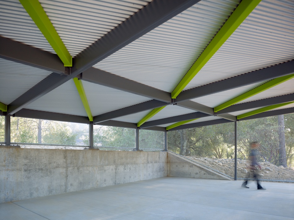
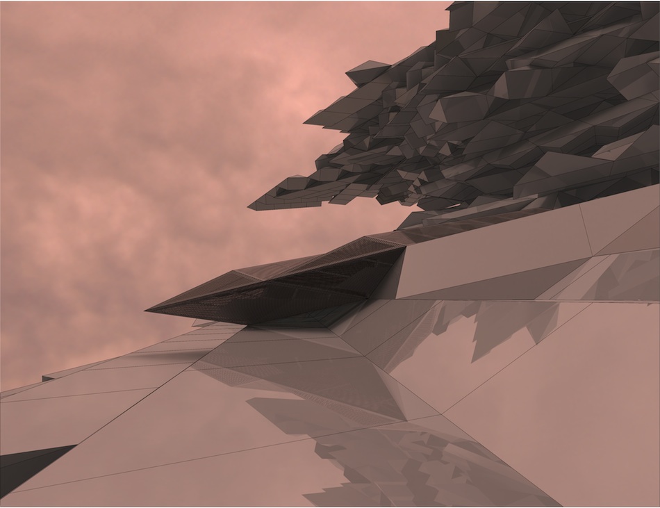
ZP: Sometimes nothing happens. There are a number of projects in which we are interested in extracting the tools of architectural representation and pulling them as far as we can along the process to the built form. Like the project Parallax, a pavilion in the Sierra Foothills, which is basically representational conventions writ large. It’s the world of perspective implanted within a neutral, Cartesian visual field.
LO: If left to our own devices, a lot of our work is very abstract aesthetically. And by abstract I mean we try to isolate the issues that we’re interested in or that we think the project is speaking about and not distract from those.
AR: What mediates the initial complexity of your design studies—because they are on the whole very complex—as you translate them to built form? And where do material and construction methods come into play?
LO: In some respects, your question points to one of the big issues we’re trying to confront with our firm. When we started a lot of our digital projects, they were on a scale of installation or conceptual work, and then there were real projects. You could live happily in one world or the other and you wouldn’t even have to have drinks with people in the other. The exciting thing for us has been the challenge of how to merge the two, to apply the computational ideas into something like structure. It’s really not that easy, because there are a lot of set conventions. You really need to have your foot in both worlds. But that kind of cross-pollination leads you to think of things you otherwise might not. On Hyde, for instance, we had to solve a problem that had to do with minimizing the floor assembly. We ended up doing something that we thought was very beautiful but it was also the most efficient structural system. There was a logic to it that didn’t conflict with either goal.
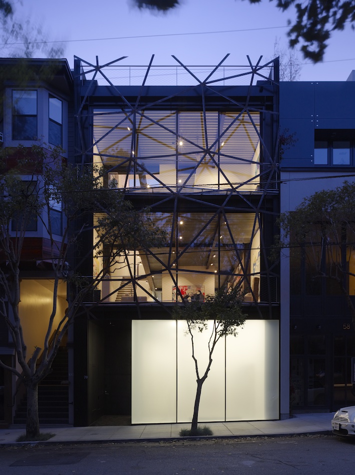
Gallery House, San Francisco, California, credit: Tim Griffith
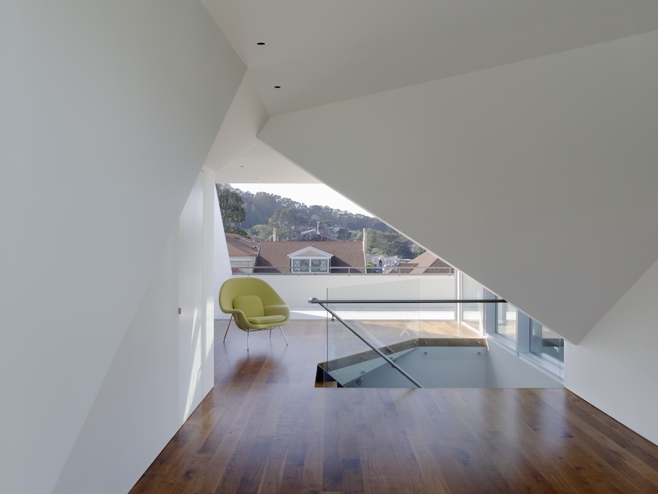
AR: Let’s talk about the Gallery House, which is one of your earliest projects, though it’s also one of the biggest. How did you manage to incorporate its triangular folded facade element into what I understand are pretty restrictive building codes in San Francisco?
ZP: The project began with an interest in figure-ground relationships because it was an infill lot next to an urban figural void. There was this ambiguous edge oscillating back and forth that could act as a buffer condition. It seemed like a good opportunity to try to employ what the planning code would call an “allowable architectural projection.” The rules in San Francisco that describe what is allowable are in the service of the replication of what you think of when you think of San Francisco, which is the Victorian bay window or something that is mimicking that shape. We didn’t want to do a bay window, but we did want something that had a sense of volume, a shifting volume. So we more or less “misread” the code and explored all of the deviant projections that were technically allowable. It was an opportunity, a loophole.
LO: Technically—and this is a whole other discussion—the reason it was possible was, at that time, that particular neighborhood was not designated a historic district. The planning department has been very supportive of contemporary architecture, but I think they also feel they may have over-empowered the citizenry. It’s interesting to think about this question of design by consensus versus expression. But when we went to the planning department with that project, the planners really encouraged us to do something creative. It was amazing. We went in open-minded but assuming we would be told what to do. To have someone tell you, in front of your clients, “Hey, let’s do something great!” was like a fantasy.
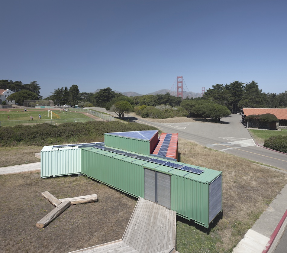
AR: Tell me about the development of the Triskelion Pavilion. At what point did shipping containers become part of the design process and what were the challenges of working with what is rapidly becoming a popular ready made design module?
ZP: We didn’t have much say in that because we came on board at the last minute. We were told it would be an exhibition pavilion that moves around from site to site. The client told us two things: the project will be nomadic and they wanted it to be site specific. They had already decided, since the project had to be shipped around and reconfigured in different locations, that shipping containers made sense logistically and economically. An enormous history of shipping container architecture already existed, so we actually felt a bit oppressed by the multitude of projects that had come before. You mentioned earlier how we latch on to conventions as a way of articulating a resistance. Shipping containers are all about efficiency, stacking, tightly packed arrays. We’ve done a lot of work thinking about close packing, and after doing a lot of work on a close-packed project, which was the Conway House, we thought, you know what? We like a little bit of wasted space. Architecture needs inefficiency; architecture requires wasted space. It’s kind of a diabolical or irresponsible thing to say…
AR: What do you mean by wasted space in this context?
ZP: Especially after the economic period we’ve been through, architects are required to make an argument about this very efficient process where every inch of the project is supporting some function. So to say some amount of inefficiency is required is important. A large part of architecture is symbolic. Great opportunities can occur when there’s some inefficiency or wasted space.
We started looking at different ways of wasting space with shipping containers, pulling them apart, thinking about what we could do with the gaps in between. The constraints of a shipping container were totally inappropriate for the program type, which was an exhibition space with a large public gallery and a lot of perimeter area. So the combination of those requirements and the nomadic purpose of the exhibition drove our exploration of different configurations.
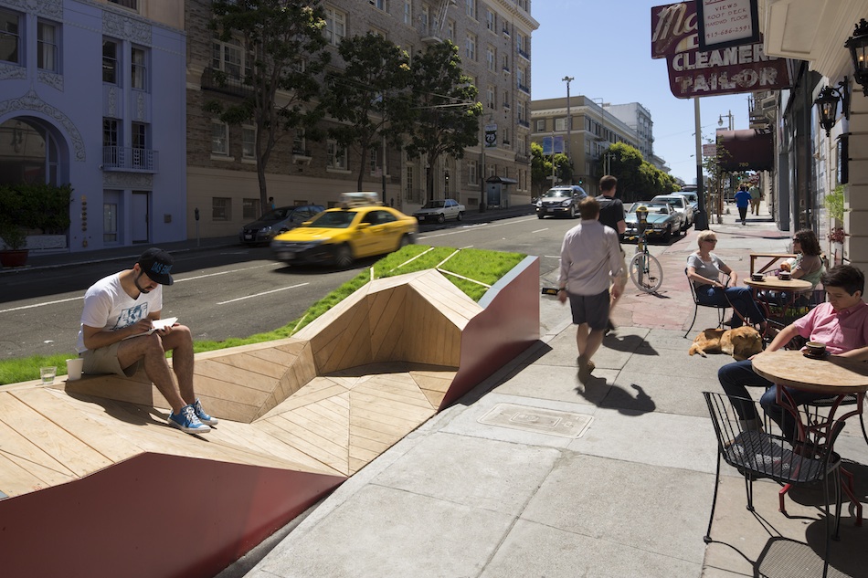
Parklet, San Francisco, California, credit: Tim Griffith
AR: A lot of these kinds of projects are designed to sit on the surface but your more recent work is quite literally embedded in the site. Would you say you begin this kind of design project by exploring program or topography?
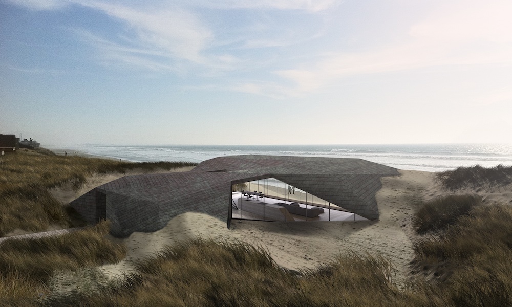
ZP: We’re really interested in ambiguity of language and the dissolve of architectural language into landscape or site language. It requires an attention to the site, and different sites give us different opportunities. We’ve worked on a couple of projects in Orinda, California, where to the greatest degree possible we wanted to push the envelope of the building to emulate the site slope, to have the houses dissolve into the sites.
LO: We had been doing a lot of computational work, and though those projects are amazing in terms of the issues they unpack, they tend to be objects. They were very abstract but they were objects. The Parklet commission was a kind of “aha moment” for us, because it was finally something manageable—it was only 6 by 40 feet—through which we could apply our research to our built work and investigate how these slopes could be, to some extent, like computational behaviors. Thinking of space essentially as a surface that is somehow computationally controlled but also has these ideas of loosely defined behaviors is an amazing terrain to explore. I get more pleasure from a space that unfolds through experience than from something that I can understand intellectually in its entirety at the beginning.
ZP: There are three recent projects—Dune, the Parklet, and the Stremmel House, which is a new project—all of which exhibit these qualities. I wouldn’t say they’re site-specific as much as they reference landscape, or are dependent on landscape form. All three projects are very close to my heart because they start in some ways with a pure desire, a dream for space to be a certain way. We’re in California because we like space, we like open space, we like being outside. The Parklet is this dream about being in what is the most New York part of San Francisco, which is the Tenderloin—a certain kind of New York, I suppose—and then contrasting it or collaging it with this strip of nature. It’s an artificial nature but nevertheless it’s what is often repressed in the city and what is often repressed in architecture.
Gardens throughout history have been places where fantasy is possible. It’s no accident that our projects, which are starting to borrow from landscape form, dissolve into the landscape and are more dreamy. There is a longer leash for fantasy in the garden, and it’s not so possible in architecture.
•••
Luke Ogrydziak and Zoë Prillinger, Ogrydziak Prillinger Architects, Emerging Voices 2013, complete lecture video | Recorded March 21, 2013 | Running time: 46:33
•••
Luke Ogrydziak and Zoë Prillinger each received M.Arch degrees from Princeton University and have taught at Harvard University and the University of California, Berkeley. Their projects have received numerous AIA San Francisco and AIA California Honor and Merit awards. See more of their work at oparch.net.

