Dwelling as drawing
For FreelandBuck, designing a spec home provided the freedom to explore the links between drawing and building.
By Sarah Wesseler
Throughout a decade of collaboration as FreelandBuck, architects Brennan Buck and David Freeland have focused on exploring the relationship between three-dimensional space and two-dimensional imagery. “We really think about drawing and image-making as very directly connected to building and making installations,” Buck said.
One of their projects transformed the ceiling of the Smithsonian’s Renwick Gallery into a trompe l’oeil homage to historic American architecture. Another used an op art-inspired façade to add the illusion of depth and complexity to a Miami commercial space.
In the past few years, the practice has experimented with a new model for blurring the distinction between drawing and architecture: building spec homes. In Los Angeles, where Freeland lives, demand for single-family houses is high and empty space increasingly scarce. Many of the remaining lots are on steep, challenging sites that developers aren’t sure how to handle. By leveraging their architectural imagination, the designers reasoned, they could identify lots that others had overlooked and design houses to put up for sale. “It was a way to develop work for the office,” Buck said.
It was also an opportunity to play with the links between drawing and building. “There was this speculation for some time in the office about ambiguous spatial conditions created by what we called the alternation between solid and void spaces,” Freeland said. The partners had already explored this checkerboard concept in digital images, installations, and design proposals, but a spec house provided a new canvas. Acting as their own client freed them from spending limited time and resources convincing a client to take an experimental approach.
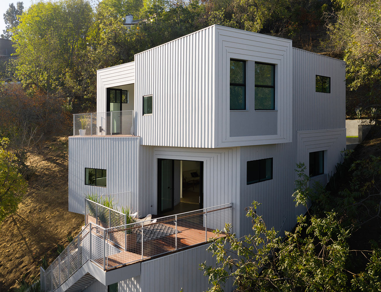
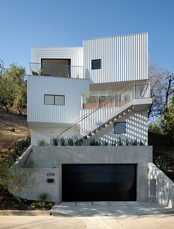
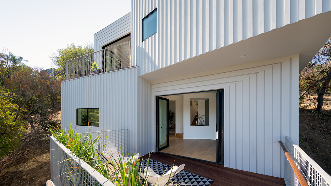
The final façade design for their Stack House project uses angled planes, alternating cladding patterns, and subtle shifts in color to create an impression of restrained dynamism. Shadows moving across the simple board-and-batten siding throughout the day give the appearance of shifting line weights.
While this project provided more creative independence than a typical client-commissioned house, it came with its own challenges, Buck said. “The freedom that we have working for ourselves, essentially, is different than working for a residential client, but it’s not necessarily greater. We have our own set of constraints financially . . . worrying about the market, and ‘Will this house sell or rent?’”
Despite the risks, the firm plans to repeat the experiment in the future. “[We’re] now being approached by not just private developers, but by end clients,” Freeland said. “They’re coming to us and saying, ‘Well, what project can we do? Can you find us land? We love what you did with the Stack House. How can we do that kind of thing in Los Angeles?’”
Explore
Michelle JaJa Chang lecture
Chang describes how her work relates to ideas about representational frameworks that describe space.
Drawing as thinking
Steven Holl, Mary-Ann Ray, and Nicholas Olsberg discuss the role of hand drawing in Michael Graves' work.
Nieto Sobejano Arquitectos: Five Themes
Fuensanta Nieto and Enrique Sobejano present their firm's work, which won the 2015 Alvar Aalto Medal.


