Folly 2013: Talking treewood
A conversation with the 2012 and 2013 winners of the Folly competition.
On May 22, 2013, representatives of the League and Socrates, Ian Veidenheimer and Elissa Goldstone, sat down with the 2012 and 2013 winners of Folly to discuss tree wood, this year’s installation. tree wood’s design team, Toshihiro Oki, Jared Diganci, and Jen Wood, spoke with Jerome Haferd and Brandt Knapp, designers of last year’s winner, Curtain.
Brandt Knapp: Tell us about the initial conception of the project. What is the significance of the title, tree wood?
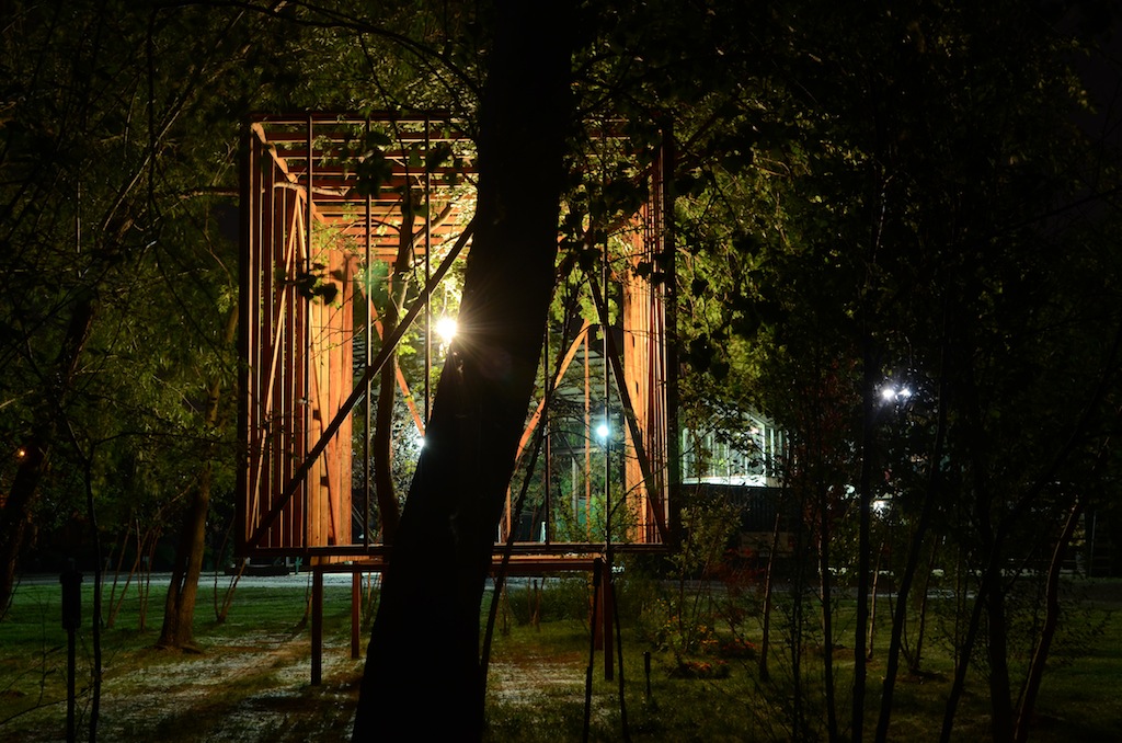
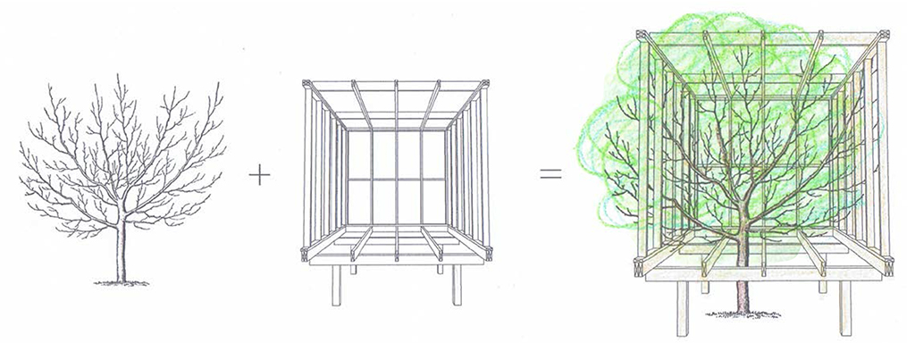
Toshihiro Oki: We had started to develop a number of different schemes, but the one thing we kept coming back to is the idea that the folly needed to engage people, the park, and the landscape. The growth of trees in the middle of the park have always felt like a very essential part of Socrates. Our office is in the neighborhood, and I’ve lived in Astoria since 1998, so I’ve visited many times, in all seasons, and I always loved those trees. It’s one of those places that always has shade, so people gravitate there naturally, especially in the summertime. I guess there was a preconceived desire to somehow engage those trees, and that’s where it all started. We thought we might be able to capture part of the trees, part of the leaves, and somehow frame them.
Knapp: You have spoken about the relationship between those trees and your choice of materials [wood two-by-fours] as: “One is the source, and one is the end product.” Allowing those two elements to exist in the same space moves it beyond simply an act of framing. What dialogue between the two do you think takes place?
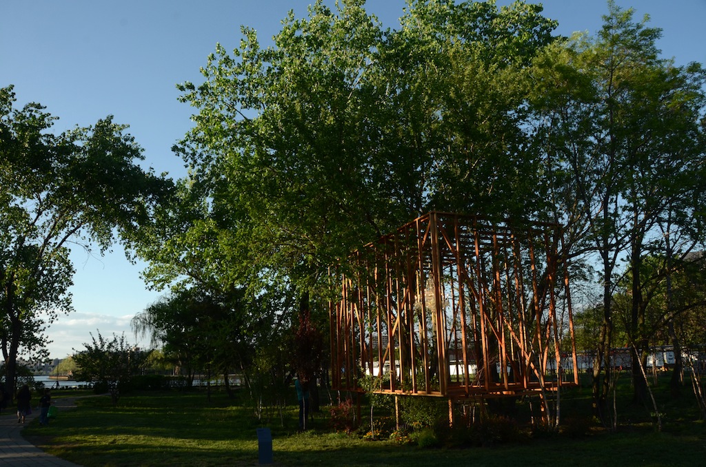
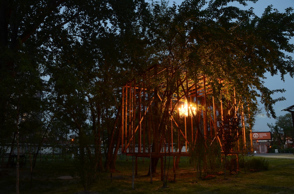
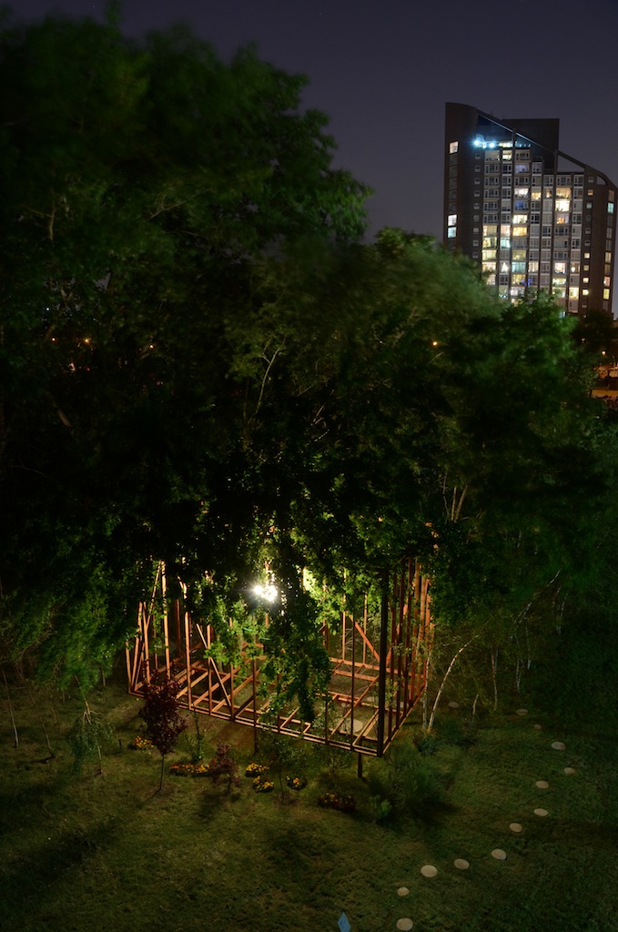
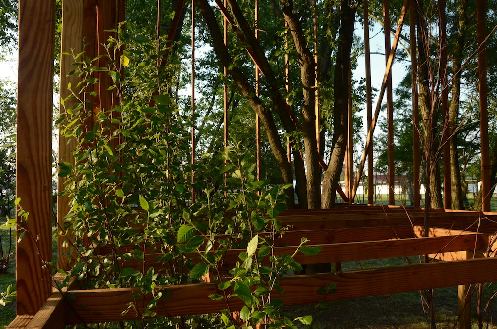
Jared Diganci: It’s mutual transformation. While the structure we’ve made does not change physically, the trees obviously do, and through their transformation, our structure is in turn transformed. The relationship is catalytic. In our proposal, two of the first images we show are of the summertime and springtime. It’s supposed to be very evident that it’s the same structure in each view, but it’s a completely different experience. That was the best part about building the project. At the very beginning, there wasn’t any green on the trees. Just a few days ago, the birch trees were growing in and the larger trees had completely covered it.
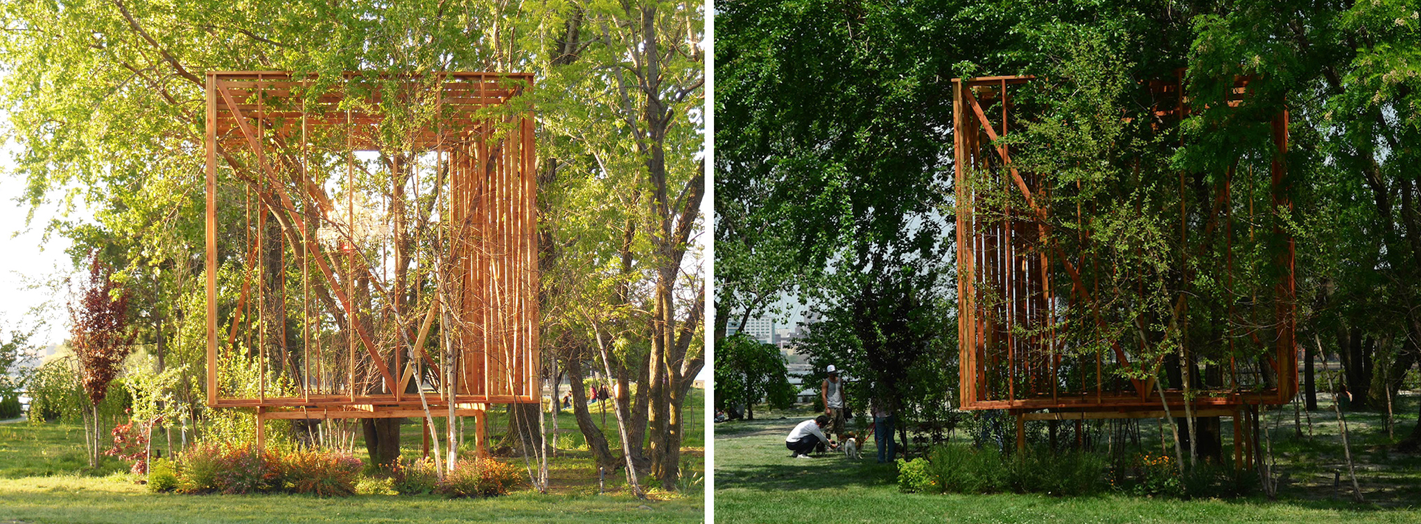
(left) tree wood on May 12, 2013 | photo: Elissa Goldstone; (right) in late June | photo: Nate Dorr.
Jerome Haferd: I respond most strongly to your piece as a visual transformation of its setting in the way you described, but there is also a strong statement about physical habitation in the way you have enclosed nature and opened these holes at the bottom where a visitor is encouraged to enter and really participate.
Oki: That’s interesting because I remember finding your folly [Curtain, Folly 2012, by Haferd and Knapp] compelling, even though I had no idea it was part of this architectural folly program. I remember thinking, “What’s that? That artist is very architectural!”
Haferd: What made you think that?
It’s as though you have thought carefully about all the words and decided, "This is the one."
Oki: Precisely because of the way your folly engaged people on such a haptic level. A lot of the sculptures in the park are more art objects. Curtain seemed to encourage people to get very actively involved. Kids were playing inside of it. I remember thinking that whoever made it must think like an architect. It’s special to have something in the park that people can physically interact with and inhabit, rather than simply look at or think about abstractly. That interactive aspect definitely carried through your project. We tried to incorporate that as well with ours. But the initial concept was to try to capture the trees spatially, to embrace them.
Haferd: To physically enclose them in a space.
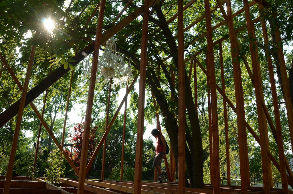
Oki: The landscape was always a critical aspect of the design. But how do you capture something so dynamic? That is where the wood cage idea came from: Wood is an inexpensive material, and naturally porous, so the trees can grow through it. That’s when it all started to congeal.
Haferd: The two-by-four studs you’ve used are intended for boundary-making, but they are actually doing the exact opposite here: letting you in, and nature out.
Knapp: That’s very true. They also lend an ambiguity about the structure’s completeness, since they evoke more the language of building and construction than they do a finished architecture.
Diganci: It’s amazing how many people have asked us, “Is it done?”
Oki: Yes, or, “Where are the walls?” People seem to have some difficulty reading the structure.
Haferd: Initially, I thought that it was a cube. It was only as I watched you guys erect it that I realized it’s a rectangle.
Knapp: Tell us about that shape, that rectangle. What is the size of it, why is it positioned where it’s positioned?
Oki: We started off with two-by-four-by-fourteen studs.
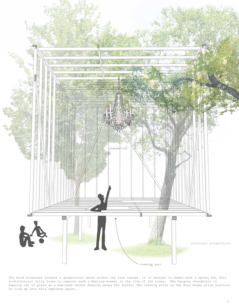
Diganci: A standardized size, to leave the least amount of waste. We angled it in order to control the approach, and also to get different gradients of the interior space. We wanted one corner purely untouched, just stud framing, and one corner that shows the meshing of the branches and two-by-fours weaving densely.
Oki: We looked into using tw0-by-four-by-sixteen-feet studs. But the logistics were difficult. How do you get a 16-foot long stud up into the trees? So, we went with the next size down. All along we knew we would have to negotiate the trees. John and Elissa told us, “Look, the trees are all over. You’re not going to hit your spacing.” Our response was that it actually wasn’t that important. We just laid it out according to how the branches went. We allowed for that kind of flexibility, to cut things as we went, to let the branches decide.
Haferd: It transformed through the construction process. Your folly essentially collides with nature in both a visual and experiential way. Is that something at work in your practice, or part of your attitude towards architecture in general?
Oki: Letting events determine what you do is just a part of life! Plans never work the way you think they will. So we definitely try to go with the flow and embrace roadblocks as they occur, and incorporate them. At the end of the day, you can’t fight Mother Nature. You learn a lot, too.
Elissa Goldstone: The chandelier is different, almost non-architectural.
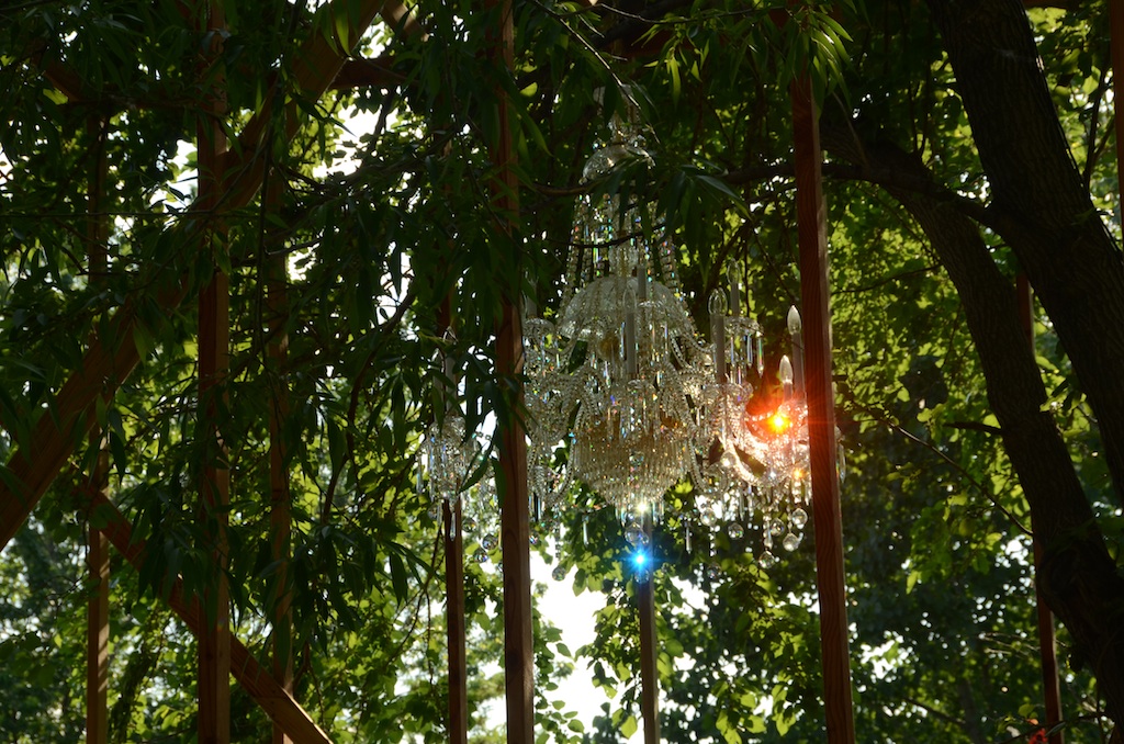
Diganci: It’s a symbol of a civilized space. We kept going with man-made versus nature, but the chandelier brings it a step further, to the point of being excessive: It’s over-the-top man-made, something very precious. It’s something that you associate with finely detailed spaces or well-made architecture.
Oki: There wasn’t a very heavy, theoretical reason behind it. It was more intuitive. I think that when we were doing the structure in the tree, it felt like it needed something odd, to draw people in, to make them think they can inhabit this if they go underneath it.
Haferd: It’s an artful domestic object that is very much on a line between architecture and sculpture/art. It agitates the line between the two.
Knapp: It has a grand sensibility, like a Beaux-Arts grand chandelier. As a sign, it indicated for me something that is fanciful, which is very folly-esque. Does that affect tree wood’s status as a piece of architecture in a sculpture park?
Oki: I don’t believe we ever saw it explicitly as art or architecture. The project was just driven by an impulse to capture the trees, and we just went with it. It’s hard to define what the difference between art and architecture is, but maybe one definition could be that people are intended to interact physically with architecture. That was very much a thought process that influenced us. Again, seeing the kids play in your folly was something that stuck in my mind. But nobody that I spoke with seemed concerned about the question of art versus architecture. The questions I encountered were much more basic, like “What is that?”
Goldstone: That’s a common question in the park. Our audience is de-sensitized enough to accept the “weird,” but when they see things that look like architecture, like a maintenance facility, they want to know its function. Who lives there? What do you do in there? Can I go in there? They ask different sorts of questions when they see architecture.
Diganci: When people ask, “Is it finished?” that, to me, is an inherently architectural question, having to do with utility and function.
Knapp: Tell us about the process and history of your practice, which is relatively new. How long have you been working together, how did the firm come about, and what’s your design process?
Oki: I met Jared and Jen through Columbia, because I teach there. They were teaching assistants. Academia creates so many collisions; you come across a lot of different groups of people. I had employed someone from my studio who is very good friends with them. She went back to school again and recommended Jen and Jared. I got an office space and brought them on. That’s how we came together. It’s been about a year now.
Haferd: So, introducing these new team members was exponentially growth-inducing. Did you change the whole structure, or did you want to add two or three more hands into what you were already doing?
Oki: Our main goal was the capacity to grow.
Haferd: The first step is starting to hire people. That’s what a lot of people in our age range wonder. What happens when you make that step?
Oki: Yes, because then you have to provide a steady paycheck and pay a steady rent. You begin thinking more about money. Before, you didn’t have to think about it so much. It becomes a very different animal.
Knapp: So, you started your collaboration with Jen and Jared a year ago; that means that you probably didn’t start working on this until November or December. Is this the first conceptual project that you were all able to work on together?
Diganci: Yes, we were looking at smaller competitions for ideas, for exploration, as an outlet to develop an identity.
Knapp: Was this meant to be an opportunity for you guys to put your heads together in a loose way, rather than very conceptually or academically? Or was this a chance to work on a practical, get-things-done, logistical process?
Diganci: Both sides of the spectrum helped energize the other. Designing, going into the field and seeing the project come up, and then being back in the office and figuring out the more finicky details.
Oki: It was a good project for us to work on together. It’s small; it’s manageable. To see it get built so quickly condenses the process of working through a whole project together. That’s educational for us as a young firm.
Haferd: How did working on the competition together affect your approach to representation? Your proposal was beautiful. Brandt and I responded strongly to your drawings; they are very simple, almost in a cartoonish language. What was your approach to representation of the project?
Oki: The sketch is where you find the spirit, the energy of the idea. We try not to lose that. By keeping it abstract and free-form and developing as we go along, we were able to keep that energy as opposed to getting too precise, too architectural. The drawing process was a way to help us keep the idea central and not get too bogged down into what the nailing pattern was going to be.
Knapp: And yet, even though it is loose, there is a lyrical precision. One of the jurors [Granger Moorhead] remarked that your approach is poetic. I think that is right: It’s poetry comprised of calculated moves. Even though it goes through this evolution, it feels calculated, thorough, and rigorous. It’s as though you have thought carefully about all the words and decided, “This is the one.”
Oki: You have to have a very clear idea, and you have to work at it many, many times to clarify that idea. We went through a lot of renderings, and we threw out a lot of work. You have to do that to understand what that final product should be.
Explore
Folly 2014: SuralArk
Images and renderings of the winning entry by Austin + Mergold.
Folly 2015: Torqueing Spheres
A look at the winning entry of the Folly 2015 competition.
Hou de Sousa introduces Sticks
Designers Josh de Sousa and Nancy Hou discuss their winning entry for the 2016 Folly/Function competition.

