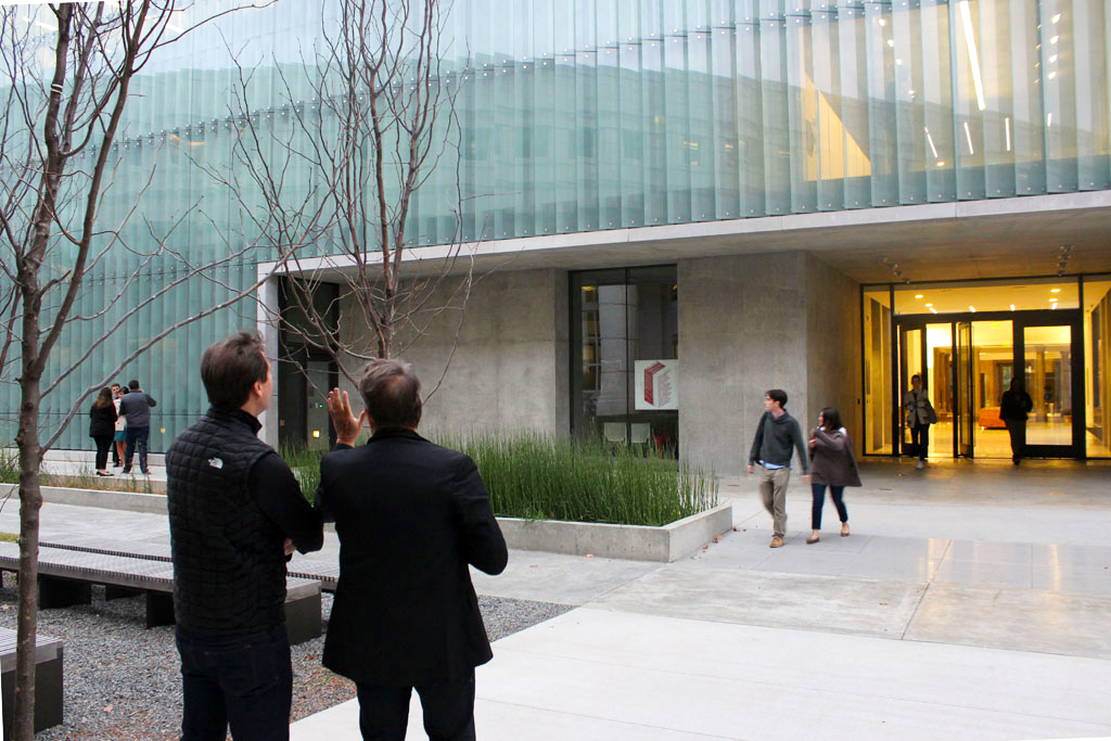
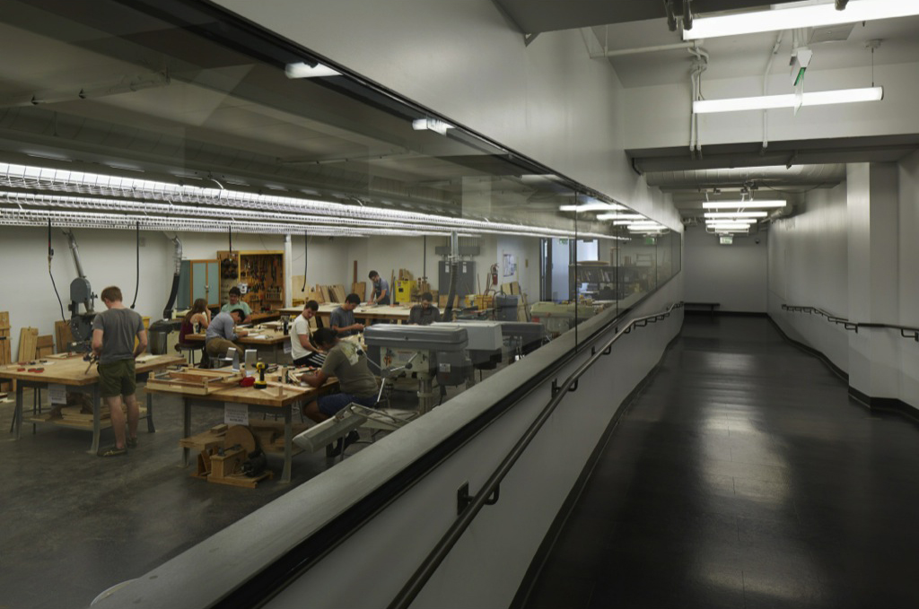
The Steven L. Anderson Design Center at the University of Arkansas by Marlon Blackwell Architects opened in 2013 as an expanded home for the Fay Jones School of Architecture, bringing the school’s architecture, landscape, and interior design programs together under one roof for the first time. The new building is an addition to Vol Walker Hall, a 1930s Neo-Classical building that originally served as the school’s library and was partially demolished and then underwent a full renovation in the expansion.
Marlon Blackwell, Distinguished Professor and Department Head, toured the building with architect Tom Phifer on November 3, 2014.
Form
Marlon Blackwell: The Anderson Design Center is a reverse figure ground of Vol Walker Hall. We considered the mass of the existing building to be the ground, and the windows the figures. In the new building, the mass is the figure, and the window becomes the ground. That was the basic strategy.
Jeff Shannon was Dean when we were planning for the building and he really made this project happen. He’s the one that asked the Chancellor: “Look around our campus, do you see a building by Fay Jones?” The Chancellor replied, “Well, no.” Jeff said, “Let’s not let it happen again. Give one of our own a chance this time.”
Vol Walker used to be the campus library; 40 years ago it became home to the architecture school. We initially hoped to relocate the architecture school to a new building on the edge of campus. The University said there wasn’t money for a new building but that we could re-do this one and add to it. And that’s how it happened. I must say, in hindsight, that it’s great to remain in the middle of campus.
The criterion from the University was that the building had to have the same length and width as the Neo-Classical east-facing bar of Vol Walker Hall. Other than that, we had control over the design. For the new building, we used the south-sloping terrain to create a plinth and then slipped some of the program underneath to maintain the proportions.
Tom Phifer: So these are studios underneath the plinth here?
Blackwell: Yes. The building was getting too tall, so we tried to pack the lower level with the studios and provide eastern light.
Facade
Phifer: Clearly there was a great rigor in the construction.
Blackwell: Everything had to align end to end. In fact, I discovered just as we were about to turn the working drawings in that we were two inches off on the north end, and I literally cried. So we stopped everything and spent three days reworking all of the dimensions – gotta get it right.
Vol Walker Hall, the existing building, has steel sash windows. We had a big debate about replacing those single-pane windows with triple-glazed windows, but we looked at the payback and it would take 300 years to break even financially with the energy savings. So instead we re-did the hardware and restored the existing windows, still using single-pane glass, then installed automated solar shades on the interior. And it works.
For the Anderson Design Center, we initially wanted a TGP steel curtain wall. But when we got the prices back, we about fell out of our chairs. However, after some discussions with a local steel fabricator and a glass company, we discovered, for the curtain wall, that if we separated the two warranties that the price would drop significantly. So we talked to the University. Although they said it was unheard of, they agreed. And so the steel frames for the addition were made ten miles away. We then worked with Heitmann & Associates, an envelope consultant out of St. Louis, to help us with the detailing of the curtain wall and the fritted glass fins (the bris soleil).
Phifer: I like how direct the connection is. You see how everything joins together — all of the bolts and the welding. It’s really beautiful. It’s wonderful how gauzy the facade is, so you can see the movement on the interior. This place is incredible.
Blackwell: The whole facade we really saw as one big window, a complete interface: transparent, translucent, and at times, opaque. The exterior has a tautness, a kind of a shrink-wrapped character.
Some people have asked why the building doesn’t use more wood like some of my other projects. But you have to respond to what’s already here, the DNA of a place: in this case, limestone and concrete. With the concrete, limestone rainscreen panels, and glass there’s a lot of precision required – thus the zero-edge detailing.
Concrete
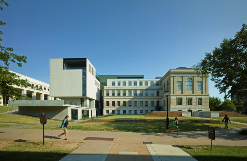
The concrete plinth forms the base for the Anderson Design Center | Photo by Timothy Hursley
Blackwell: The key to the post-tensioned concrete walls was having a really good concrete consultant, so we worked with Peter Clarkson out of St. Louis. He did Tadao Ando’s Pulitzer Arts Foundation building. He was amazing with all the specs. For the concrete, we used a company that had also been involved on the expansion to the Salk Institute, so they had experience with the quality that we required.
Phifer: This is some of the best concrete in America. It’s really beautiful. I understand the building now — you don’t see this in the pictures, but the way the concrete traces around the exterior is very honest.
Blackwell: It’s as if you cut the building in half, right? It’s a section — the building as a section. The outline, or trim, is all pre-cast concrete. It’s the only way we could really get it right. I don’t think we could have cast it in-situ.
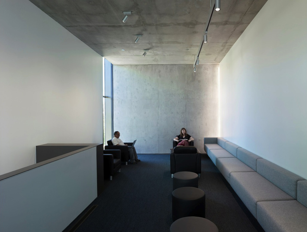
The exposed architectural concrete extends to the building's interior, visible here in the faculty lounge | Photo by Timothy Hursley
Stairs and lighting strategy
Blackwell: The big move is the formal joint, between the old and new, formed by new exit stairs.
We got Richard Renfro as the lighting designer — he’s a University of Arkansas grad. He did all of the lighting in the public spaces and came up with the idea of embedding lights in the concrete of the exit stairs. Richard also did the vitrines to light the public axis and lobby. There are no lights in the plaster ceiling.
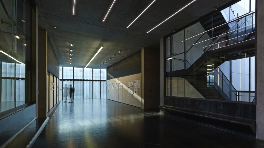
Glass and concrete are expressed in the circulation space, which also serves as a pin-up area | Photo by Timothy Hursley
On the inside of the stairs, all of the steel is raw. The whole idea is to be episodic, because there was no way to tie the whole building together as one consistent narrative.
Phifer: But that’s what’s beautiful about it — it shows how things are made. Richard did a great job. The lighting is a big part of this.
Blackwell: We knew it would be. He was worth every nickel.
Phifer: I love this — is this a perforated metal inside the stair?
Blackwell: Yes, it’s a mesh. We didn’t want the stairwell all cluttered up with rail, you know. Just rough materials. It’s a teaching moment — you could take students into this stairwell and teach them everything.
Phifer: Yes, about how the materials come together —how this little piece is welded on, the extension of a handrail, the treatment of the steel — you don’t need to grind it! Materials today are too precious, not authentic.
Wood tableau
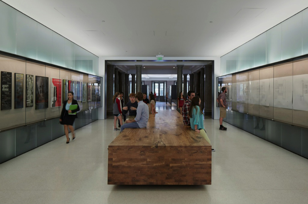
The wood tableau is a central element in the Vol Walker entrance, creating a resting and socializing space as well as a teaching moment | Photo by Timothy Hursley
Blackwell: Let’s go in the West Entrance to the inside axis of Vol Walker Hall. Tom, all of this was book stack area previously — that was all taken out and we re-built the whole core. For this wood piece, we took two 100-year-old oak trees and turned them into this twenty-five-foot long tableau where we can teach students about end-grain, long-grain, and face-grain. You can see the roots and then where the branches of the trees intersect with the trunk.
Blackwell: This is the computer and media lab, and then here’s the candy store: the woodshop, the materials library, and the viz lab. We have a sunken yard outside with a connection to a mechanical lift that brings materials in and out, so students can build out there. We also have a really good shop guy, Tim LaTourette, who does great work with the students.
Main level gallery

An exhibit in the new gallery honored E. Fay Jones, the first dean of U. of A.'s School of Architecture for whom the school is now dedicated | Photo by Timothy Hursley
Blackwell: We’ll walk up to the exhibition gallery now. It’s really one open space but with massive, thick concrete walls to create three smaller exhibit rooms. These three panels rotate to create light control for the western sun, or when closed they form one continuous surface. It’s very simple.
Phifer: I love the materials. What is the ceiling made of?
Blackwell: It’s made of felt.
Phifer: Felt, that’s felt! Wow.
Central jury room
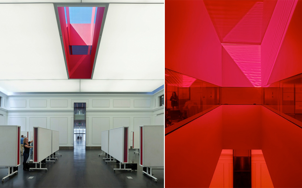
The central jury room, with an oculus that provides additional natural light as well as a pop of color | Photos by Timothy Hursley
Blackwell: This is the large central second-floor jury room — a bit of a mess right now. I think they just finished a review.
Phifer: This is the space I was trying to figure out in the pictures. What is this red — ?
Blackwell: The oculus, with a red liner and a continuous red glass window. The studios are up above on either side, overlooking this space. This is a Newmat ceiling: a backlit stretched ceiling system that provides even lighting and acoustic improvement. I’d seen this done by Renfro at the UNStudio loft that he worked on in New York.
Studios
Blackwell: We’ll go into one of the renovated studio spaces. The students aren’t allowed to tape to these sheer walls, so instead we used sanded homasote on the back wall to create crit spaces. It’s very compact because we fit the maximum number of desks we could to prepare for the program’s growth.
Phifer: There’s a lot of energy in here because people are so close together. These are great little crit spaces, too. This is the sanded homasote?
Blackwell: Yes. And you can actually buy it sanded. We didn’t know that, though, so these poor guys sanded it all – a lot of work.
The University allowed us to not worry so much about restoring everything in the existing building to what it originally was – you know, to replicate it. Instead, we used white paint over the existing detailing that unifies all the various surfaces. We had some terrible chandeliers here in the grand stairwell, which we replaced with David Chipperfield fixtures.
Blackwell: Right now this fourth-floor central upper level is flex spaces, but they’ll become studios as we grow. There are faculty offices and a staff area up here as well. Here you can look into the red oculus, and then you have great views out. Walking out, this is a green roof that is actually a lab for the landscape program. They do studies on Ozark sedums and other plants.
Phifer: It’s like a little tree house up here. So you have a landscape architecture program here as well?
Blackwell: Yes, Landscape Architecture and Interior Design. The programs were spread around campus, and this building provided the opportunity to bring everybody together in one building, under one roof.
Biographies
Marlon Blackwell established Fayetteville, Arkansas-based Marlon Blackwell Architects in 1990 with a design philosophy that is rooted in “strategies that draw upon vernacular and the contradictions of place.” The firm has been recognized for works regionally and nationally, including the Keenan TowerHouse, the Porchdog House in Biloxi, the Crystal Bridges Museum Store, and the St. Nicholas Eastern Orthodox Church.
founded New York City-based Thomas Phifer and Partners in 1997, approaching work “from a humanistic standpoint, connecting the built environment to the natural world with a heightened sense of openness and community spirit.” The award-winning firm’s work includes the Corning Museum of Glass North Wing, the North Carolina Museum of Art in Raleigh, the Brochstein Pavilion at Rice University, and residential commissions in the Hudson River Valley. Phifer is a member of the League’s Board of Directors.

